SafeInsights, Rice University
Designed a multi-step research
proposal submission experience covering proposal intake, IRB, agreements, and feedbacks.
Status: Live
Designing a 0→1 research proposal system for multi-stakeholder collaboration.
Transforming fragmented, compliance-heavy workflows into a structured, iterative system for researchers and data organizations.
SafeInsights is a secure research platform that enables researchers to analyze sensitive data in a controlled environment while maintaining strict privacy and compliance standards.
As a new product, there was no defined workflow for how researchers and data organizations should collaborate — resulting in unclear expectations and fragmented decision-making. I led the end-to-end design of a multi-step, multi-user proposal and review system, turning this ambiguity into a structured, iterative workflow that supports both technical and non-technical stakeholders.
Three problems. One platform built from scratch.
K-12 research data is valuable, but nearly inaccessible.
Researchers studying educational outcomes face significant legal and compliance barriers, such as FERPA when accessing sensitive K–12 datasets. While data organizations are open to sharing, they lack a safe and structured way to do so. SafeInsights was created to bridge this gap, but without an existing model, there was no playbook for what researchers should submit, how proposals should be evaluated, or how decisions should be communicated.
Researchers had no clear path to submit or reiterate on the submitted proposals.
Researchers were responsible for proposing studies and writing code against sample data, with no visibility into the real dataset and no clear signal for what an approvable proposal looked like. There was no guidance on what information was required, how to write code that would hold up on the real data, or how to act on a rejection and resubmit.
Data organizations had to evaluate requests without a shared framework or shared expertise.
Data organizations weren't a uniform group. Each operated independently, with their own access criteria and staff with varying levels of technical expertise. There was no standardized evaluation framework, no consistency in how code was assessed, and limited visibility into proposal history. The challenge wasn't just building review tools: it was building structure that worked across organizations with different processes and proficiencies.
Redesigning the proposal workflow as an iterative, multi-user system
Four solution areas. Each addressing a distinct gap in the workflow.
Bringing clarity to Researchers and Data Organizations throughout the study proposal.
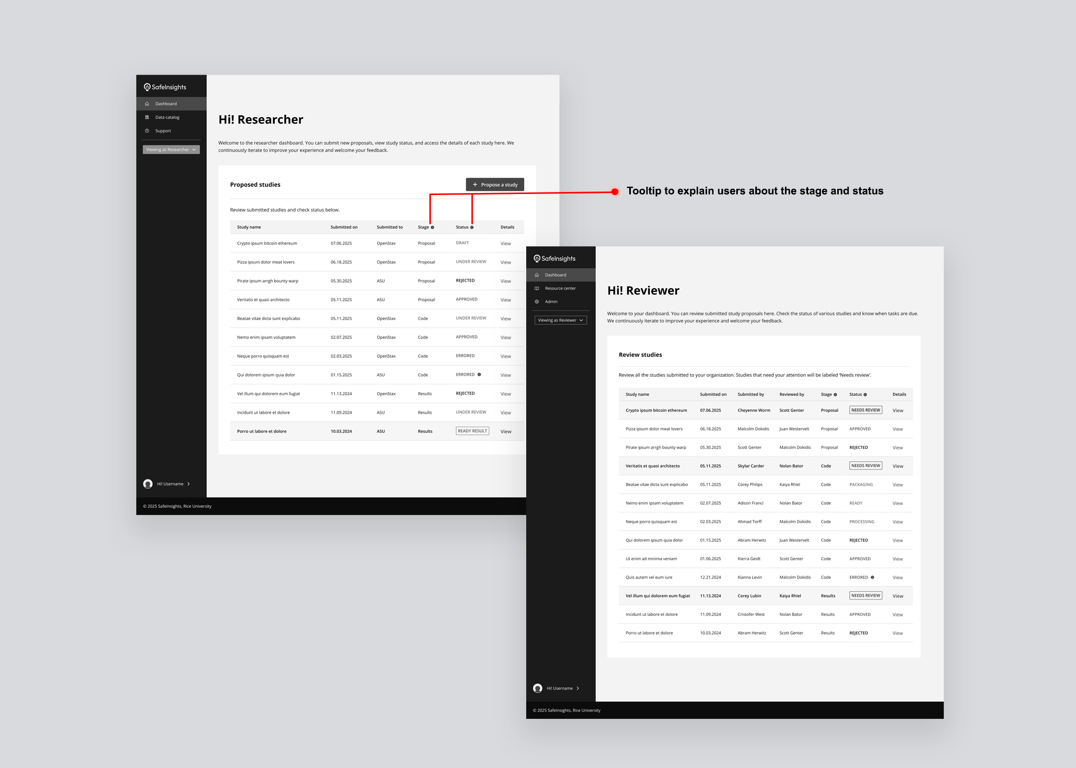
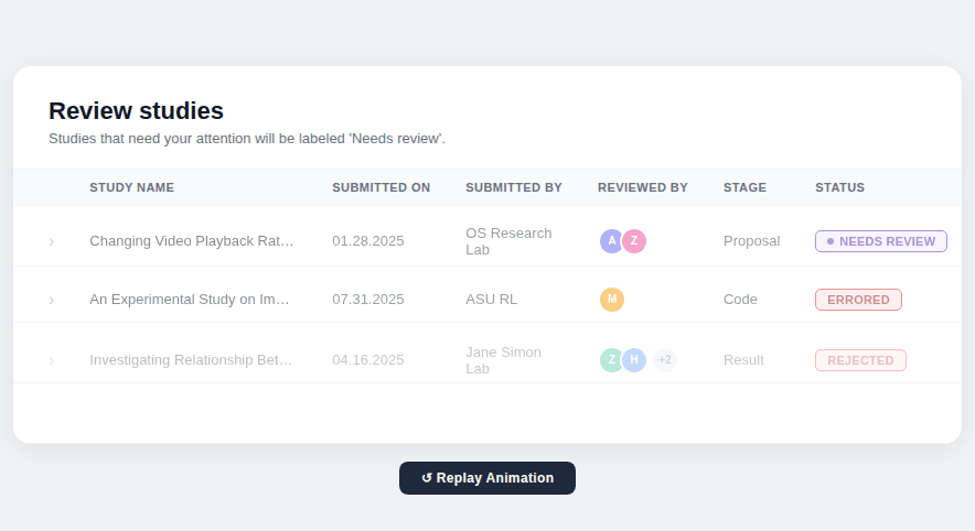 Designed a study table giving all stakeholders a unified view of every proposal's current stage, status, and decision.
Breaking the proposal into guided steps — from initial request to code submission, and result.
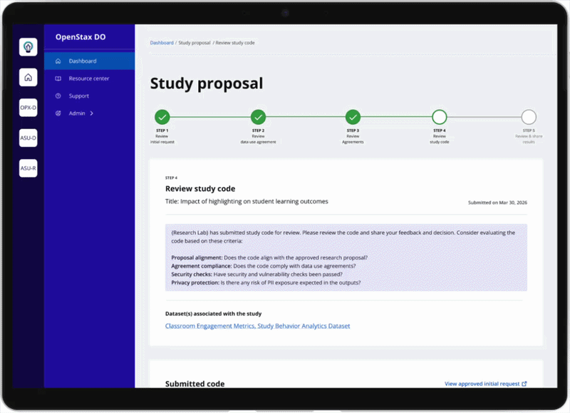
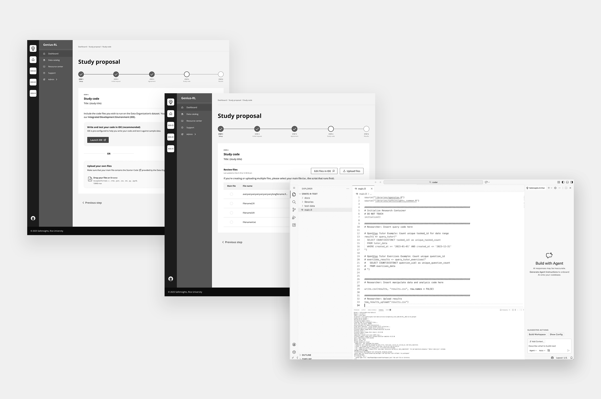
 Designed a multi-step workflow covering each phase of the proposal: initial request, agreements, IRB, and code submission, so researchers always knew what was required at each stage.
Collaborative Feedback & Iteration System
 Designed a feedback system where multiple reviewers can evaluate and comment on different stages of study proposals.
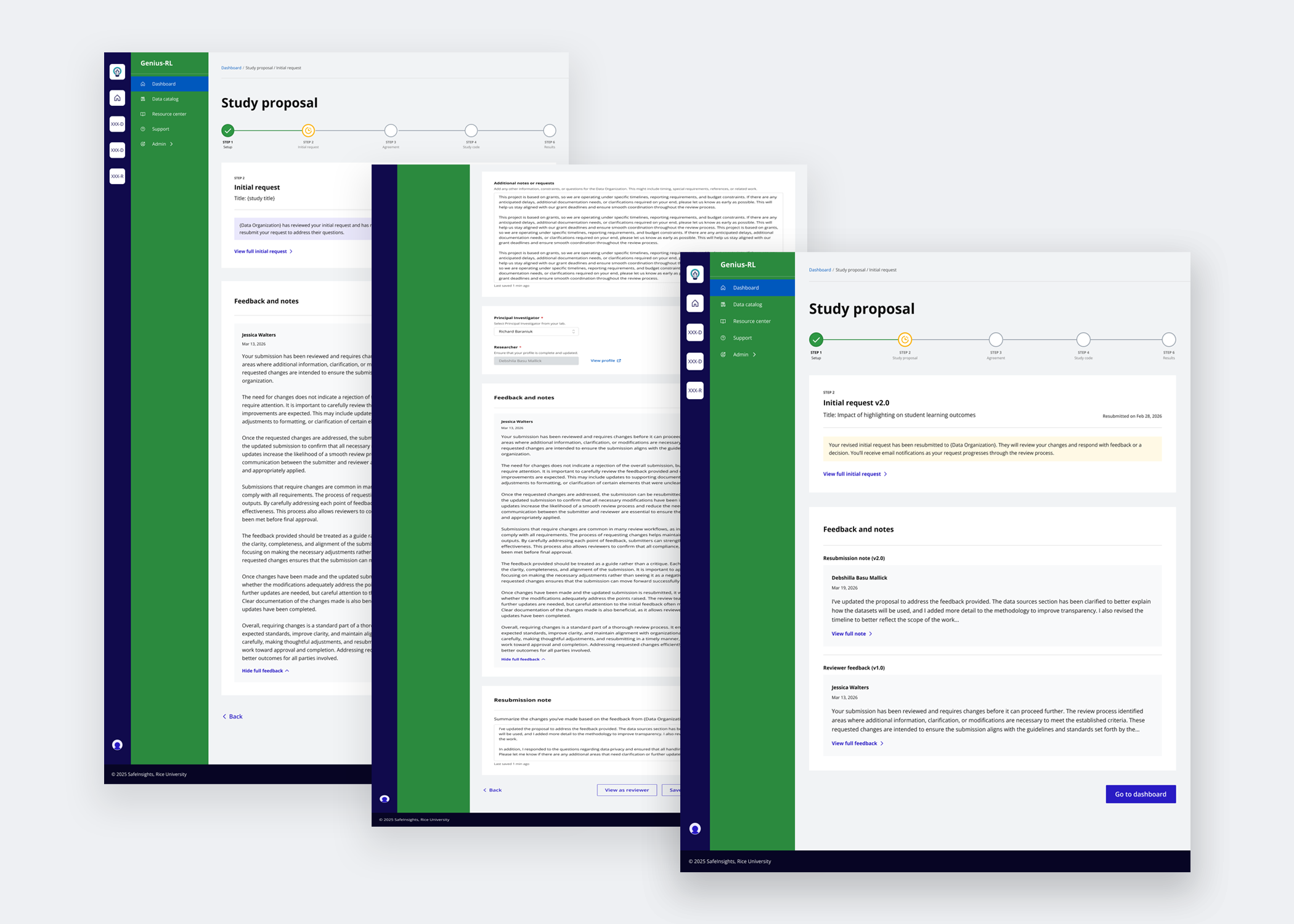 Enabled researchers to act on reviewer feedback, revise their submissions, and attach resubmission notes to communicate changes back to reviewers.
AI-Assisted Code Creation & Evaluation
 Integrated AI-assisted code generation to support researchers with varying technical expertise.
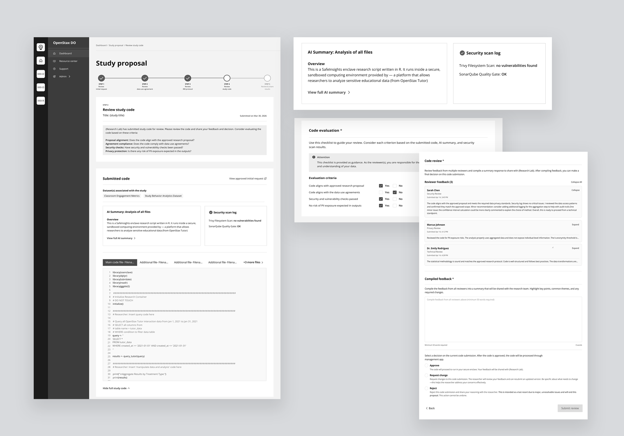
 Introduced AI-generated code summaries and a structured evaluation checklist so data organizations can review submitted code quickly and confidently, regardless of technical proficiency.
So how did we get here?
How I approached designing a system that didn't exist
Researchers are new to a secured dataset model, one where data is never directly shared with them. On the other side, data organizations are not a uniform group. Each has its own evaluation criteria, staff expertise, and capacity. The challenge was designing a flexible system that could hold variation on both sides, surfacing mental models gradually, keeping engineering sustainable through phased releases, and earning clarity before designing for complexity.
- Research Lab — multiple researchers, one project admin as accountable decision maker.
- Data Organization — independent partners, each has their own processes and capabilities to support research.
- SafeInsights — Building the platform and ecosystem to support this secured large-scale research.
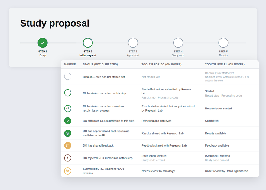
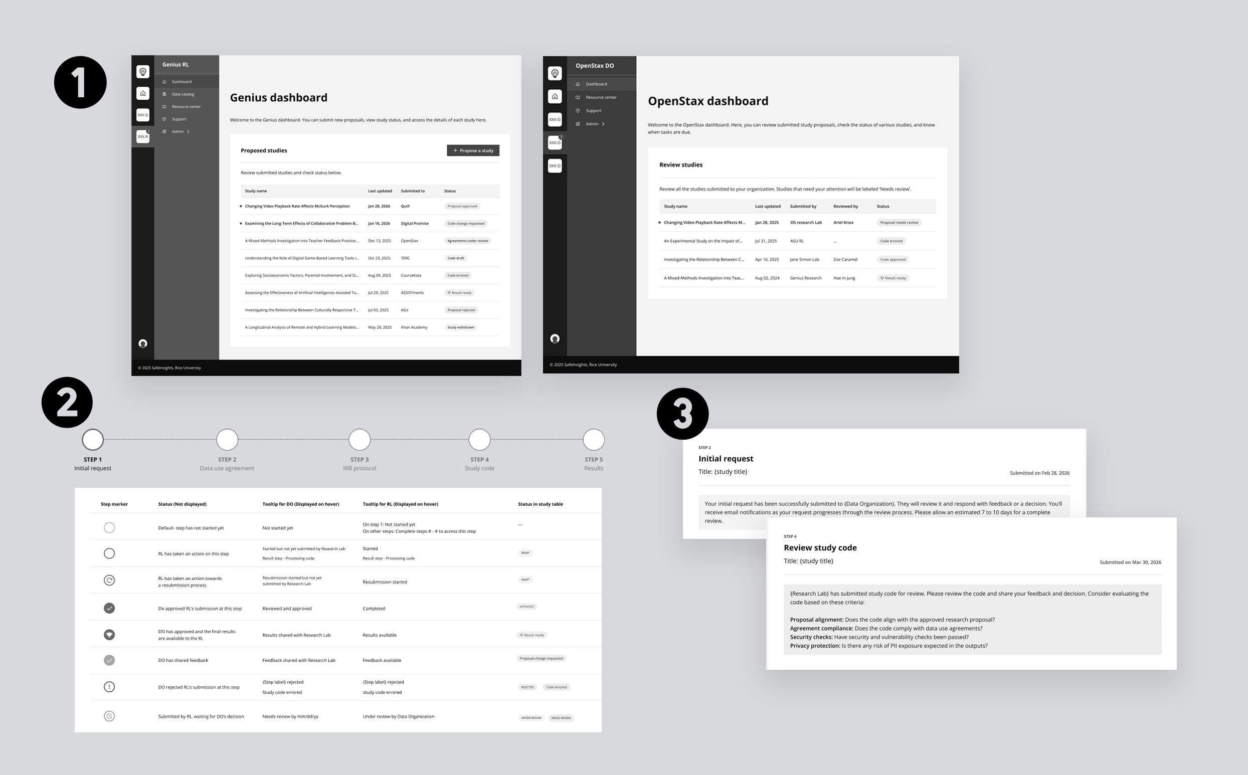
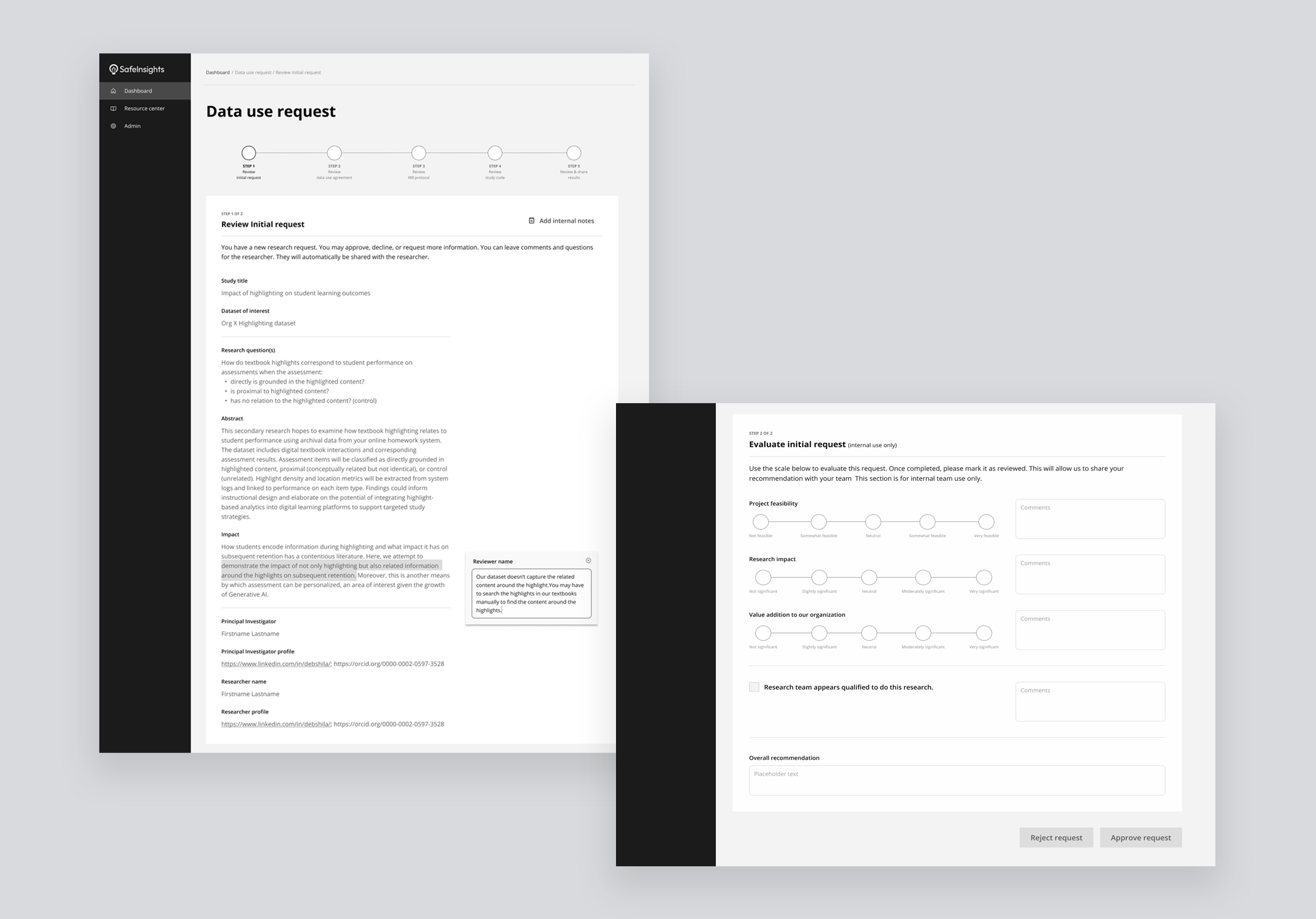
- Step 1 — Initial request: intent, datasets, coding language, profiles
- Step 2 — Data use agreements: review and sign
- Step 3 — IRB approval: ethical review signed off
- Step 4 — Code submission: run against sample dataset
- Step 5 — Evaluating results: output reviewed, iterate or close
Steps define the user journey. Phases define how we built it.
Not defined upfront. Earned through the work.
What we learned from concept and usability testing sessions.
How I researched
While testing early mockups, I conducted 8 open-ended usability sessions with external users, including 4 researchers and 4 data organization staff, to understand what they surfaced unprompted. Each session lasted 90 minutes and was deliberately unstructured to capture natural behavior and feedback.
Once we began implementing changes, we ran internal testing across system validation, QA, and usability to ensure the solutions held up end-to-end before moving forward.

Usability testing session.

Affinity mapping the insights to identify patterns.
Key insights
Trust is critical, but the burden of proving it needs to be shared.
Data organizations named trust as their #1 factor for working with a researcher, but didn't want to spend time verifying it themselves. They relied on institutional signals: IRB approval, affiliations, resume, and past research history.
The proposal workflow wasn't linear, but the early design suggested it was.
Participants rejected the progress bar, not because it was confusing, but because it didn't reflect reality. Proposals loop back and forth. Steps overlap.The current progress bar wasn't reflecting them.
Both sides wanted control over collaboration, but defined it differently.
Reviewers needed clear control over who could view, respond to, and resolve feedback, while researchers wanted clarity on what was being asked and by whom. Many data organizations involve multiple reviewers who collaborate internally before sharing consolidated feedback with researchers, and they expected the system to support this workflow.
Technical capability was uneven on both sides.
Researchers had varying levels of coding expertise, while reviewers were primarily domain experts and not fully proficient in evaluating code for safety and alignment. Both gaps were significant, and the platform needed to address them.
How each solution evolved
Before arriving at the final design, each solution area went through multiple rounds of exploration, testing, and iteration. Here's how each one evolved.
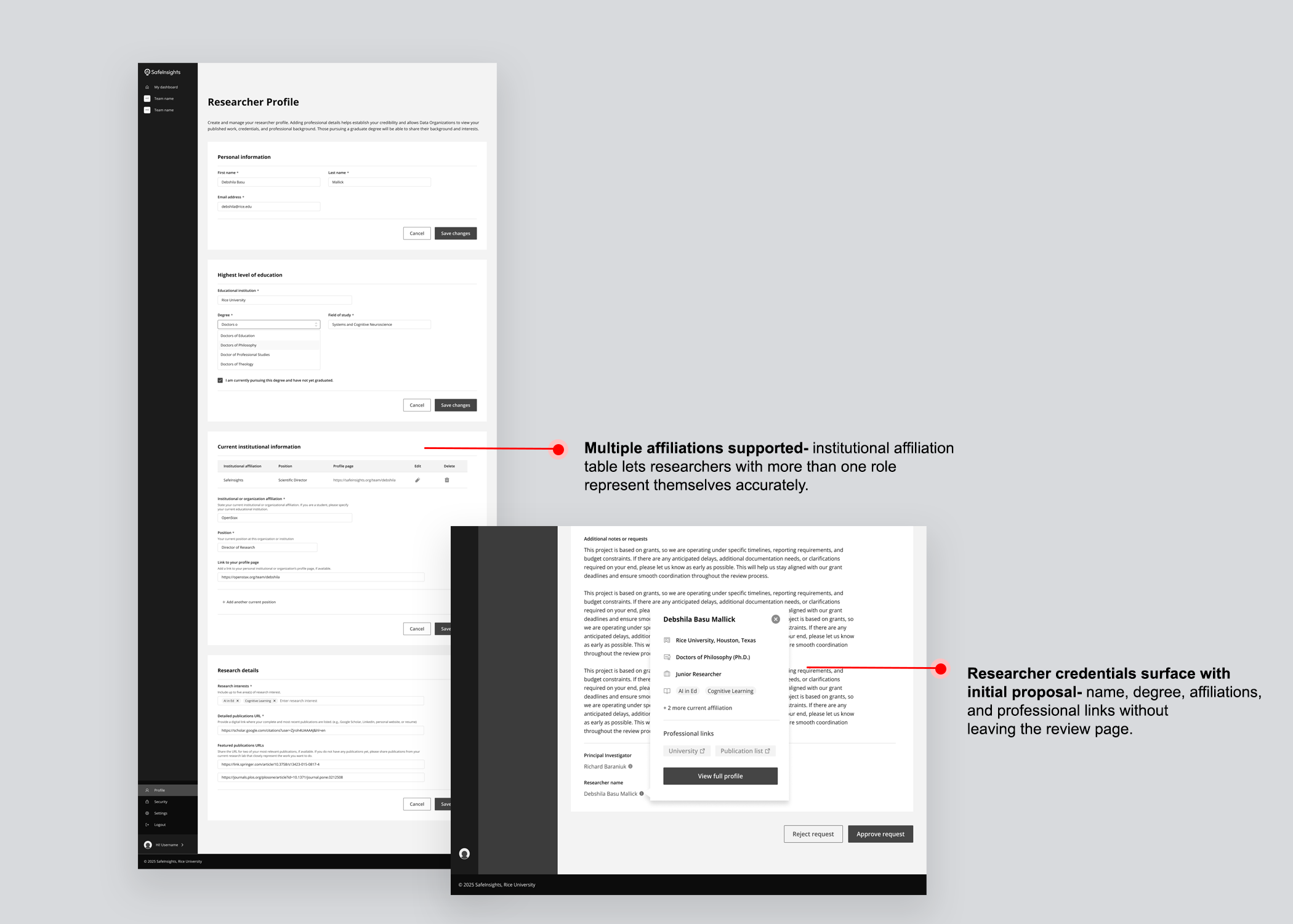
Trust was the single most important factor in a data organization's decision to work with a researcher, but data organizations did not want to spend significant time verifying researchers themselves. The solution was a set of four interlocking trust signals, each one reducing a different kind of uncertainty before it could slow the process down.
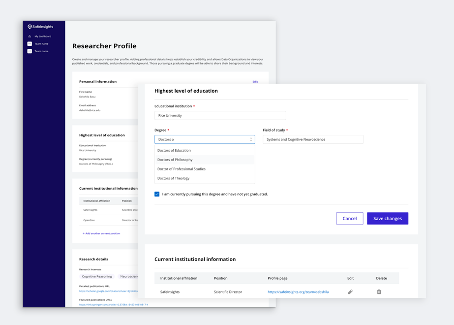
Researcher profile
Data organizations needed a structured view of a researcher's credentials — affiliations, published work, career history — without having to chase that information themselves. Rather than sitting in a separate section, the profile surfaced as a popover directly within the proposal review page, so trust signals travelled with the proposal.
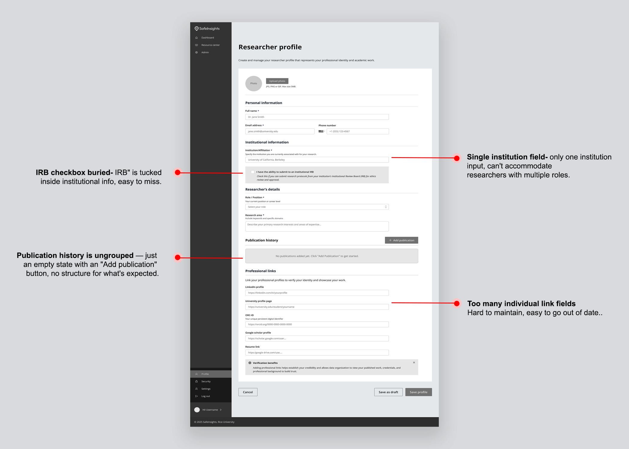
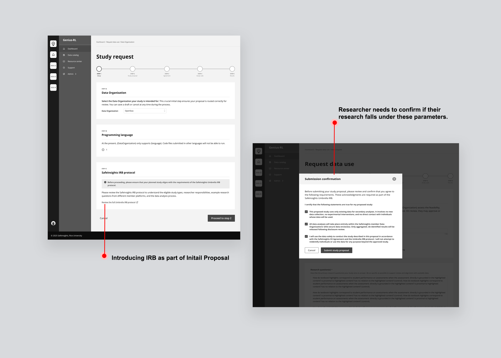
IRB protocol
IRB approval signals that a project has passed independent ethical review, giving data organizations a familiar vetting checkpoint. SafeInsights introduced an Umbrella IRB — a shared institutional approval covering all research on the platform — so studies that fall within its parameters require no separate institutional approval.
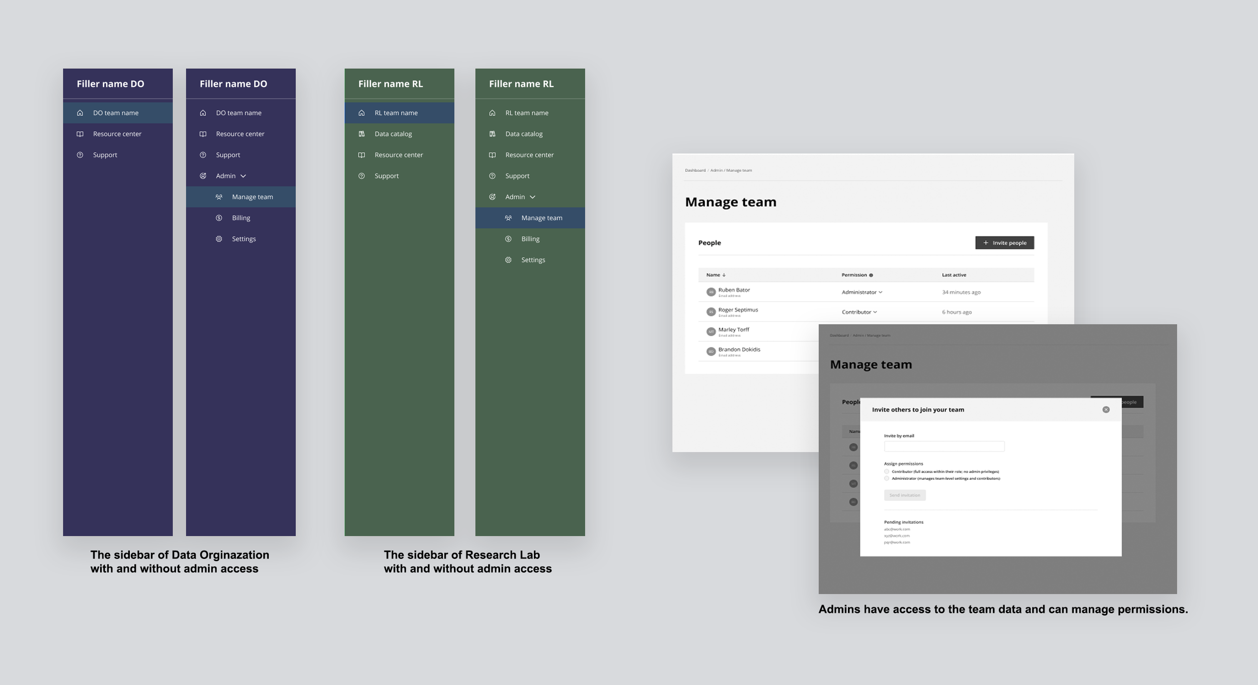
Roles & permissions
Both research labs and data organizations work in groups, and groups need clarity on who holds primary responsibility. Two roles were introduced — Administrator and Contributor — made visible through navigation itself. Administrators see the full sidebar including Admin, Manage team, Billing, and Settings. Contributors see none of that. Your role was visible by what you had access to.
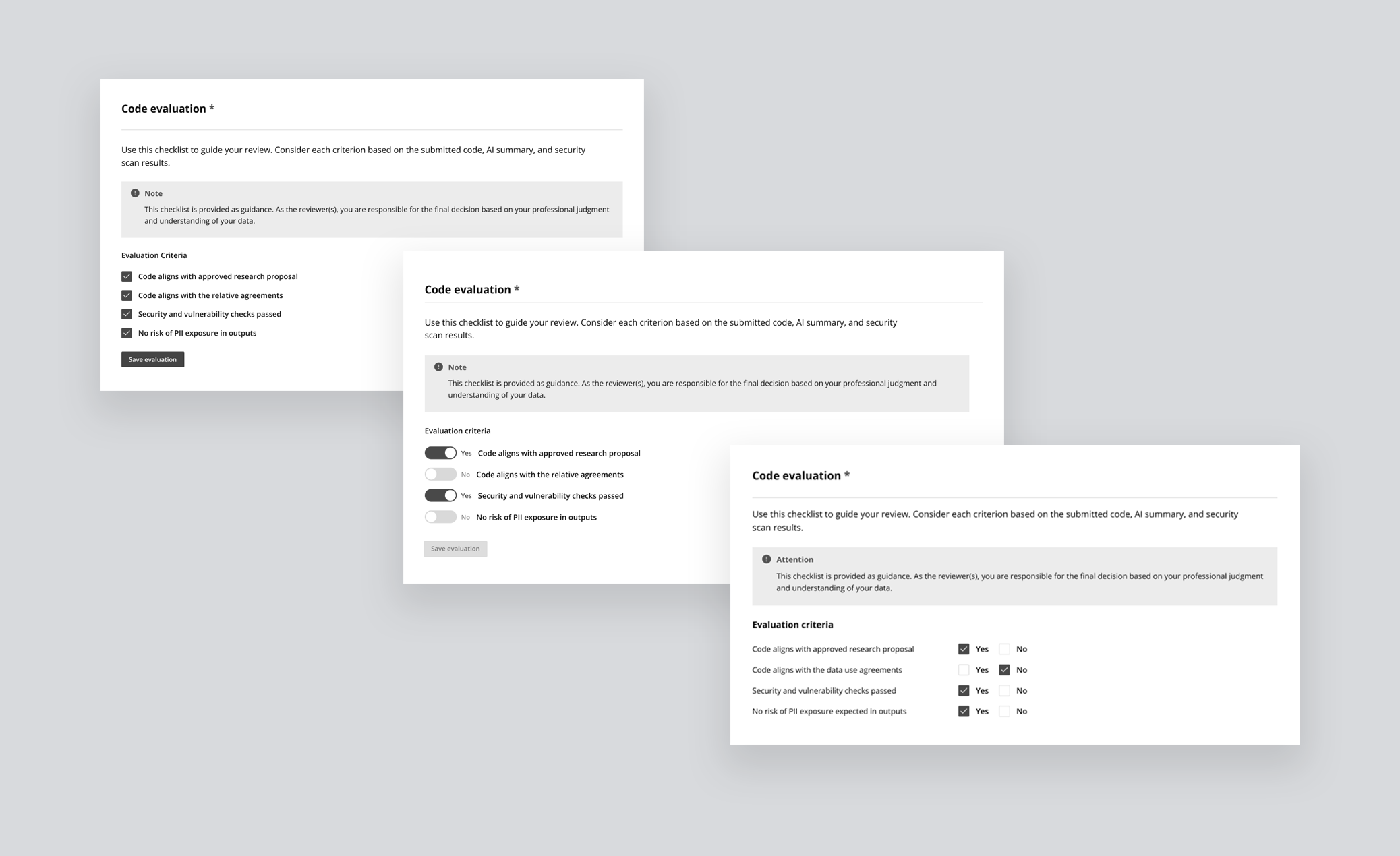
Evaluation checklist
Without shared criteria, every review was subjective. A binary Yes/No checklist gave data organizations a consistent standard and gave researchers clarity on exactly how their submission would be judged — before they submitted it. The checklist was visible to both parties throughout the process, not just at the point of review.
The proposal lifecycle had real structural complexity, 5 steps, multiple stages within each, different decisions tied to each stage, and two user types experiencing the same journey differently. The challenge wasn't designing a workflow. It was figuring out how to communicate that structure clearly, without overwhelming a first-time user before they'd even begun.
Study table & progress tracker
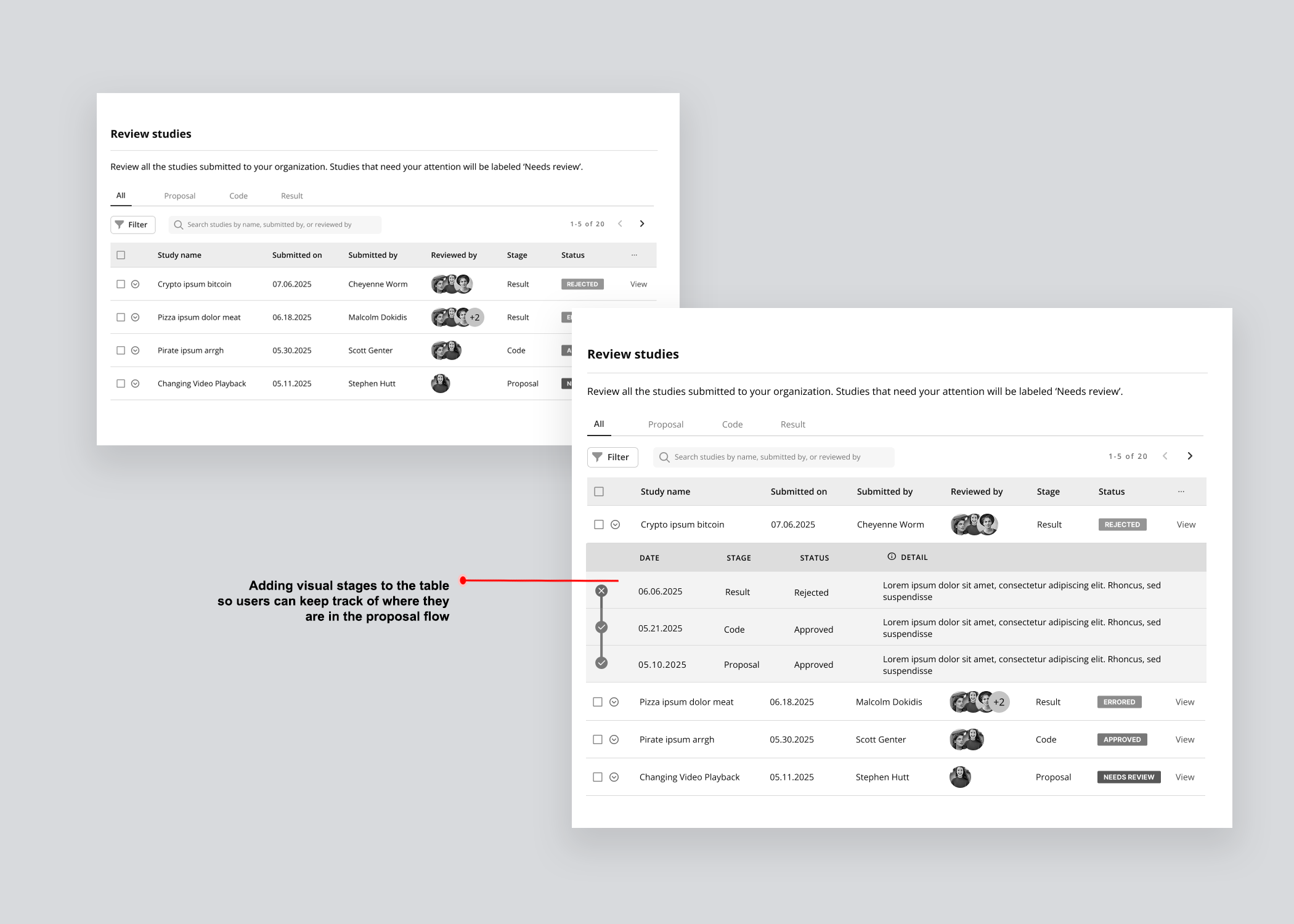
Version 01 — Separated stage and status into distinct columns for a clear read of where a study sat and what decision had been made. What it couldn't communicate was the full project lifecycle — no sense of what came before, what came next, or how far along a study was in its journey.
Version 02 — Responded to that gap by visually incorporating a progress timeline into the table, with dates, decisions, and reviewer avatars revealed on row expansion. The added information significantly increased cognitive load, and resubmissions and back-and-forth between stages remained invisible.
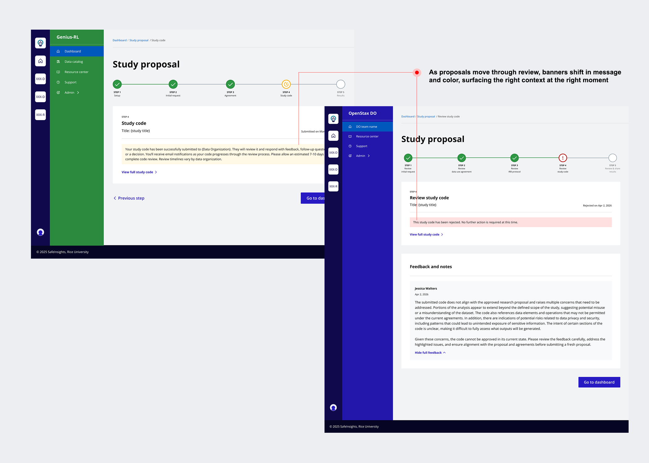
Version 03 — Simplified the table by combining stage and status into a single contextual label, then introduced a five-step progress tracker using visual icons, colour, and step labels so users could orient themselves at a glance. A status message banner was added at every stage to tell users exactly where they were and what to expect next.
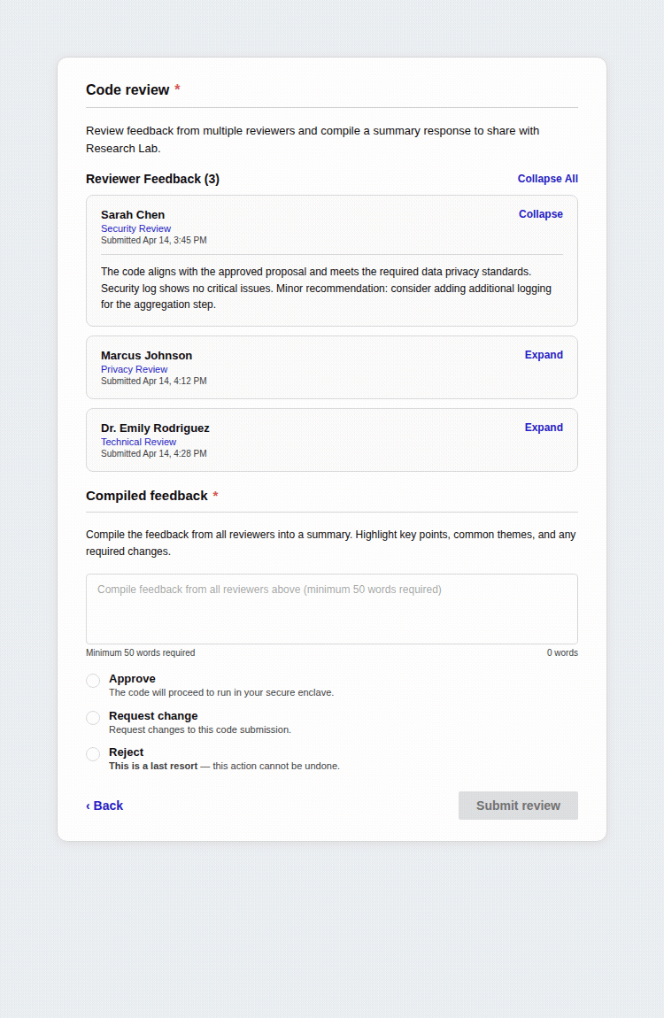
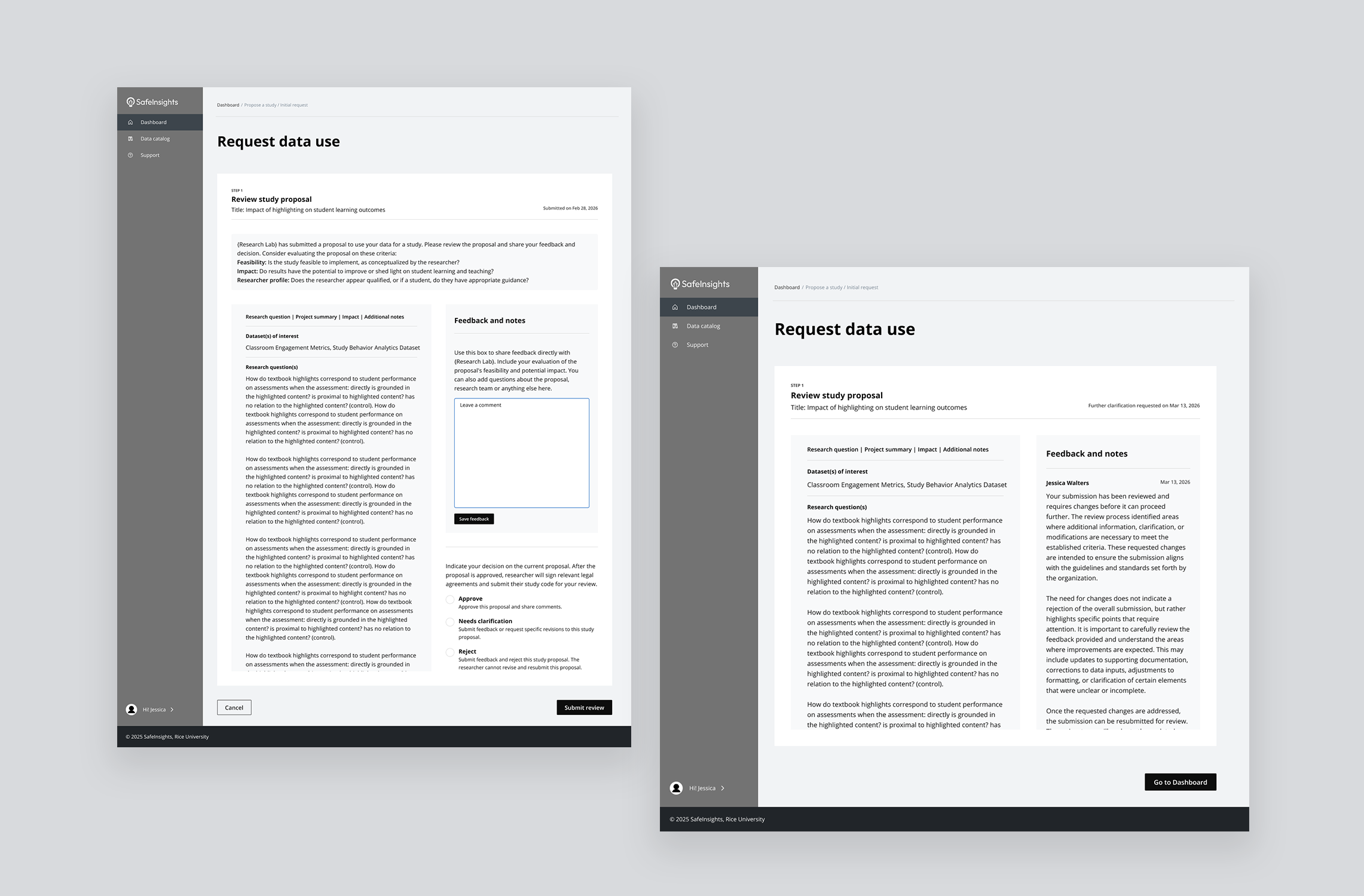
Feedback was the connective tissue of the entire workflow. Without a structured feedback system, the whole proposal lifecycle broke down. The challenge was designing something flexible enough for quick clarifications and complex technical reviews, clear enough for researchers to act on, and scalable enough to support multiple reviewers working asynchronously.
From inline comments to multi-reviewer threads
Version 01 — Gave reviewers the ability to highlight any passage and attach a comment anchored to that exact text, floating in the right margin — precise and familiar, like Google Docs. But it was designed for a single reviewer, with no model for multiple people weighing in or reaching a final decision.
Version 02 — Moved away from inline commenting and introduced a consolidated feedback panel: the proposal on the left, and a structured panel on the right with a text box and three decision options — Approve, Needs clarification, and Reject. Faster and more structured, but still built for one reviewer acting alone.
Version 03 — Extends Version 2 into a multi-reviewer model. Reviewers leave feedback and indicate their individual leaning in a shared internal thread, visible to all reviewers but not the researcher. One designated reviewer then synthesises everything into a single consolidated response — internal deliberation stays internal, and the researcher receives one clear, actionable reply.
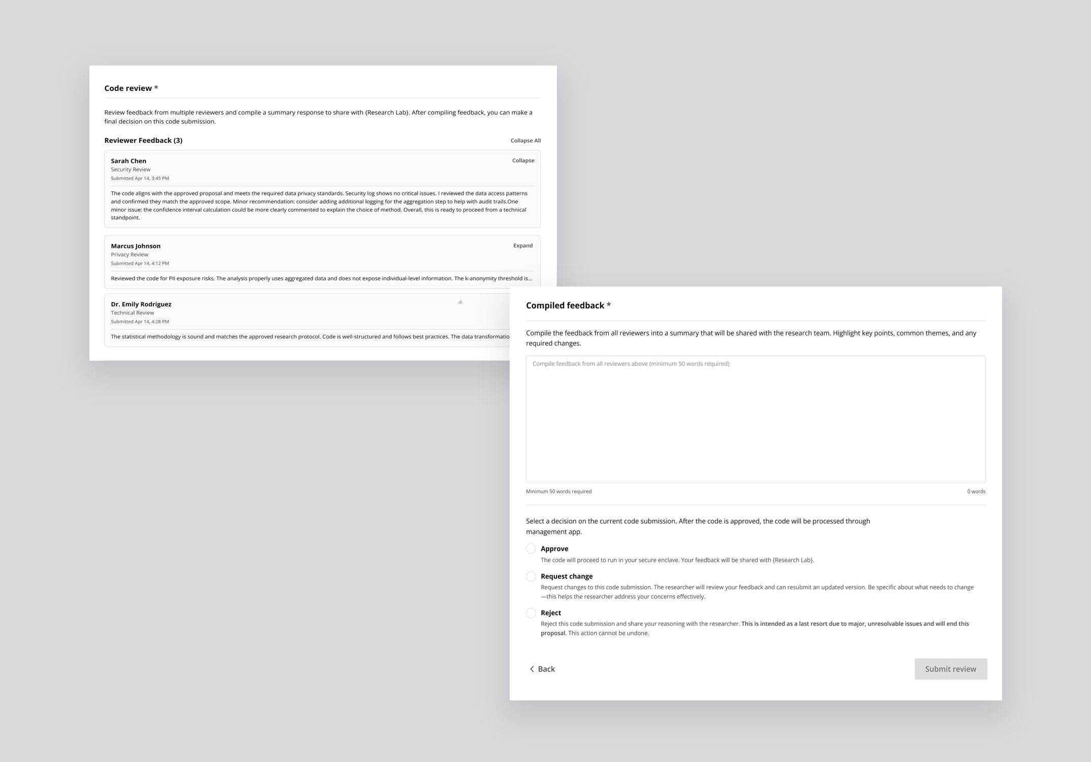
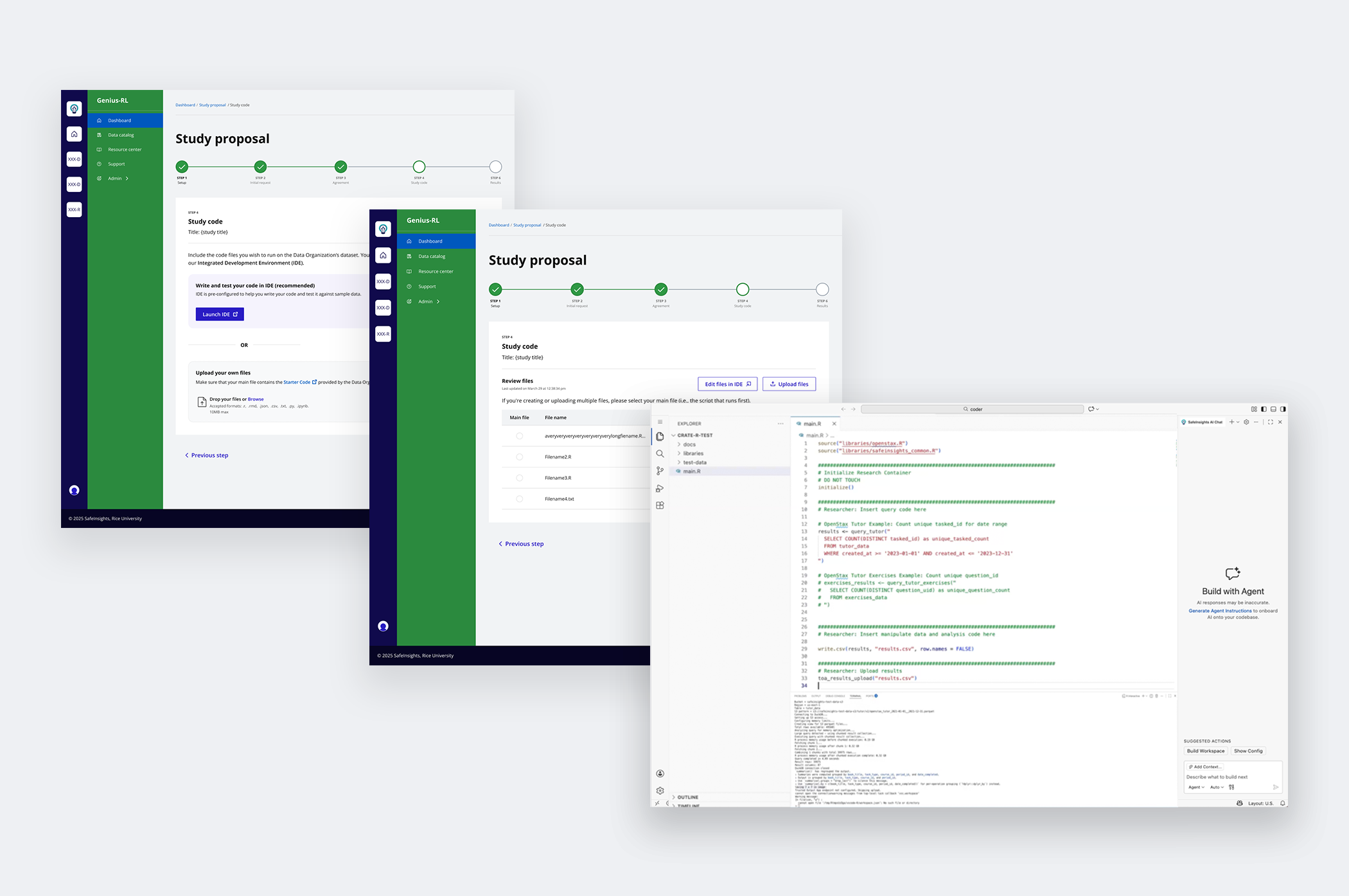
The code submission step exposed a gap on both sides simultaneously. Researchers had varying levels of coding ability. Reviewers at data organizations were domain experts, not engineers, being asked to evaluate code for safety, proposal alignment, and PII risk was a task many felt unequipped to do.
From file upload to AI-assisted evaluation
Version 01 — Purely transactional: researchers uploaded code files and reviewers downloaded them for evaluation. No guidance, no structure, no support on either side. Expecting reviewers to assess a raw .R or .py file with no evaluation framework was unrealistic at scale.
Version 02 — Tackles both sides of the problem at once.
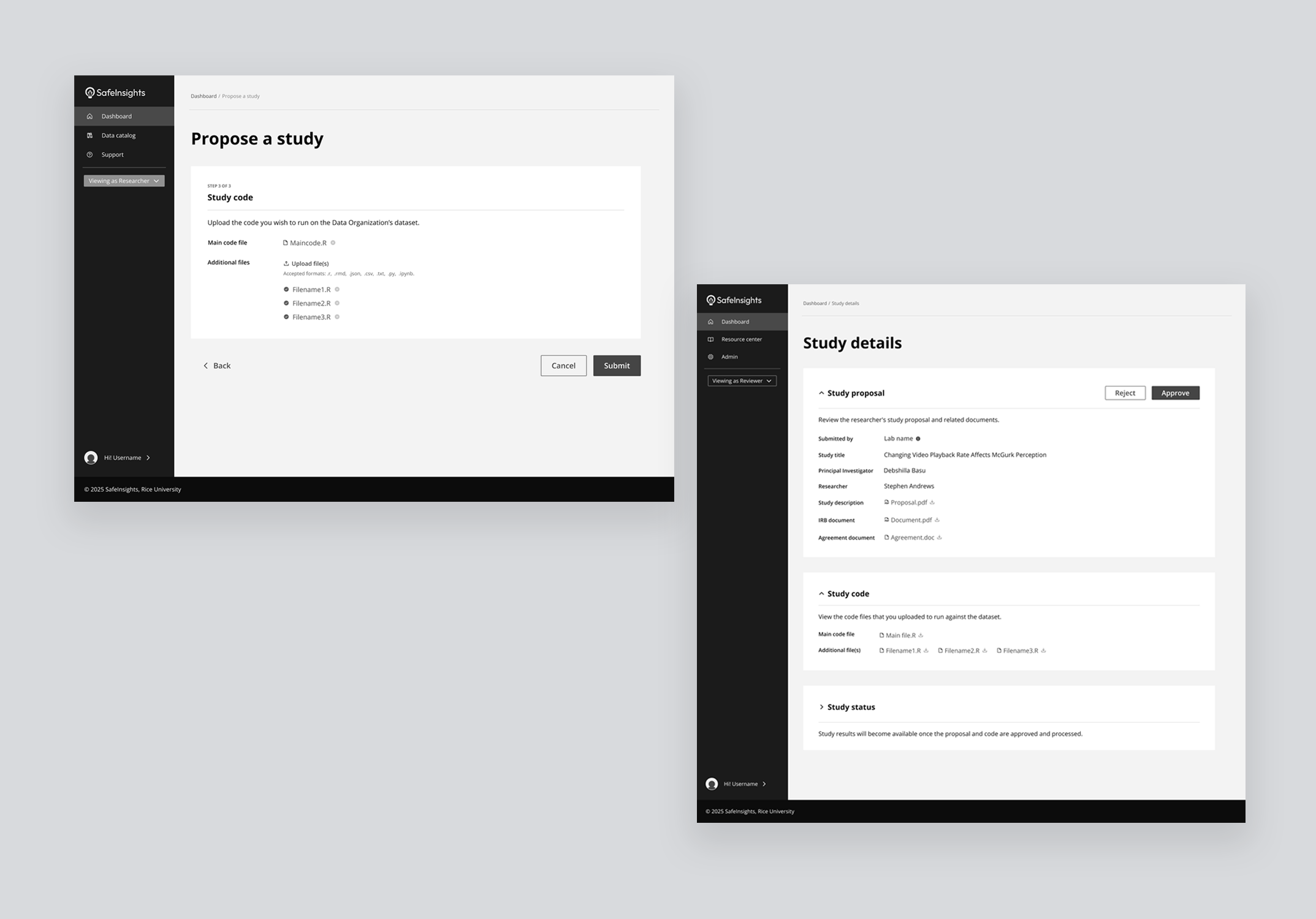
For researchers — An integrated development environment comes pre-configured for the platform, letting them run code against sample data with AI-assisted suggestions as they write.
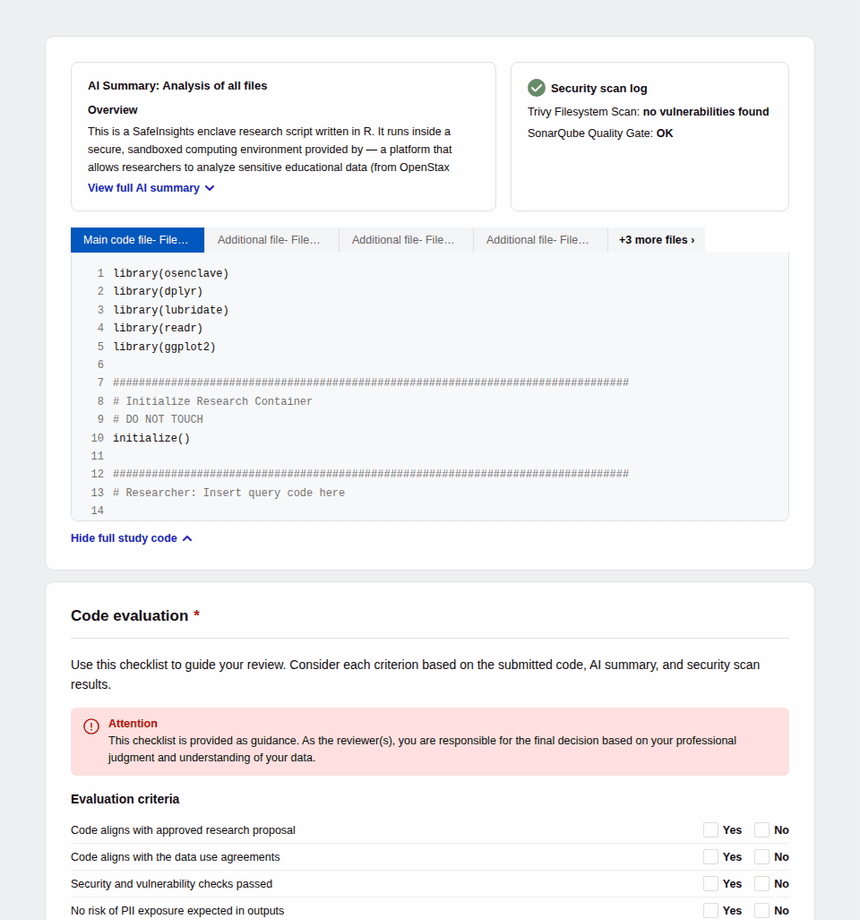
For reviewers — Submitted code appears inline with syntax highlighting alongside a pre-generated AI summary explaining what the code does, which datasets it touches, and what outputs to expect. An automated security scan surfaces any vulnerability flags, and a four-criteria checklist — proposal alignment, data use compliance, security, and PII risk — guides the final decision.
Final Solution
End-to-end flows designed, tested with users, and shipped.
Four solution areas — refined, tested, and built in collaboration with engineering.
- Establishing Trust Researcher profiles surfaced in context as a popover, Umbrella IRB reducing approval friction, role-based permissions visible through navigation, and a shared evaluation checklist setting expectations on both sides
- Proposal Workflow Simplified dashboard combining stage and status through language, a five-step progress tracker with visual icons and colour, and status message banners at every stage telling users where they are and what comes next
- Collaborative Feedback Multi-reviewer internal thread with individual leanings, one designated reviewer synthesising collective feedback into a single consolidated response shared with the research lab
- AI-Assisted Code Integrated IDE with AI code generation for researchers, and inline code with AI summary, automated security scan, and structured Yes/No evaluation checklist for reviewers
What I learned
Designing SafeInsights from the ground up taught me things that no brief could have anticipated. Here are the three that will stay with me.
Ambiguity is an invitation, not a problem
Vague briefs created space for design to shape the product, not just execute on it. Asking the right questions early became one of my most valuable tools.
Designing a system means designing for variation
Flexibility and consistency had to coexist across two very different user types. That tension sharpened my thinking at every decision point.
The product reflects how it was built
The most coherent parts of SafeInsights were designed in close collaboration with engineering, product, and legal — when those conversations happened early, it showed.
Three things I'd do differently from day one.
Every complex product reveals its gaps under pressure. These are the decisions I'd make earlier — not because anything went wrong, but because making them sooner would have sharpened the work at every stage after.
-
01Set up accessibility guidelines earlier in the processFormalizing accessibility from the start would have avoided retrofitting components later and ensured consistency across the system from the first build.
-
02Involve stakeholders earlier to uncover edge casesResubmission paths, multi-reviewer conflicts, and IRB exceptions all surfaced late. Earlier mapping sessions would have exposed these scenarios sooner and reduced mid-build complexity.
-
03Document design decisions as they happen, not afterA lightweight decision log maintained throughout would have improved alignment, faster handoffs, and long-term scalability.