Set up accessibility guidelines in phase one
If we had followed WCAG guidelines from day one, we wouldn’t have had to fix things like focus states and color contrast later.
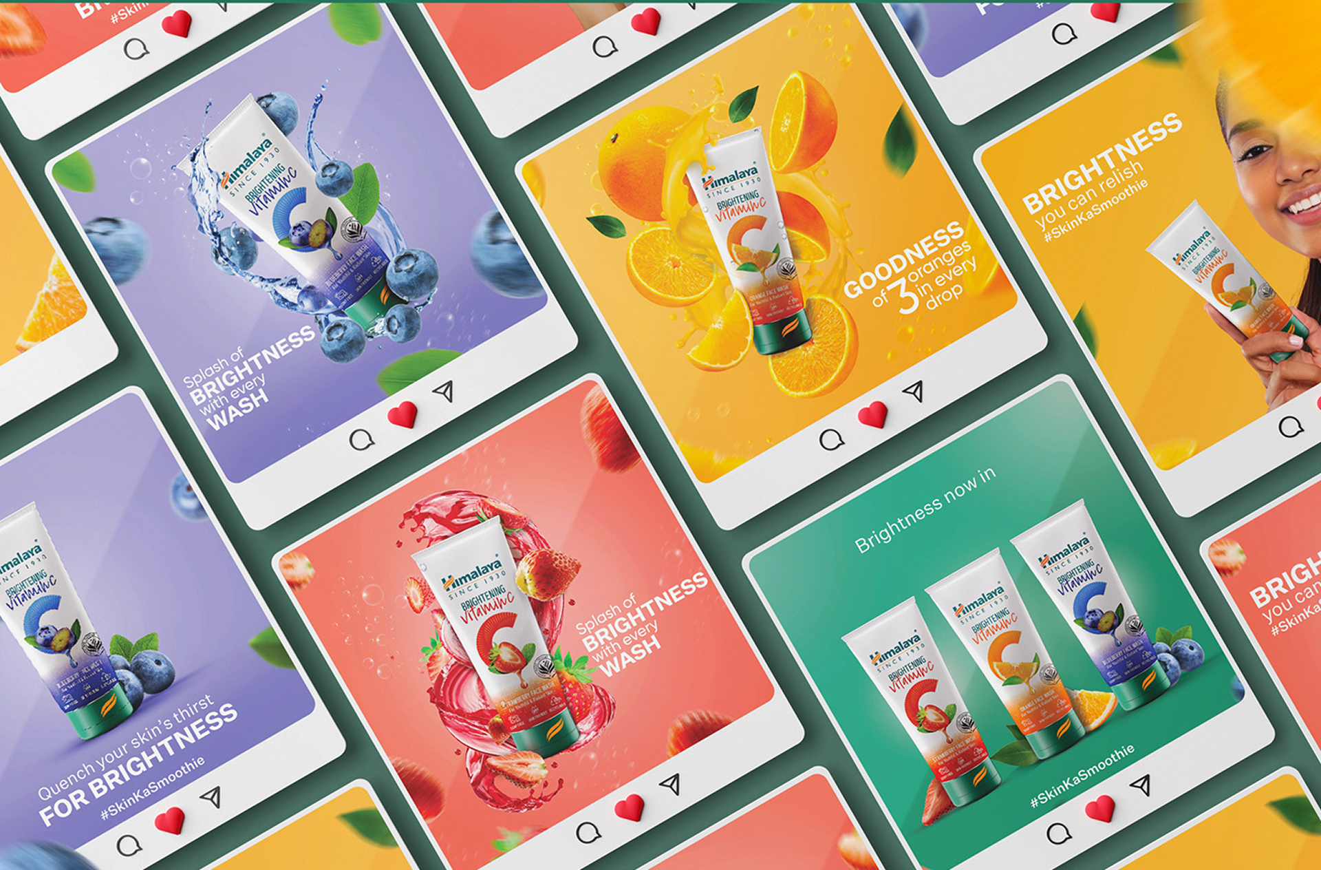
SafeInsights, Rice University
Status: Live
Starting from zero, I created a system that enabled faster development, consistent UX, and scalable growth.
When I joined SafeInsights, there was no brand, no component library, and no shared visual language. While engineering had adopted Mantine, the existing Figma resources were too generic and vast for early-stage product development.
I led the creation of the design system from the ground up — defining tokens, building atomic components, and structuring scalable patterns that could support dashboards, admin tools, and complex data workflows. This is the story of how that system came to life and how it held up over 12 months of real product development.
Developers chose Mantine — but the Figma library was enormous, generic, and not ours. Here is how that shaped everything.
Developers chose Mantine as the engineering UI library. But the Mantine Figma community file was enormous — thousands of variants, visually generic, and built for every possible product, not ours. SafeInsights had no visual language of its own: no colour palette, no spacing system, no typography scale. Nothing to inherit.
We needed to move fast to test the MVP. So we started borrowing — grabbing components from the Mantine Figma library and modifying them to fit SafeInsights' needs. It worked in the short term. But we were building on someone else's foundation without understanding what was underneath it.
Because we never built our own elements from the ground up — from atoms to molecules — nothing was truly connected. Styles became hard-coded at the component level, and global changes required manual fixes across dozens of components.
Simple updates exposed the cracks:
Every shortcut compounded into design debt.
We needed our own system, built for our product, not borrowed from a generic library.
SafeInsights required a design system grounded in our product needs and visual direction, while still aligning with Mantine for engineering consistency. The examples below show how this shift resolved the issues and enabled scalable, consistent design.
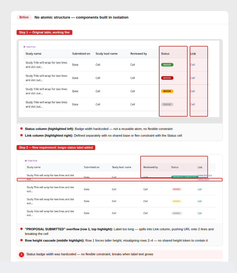
Components built in isolation
Mantine pieces were grabbed and modified independently. With no shared atoms underneath, a change to one component had no way to cascade — everything had to be fixed manually.
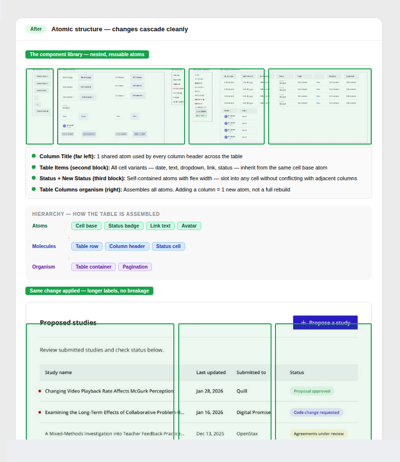
Atom → molecule → organism hierarchy
Every component is built from smaller reusable atoms. Updates cascade automatically through the hierarchy — one change propagates everywhere it's used.
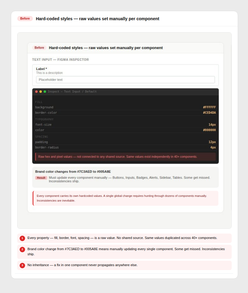
Values hard-coded per component
Colours, spacing, and type were set manually on each component. No shared source of truth meant a single brand change required touching every file individually.
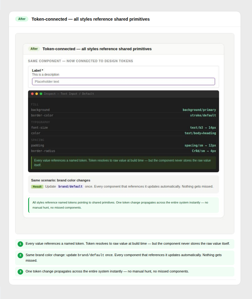
All styles driven by shared tokens
One token change updates the entire system instantly. Colour, spacing, and typography stay consistent across every component without manual fixes.
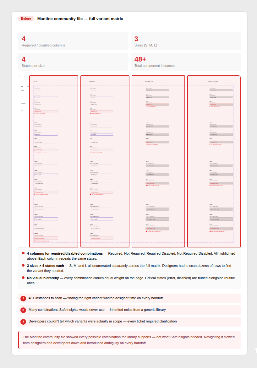
Mantine's full component library
The community file included every possible state and variant. Designers couldn't navigate it efficiently, and developers were unsure which variants were actually in scope for SafeInsights.
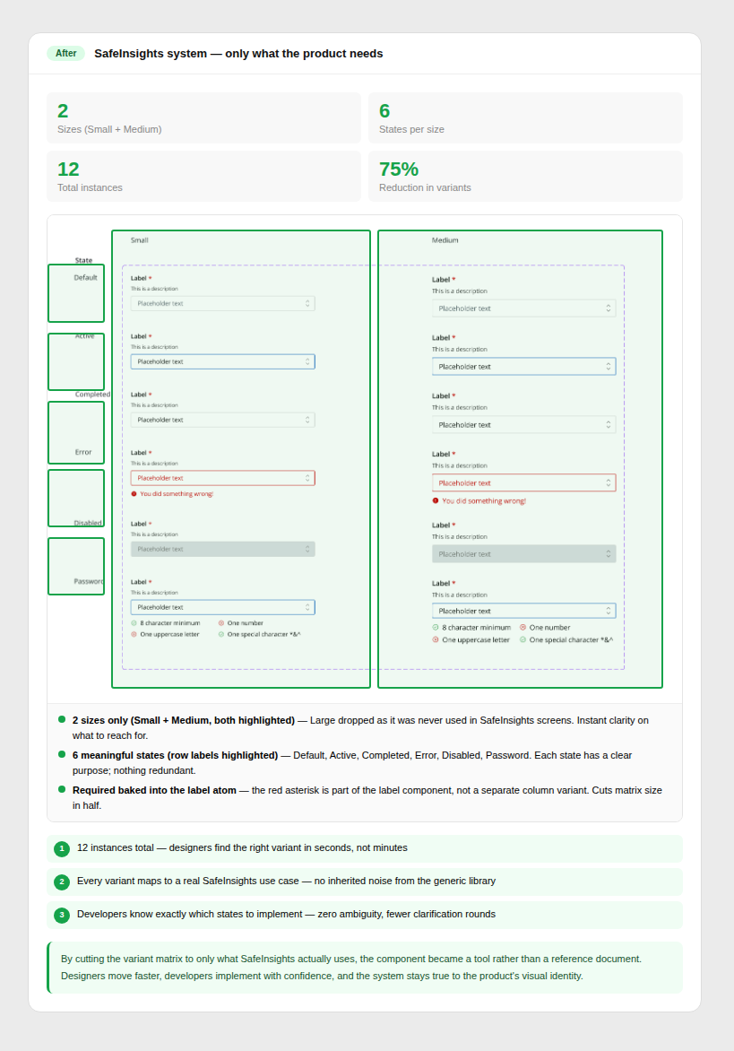
Only what SafeInsights needed
Variants were stripped to exactly what the product required. Fewer options meant less confusion in design, faster decisions in handoff, and cleaner implementation.
Clear guardrails set before a single component was drawn.
From the start, this wasn’t about building components — it was about defining a system that could scale with the product. The system needed to balance three constraints: move fast for MVP, align with Mantine for engineering, and establish SafeInsights’ own visual and structural language.
Build-from-scratch responsibility touching design, engineering, and documentation simultaneously.
As the designer responsible for the system, I led every layer — from architecture decisions to the smallest naming convention. This wasn't a maintenance role. It was a build-from-scratch responsibility that touched design, engineering, and documentation simultaneously over 12 months of real product development.
Building a design system for a product that didn't exist yet meant the process had to be as adaptive as the system itself.
Before defining tokens or components, I needed to establish what the system should feel like. This meant balancing two parallel tracks: understanding Mantine's structural constraints and exploring SafeInsights' visual direction. I analyzed existing patterns, mapped MVP needs, and explored color, typography, and layout directions to define a foundation that was both expressive and system-ready.
Outputs: Moodboard & visual direction · Early system blueprint
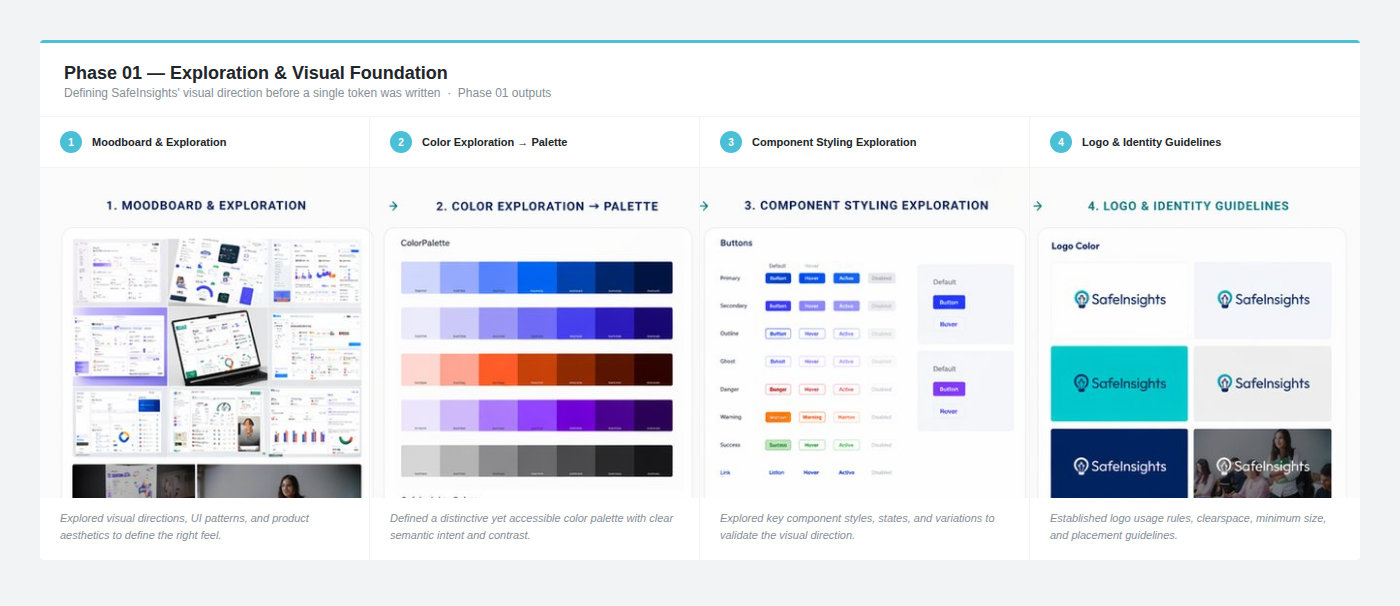 Early exploration — moodboard & visual direction
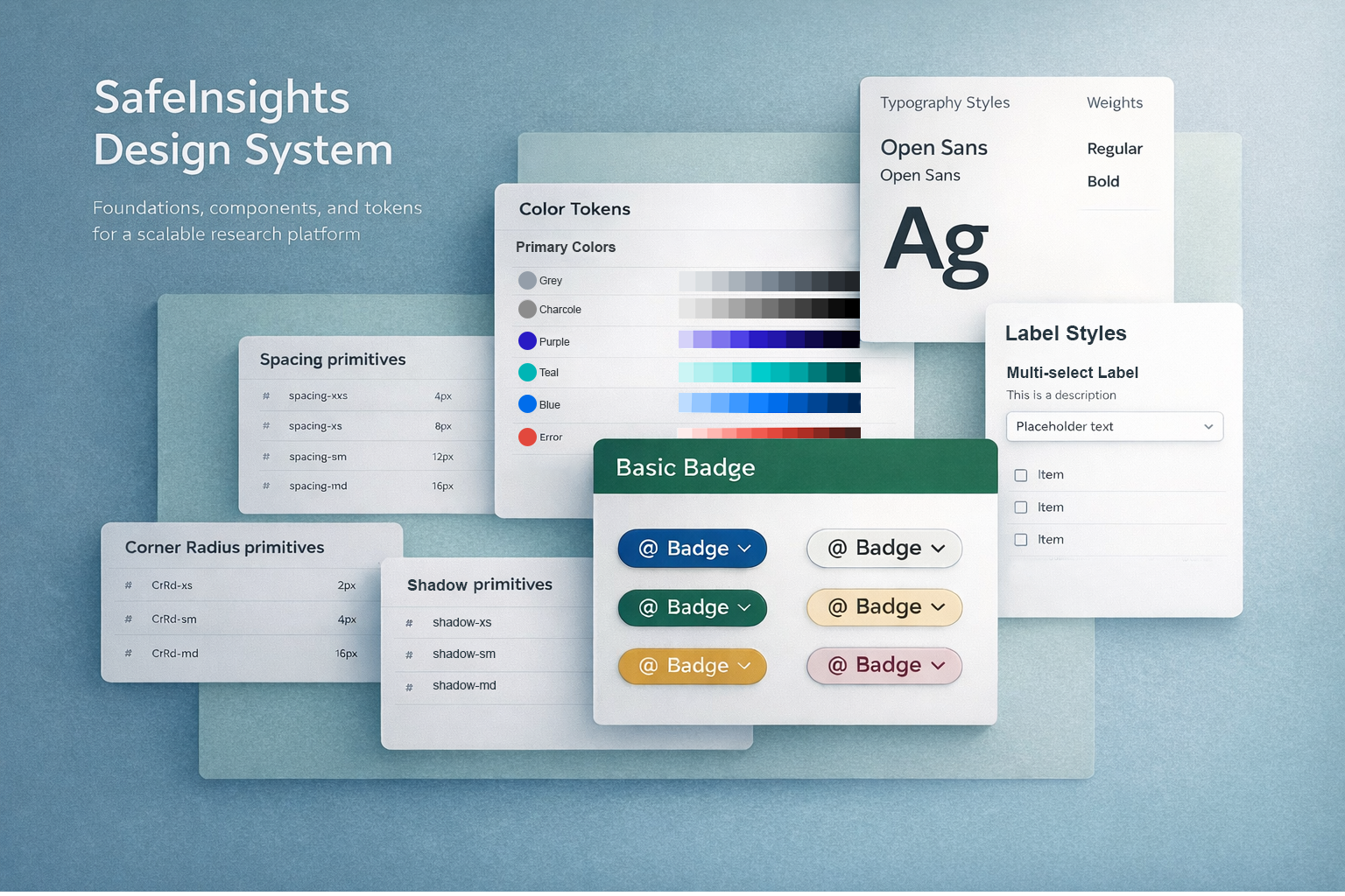
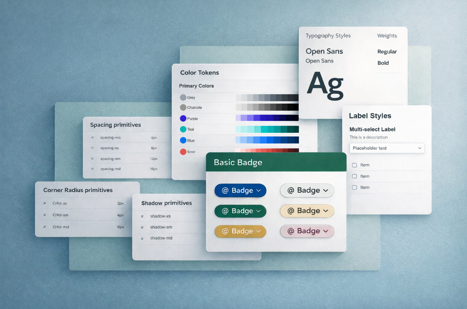
Before touching a single component, I established the foundation that every future decision would rest on. Typography scale, spacing system built on 4px increments, color palette with semantic tokens, interaction states, and grid rules — all defined and shared with engineering before component work began. This alignment upfront prevented the most expensive kind of rework: foundational rework.
Outputs: Core design tokens · Foundation specs · Visual direction for component styling
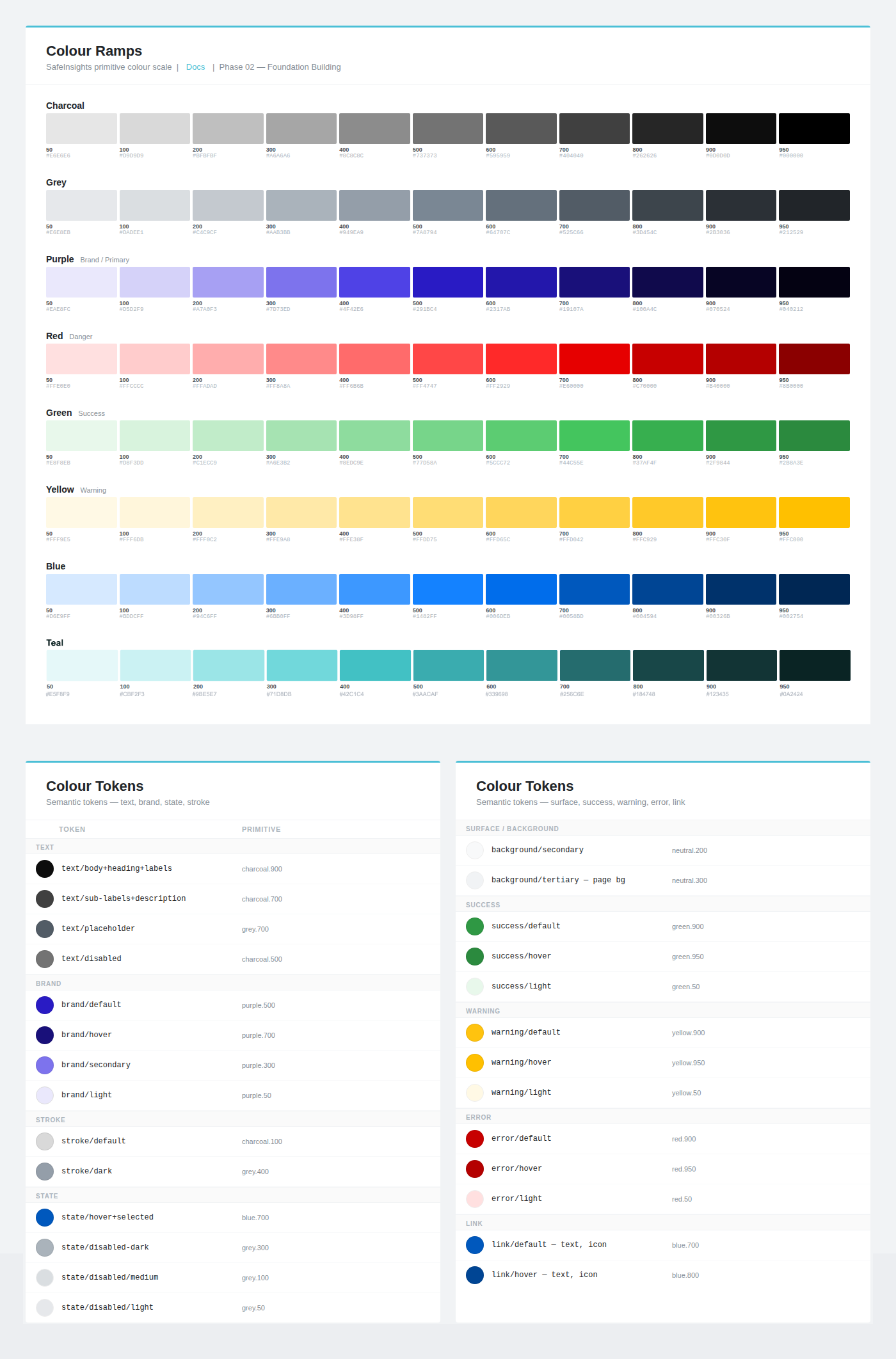 Colour primitives and tokens.
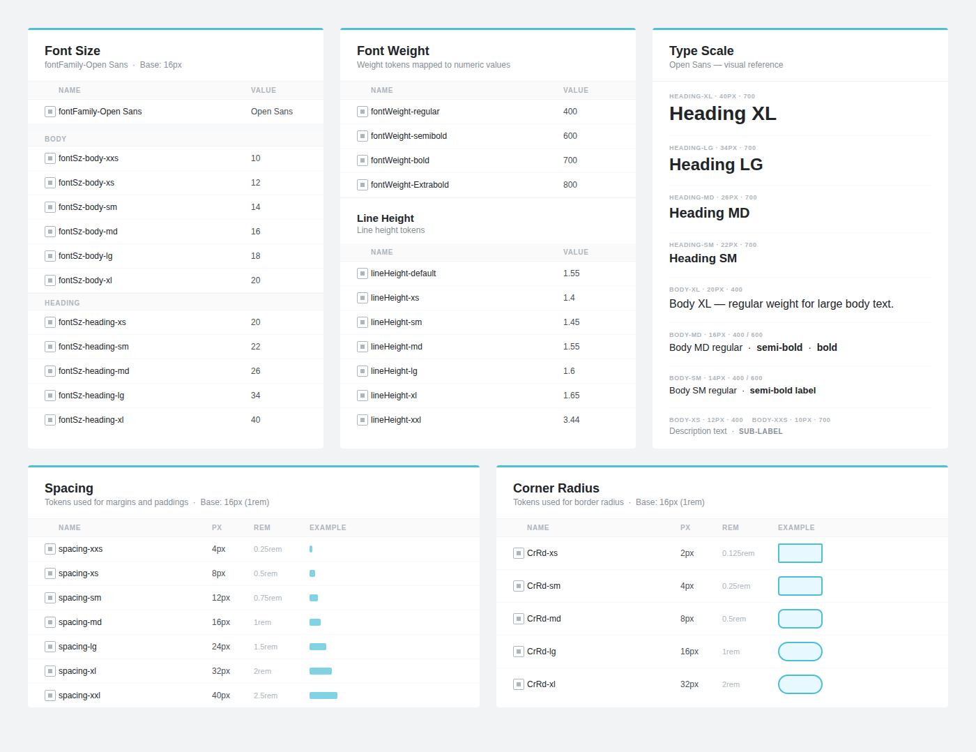 Typography primitives alongside spacing and radius tokens.
With the foundation set, I organized the component library using atomic design principles — not as a rigid rule, but as a practical framework for prioritization and hierarchy. This structure made it clear what to build first, and created a maintainable hierarchy as the library grew.
Outputs: Component roadmap · Prioritized build order · Atomic structure documentation
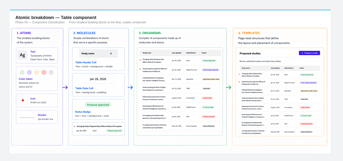 Atomic breakdown of the Table component — Cell → Row → Table container, with colour tokens.
Instead of adapting Mantine’s community file, I rebuilt every component from scratch — aligning with Mantine’s structural logic while defining our own visual system.The most important decision wasn’t what components to build, but how to structure them. By designing components as nested, composable systems, we enabled flexibility without duplication — allowing the system to scale as the product evolved.
Outputs: Full component library · Nested component structures · Component documentation
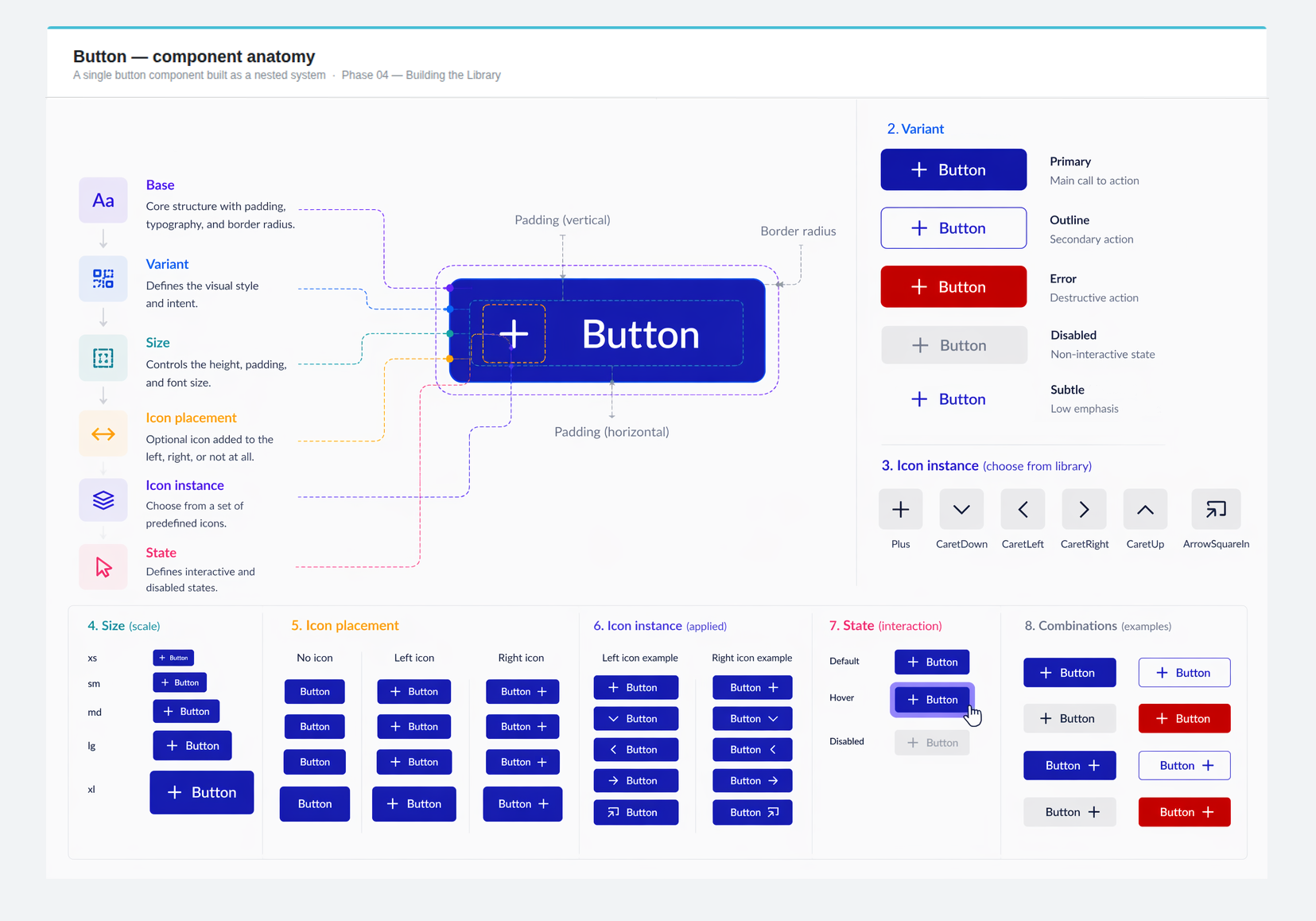 Button matrix — 5 sizes × 5 variants × 6 icon instance, all from a single nested base component.
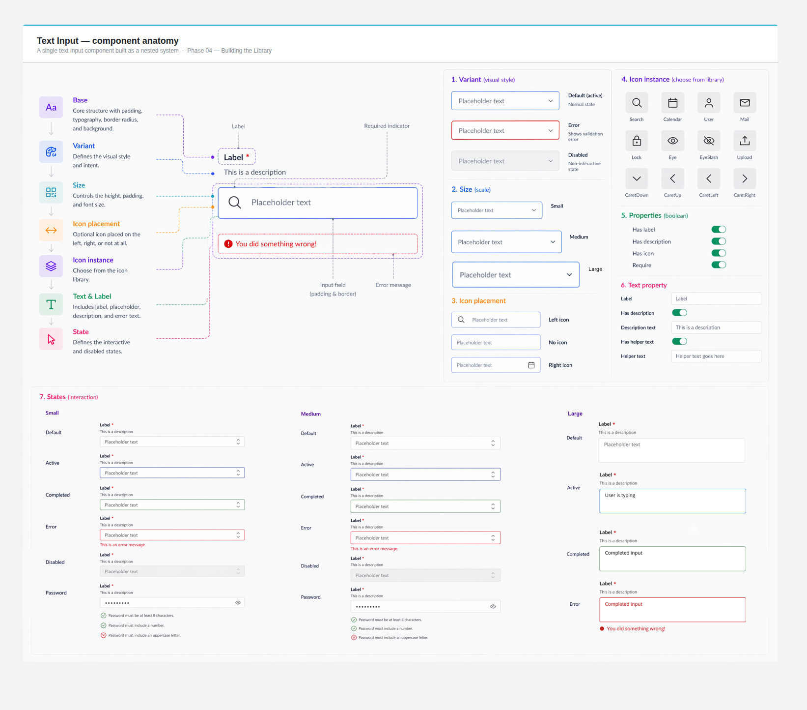 Text input — label text → description text → error state, icons, all nested inside a single base.
As new features shipped, the system kept pace. Spacing was refined. Missing variants were added. New patterns emerged from real product needs and fed back into the library. This iterative cycle — design, ship, learn, refine — is what separated a component library from a living design system.
Outputs: Refined spacing and responsive behavior · New variants and patterns · Strengthened design–engineering alignment
 Model — covering different sizes, states, and modes and documenting it for use..
 Alert component and documentation
The impact of a design system shows up everywhere — in how fast screens get designed, how few bugs come from styling mismatches, and how confidently engineers build from a handoff file.
Faster screen creation after the system reached maturity.
Mantine mapping eliminated an entire class of styling mismatch bugs.
System shipped with the MVP and kept expanding across product phases.
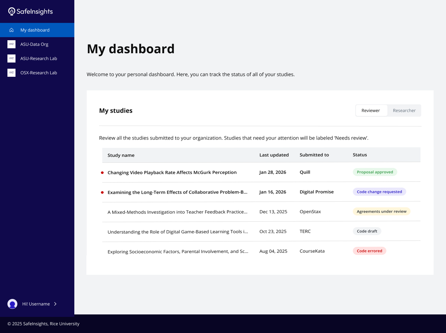
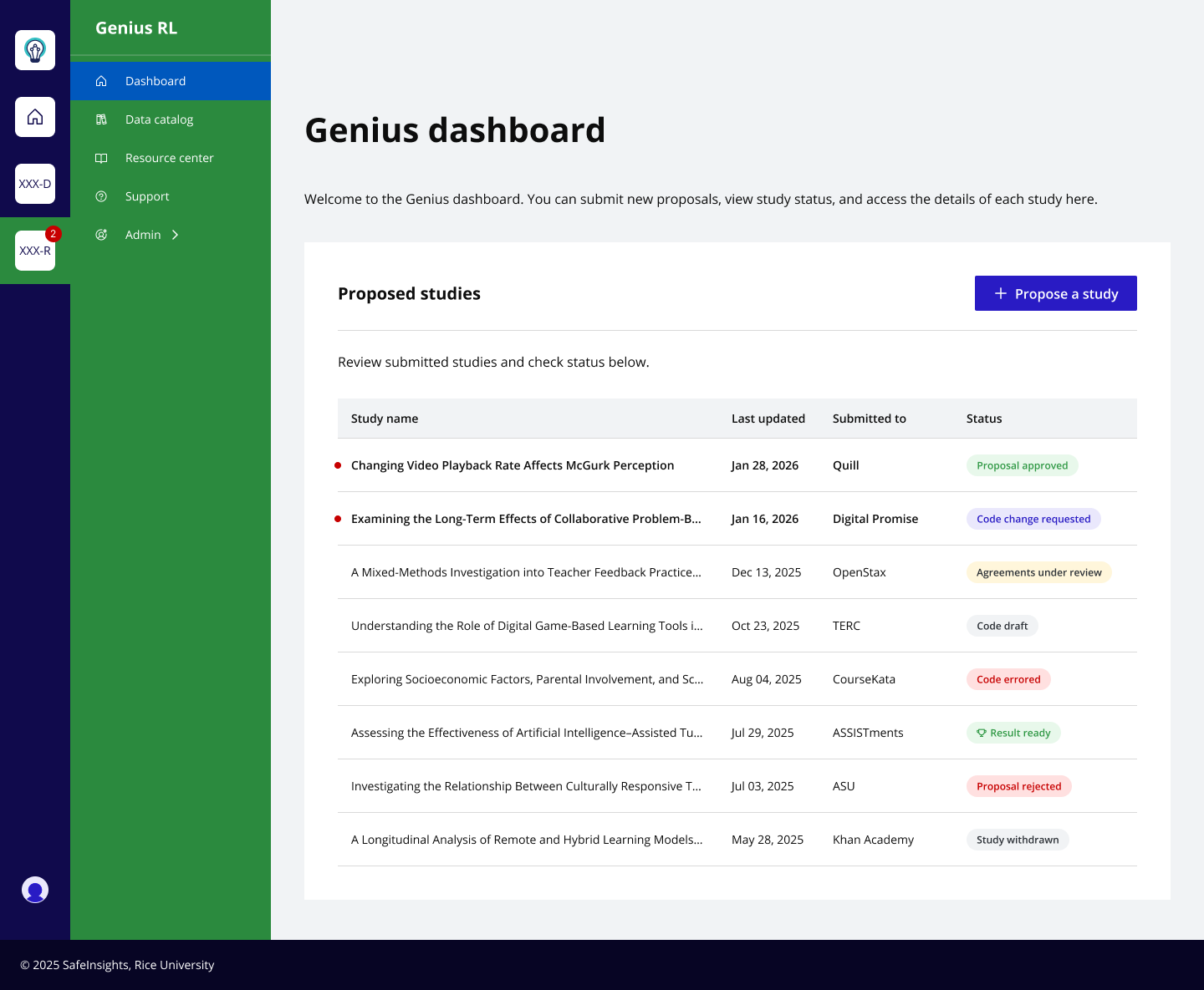
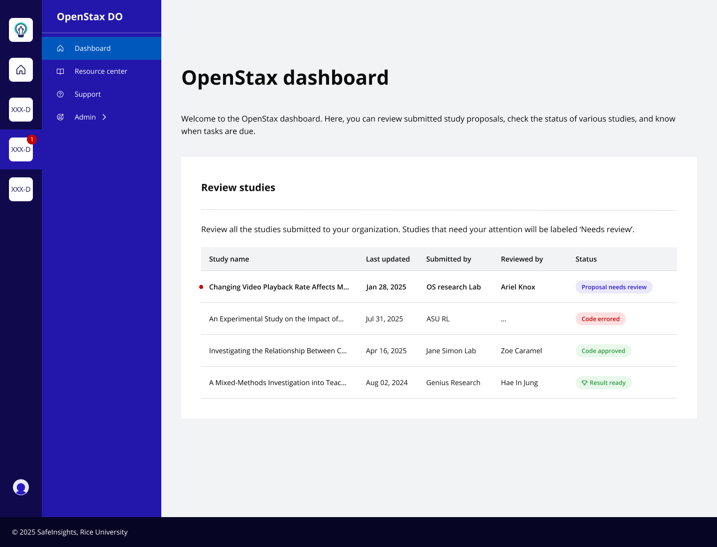
One design system — three different contexts. The personal dashboard, Research Lab view, and Data Organization view all use the same components, tokens, and spacing rules. Color-coded role distinction is built into the system itself, not applied after the fact.
From tokens to templates — every layer of the product UI is supported by the system, from the smallest icon to full dashboard layouts.
The system expanded continuously across 10 months without requiring structural rework — proof that the nested architecture held up under real product pressure.
Focus states, contrast considerations, and keyboard navigation groundwork are in place. The foundation is ready for full a11y guidelines as the platform evolves.
12 months designing SafeInsights' design system taught me things no brief could have anticipated.
Setting up the token system before building any components felt slow. In hindsight it was the most important investment I made. Every decision encoded in a token — a spacing value, a semantic color, a state was a decision I never had to make again.
Nested component structures paid dividends every time the product changed direction — which it did, repeatedly. An update to a base button propagated across every variant and state automatically. Without nesting, the same change meant hunting through dozens of components manually.
The most important parts of the system were built in close conversation with engineering. When developers were involved early — in naming, token structure, and component logic — the system held. When they weren't, it showed. The system's real value wasn't the Figma file. It was the shared understanding it created.
Every design system reveals its gaps over time. These are the decisions I'd make earlier, not because anything went wrong, but because making them sooner would have compounded the value of things built after.