Dorling Kindersley
Designing a scalable visual system for 50+ global travel guidebooks
Status: Published
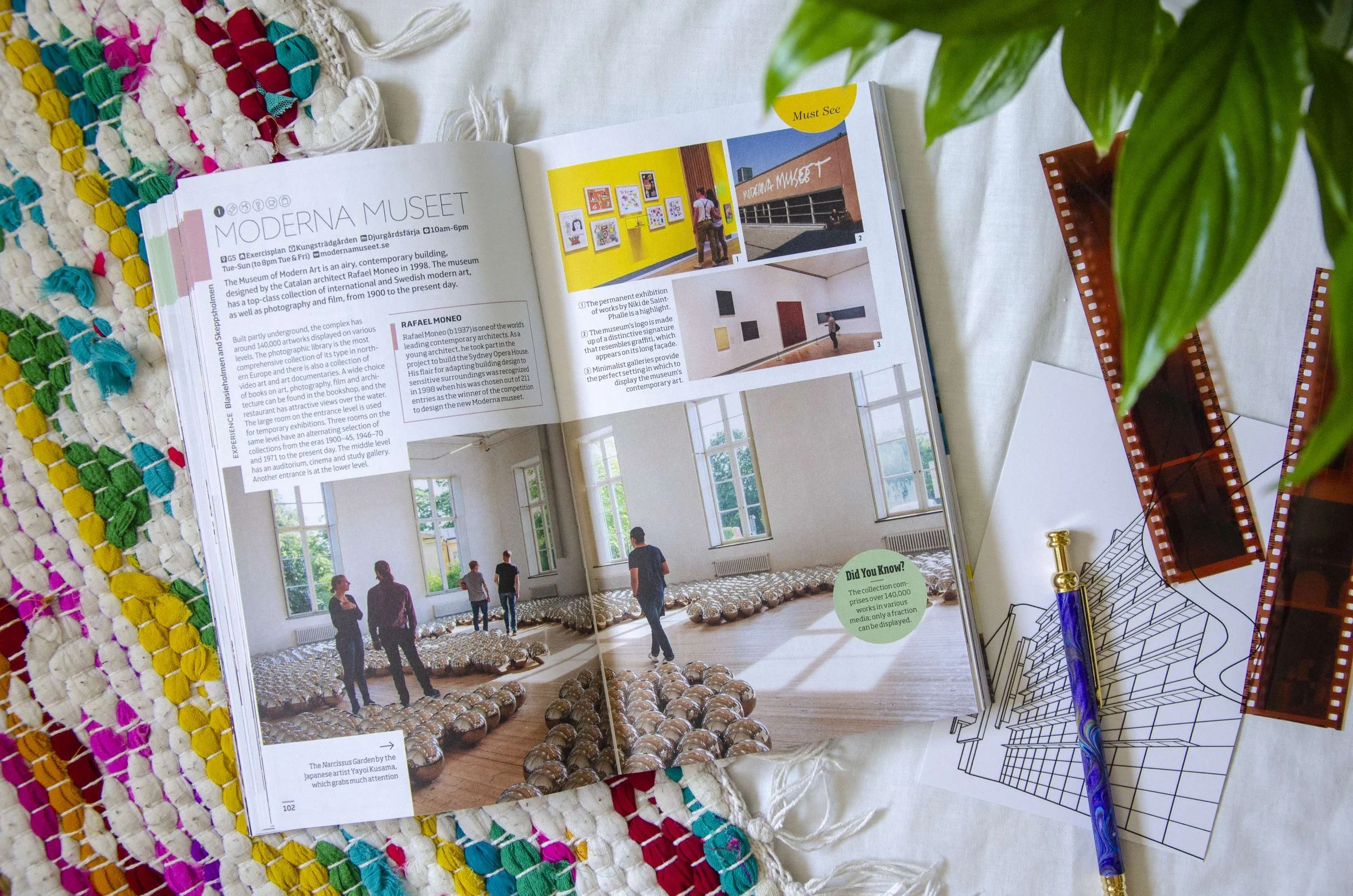
Designing a scalable visual system for 50+ global travel guidebooks.
Two years at Dorling Kindersley designing spreads, jacket covers, and the editorial system that held it all together across London and Delhi.
At Dorling Kindersley (Penguin Random House), I worked as a book designer across three major travel series: DK Eyewitness Top 10, DK Eyewitness, and DK Eyewitness: Like a Local. Each title required balancing rich visual storytelling with dense editorial information within fixed page counts, tight image budgets, and global production constraints.
Beyond individual titles, I led the redesign of the Top 10 style guide, creating a clearer, more scalable system adopted by design teams in London and Delhi. This shifted my practice from designing individual spreads to designing a system that others could use.
- →Designed 4 new travel guidebooks from concept to final production
- →Led 50+ redesigns and layout updates across existing titles
- →Contributed to jacket cover design for 15+ books
- →Redesigned the DK Eyewitness Top 10 style guide, adopted globally
Designing for global audiences within tight editorial and production constraints.
Every spread had to balance visual richness, information density, and publishing precision across dozens of titles and two continents.
Rich storytelling. Dense information. Fixed page counts.
Designing travel guidebooks requires balancing rich visual storytelling with dense editorial information. Each spread must combine photography, maps, and text within limited page space while remaining clear and engaging for a global audience.
The design system also had to remain consistent across dozens of titles produced by distributed teams in London and Delhi, each working to different production timelines and editorial briefs.
Four factors that shaped every design decision.
Every title had a fixed number of pages. Content had to be shaped to fit, not the other way around.
Photography choices were constrained by rights availability and per-title image budgets negotiated with picture researchers.
Travel information required cross-checking with editors and authors to ensure accuracy before going to print.
Design decisions had to translate cleanly across teams in London and Delhi working on different titles simultaneously.
Three series. One shared visual language.
Compact, list-driven guides for city travelers. I led the style guide redesign and designed Top 10 Valencia from scratch.
Comprehensive destination guides with detailed maps, floorplans, and illustrated cross-sections. Redesigned 50+ spreads.
An insider's perspective series launched in 2019. Contributed to early storyboarding, template development, and icon style.
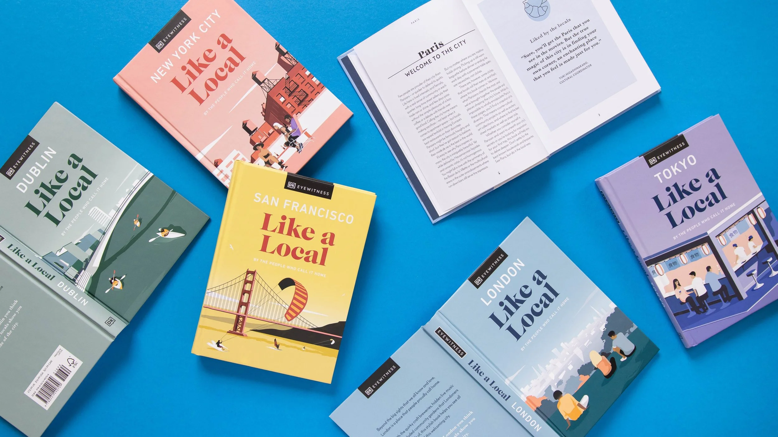
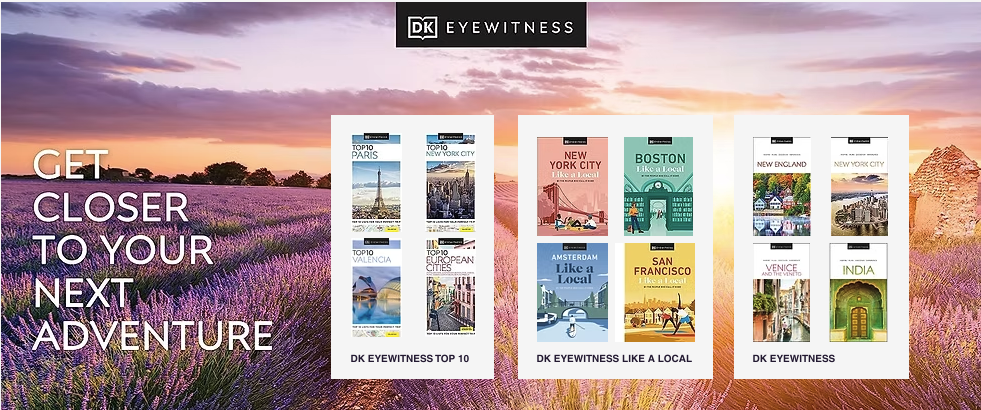

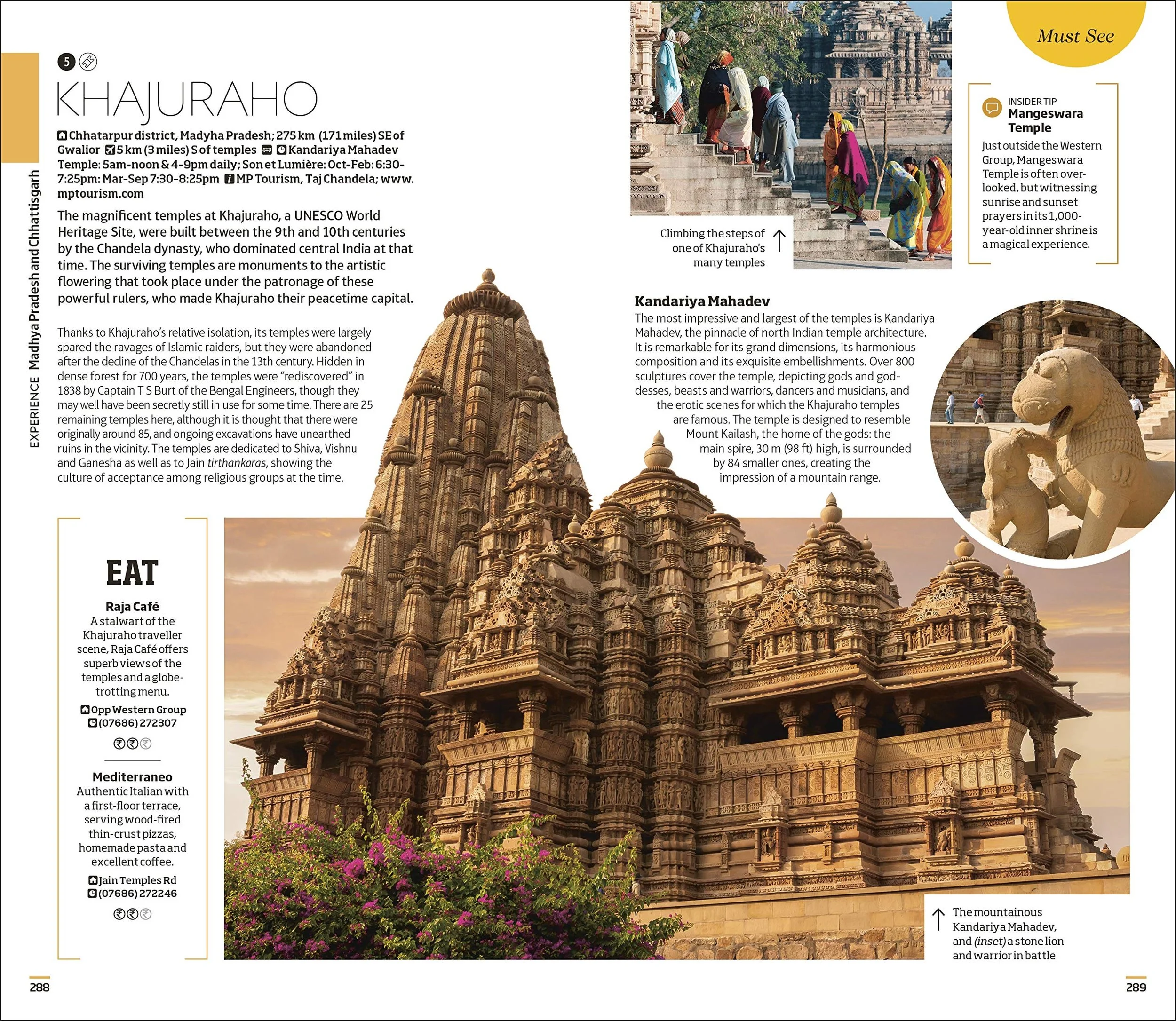
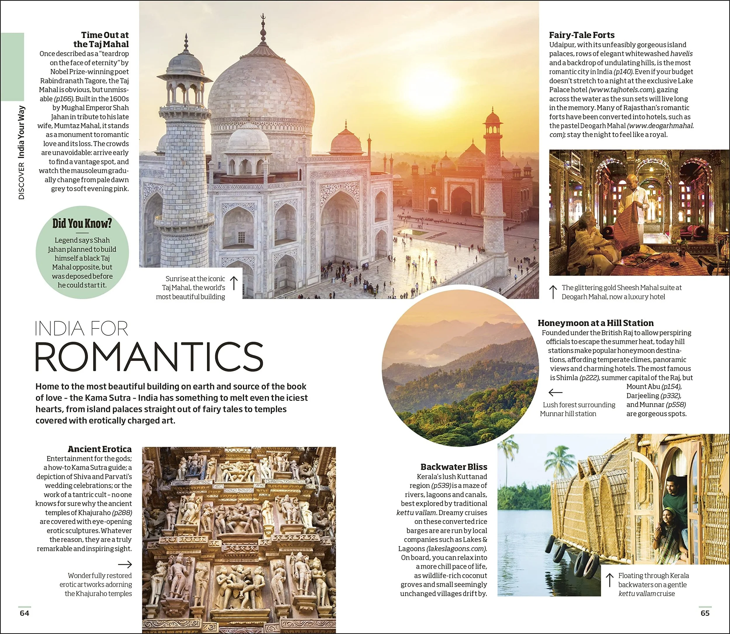
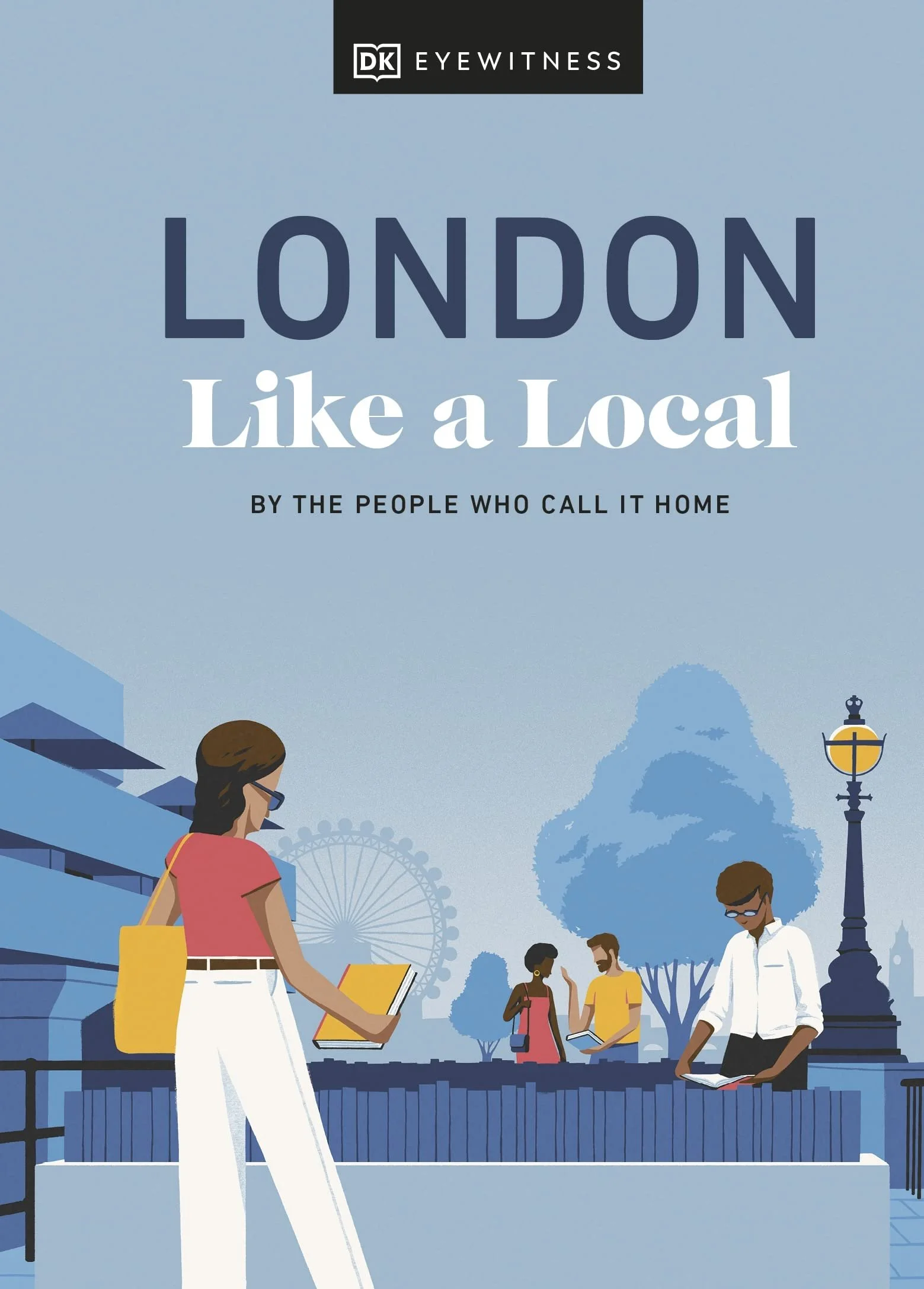
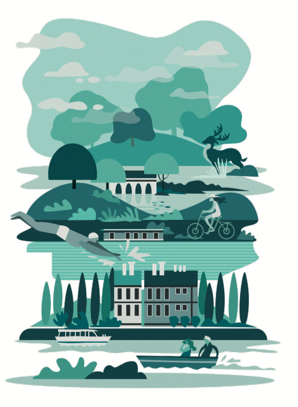
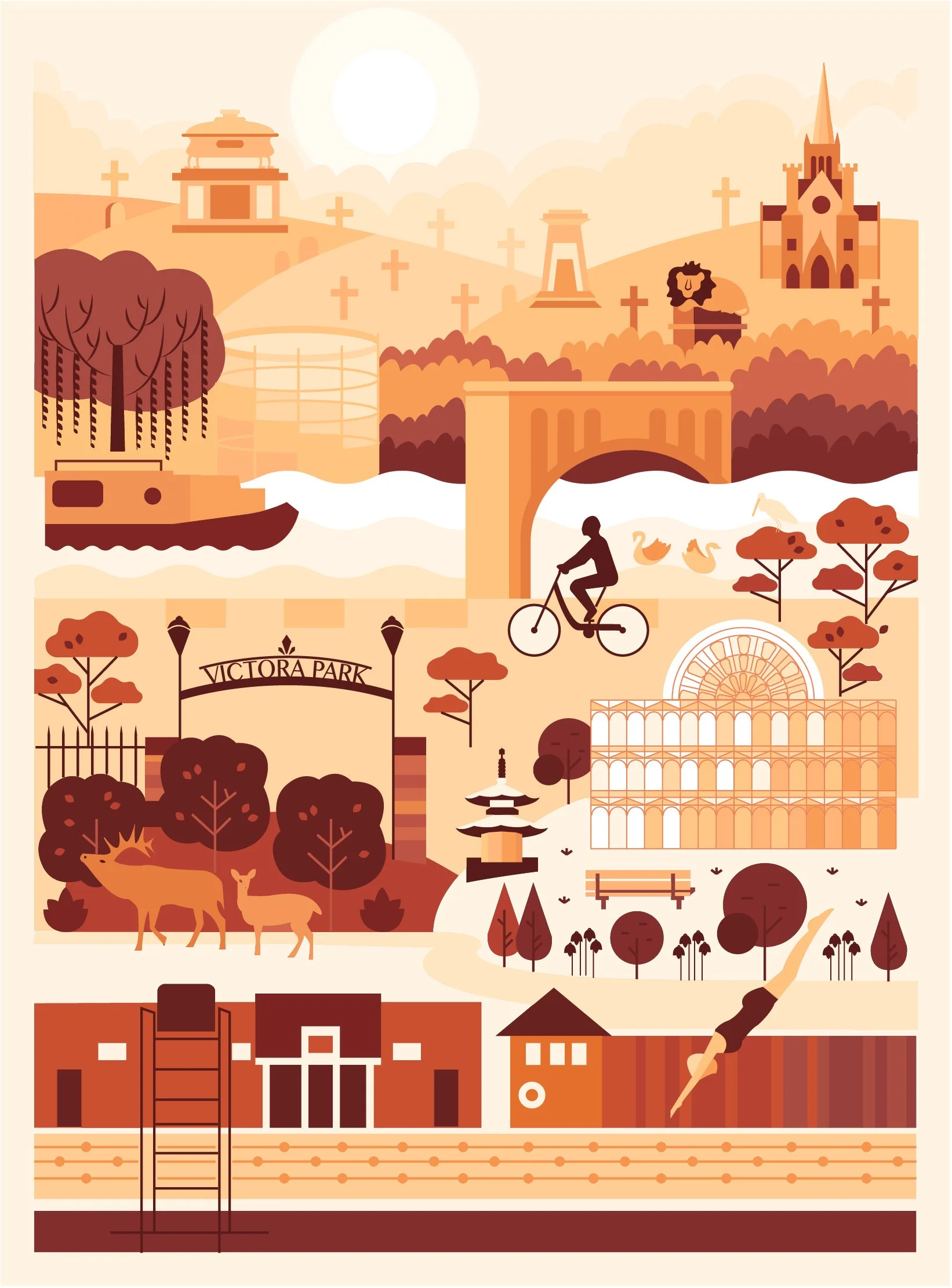
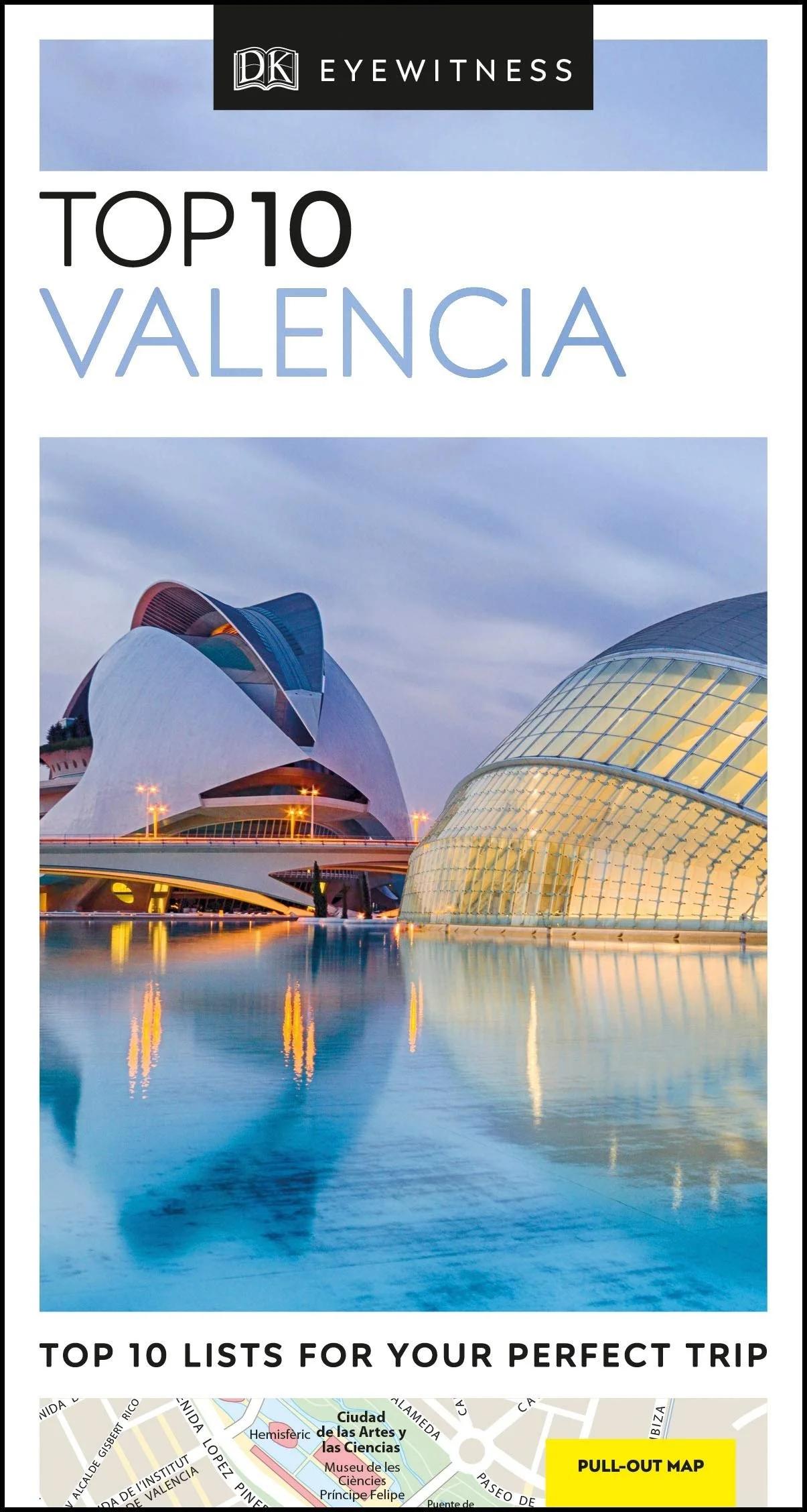
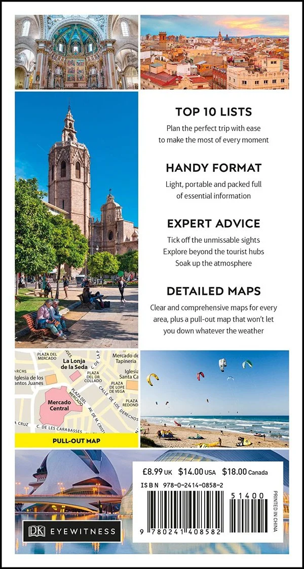
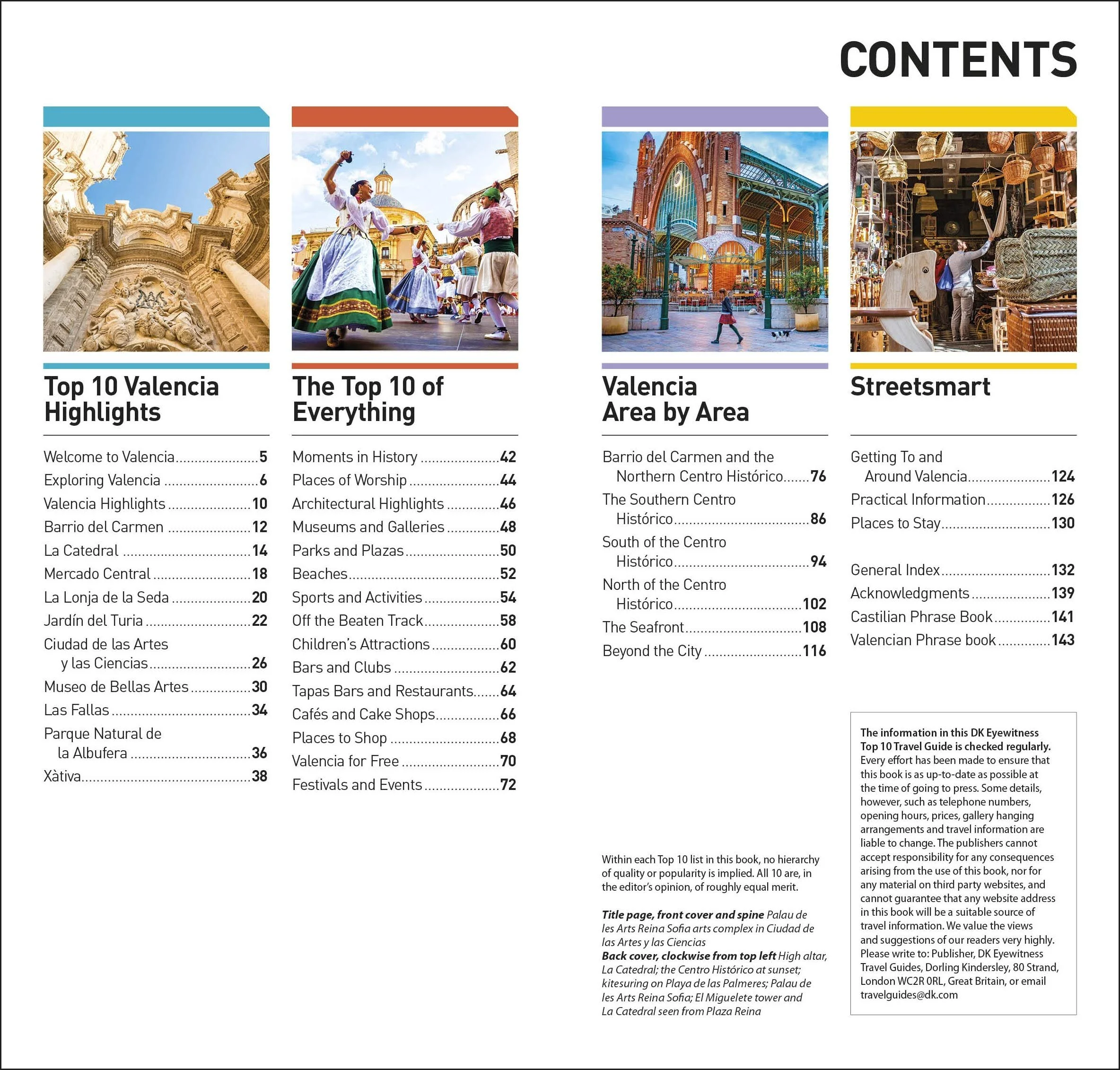
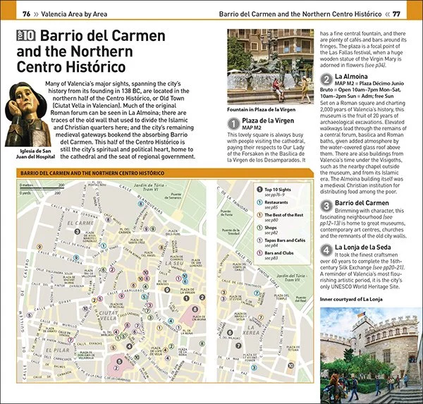
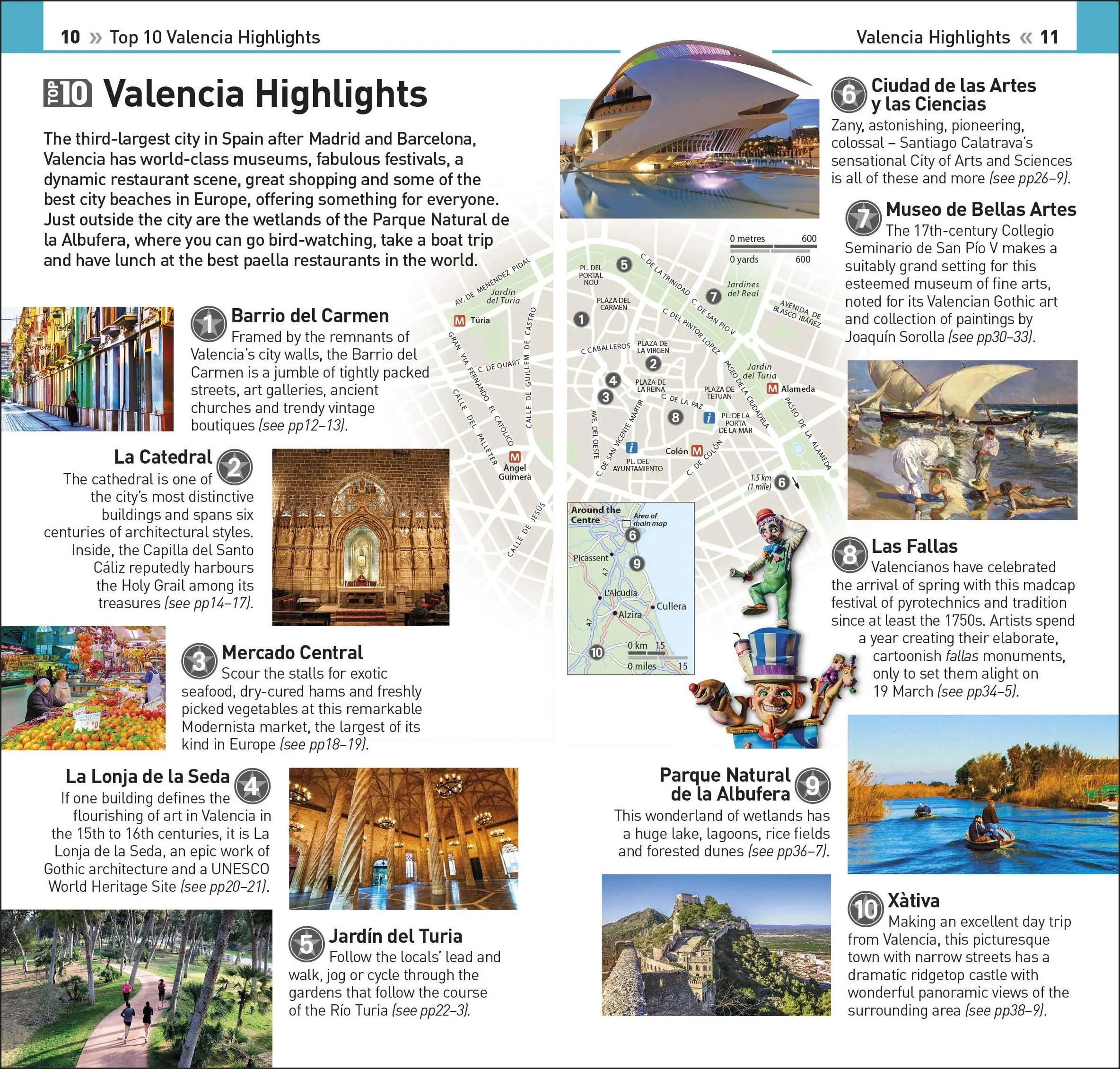
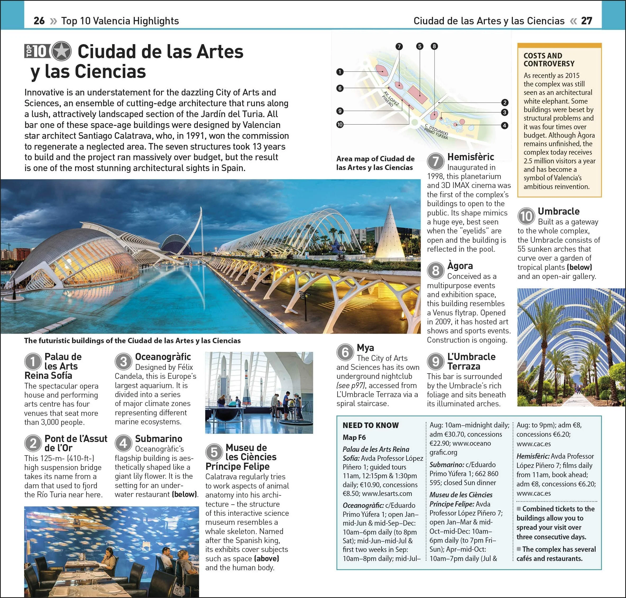
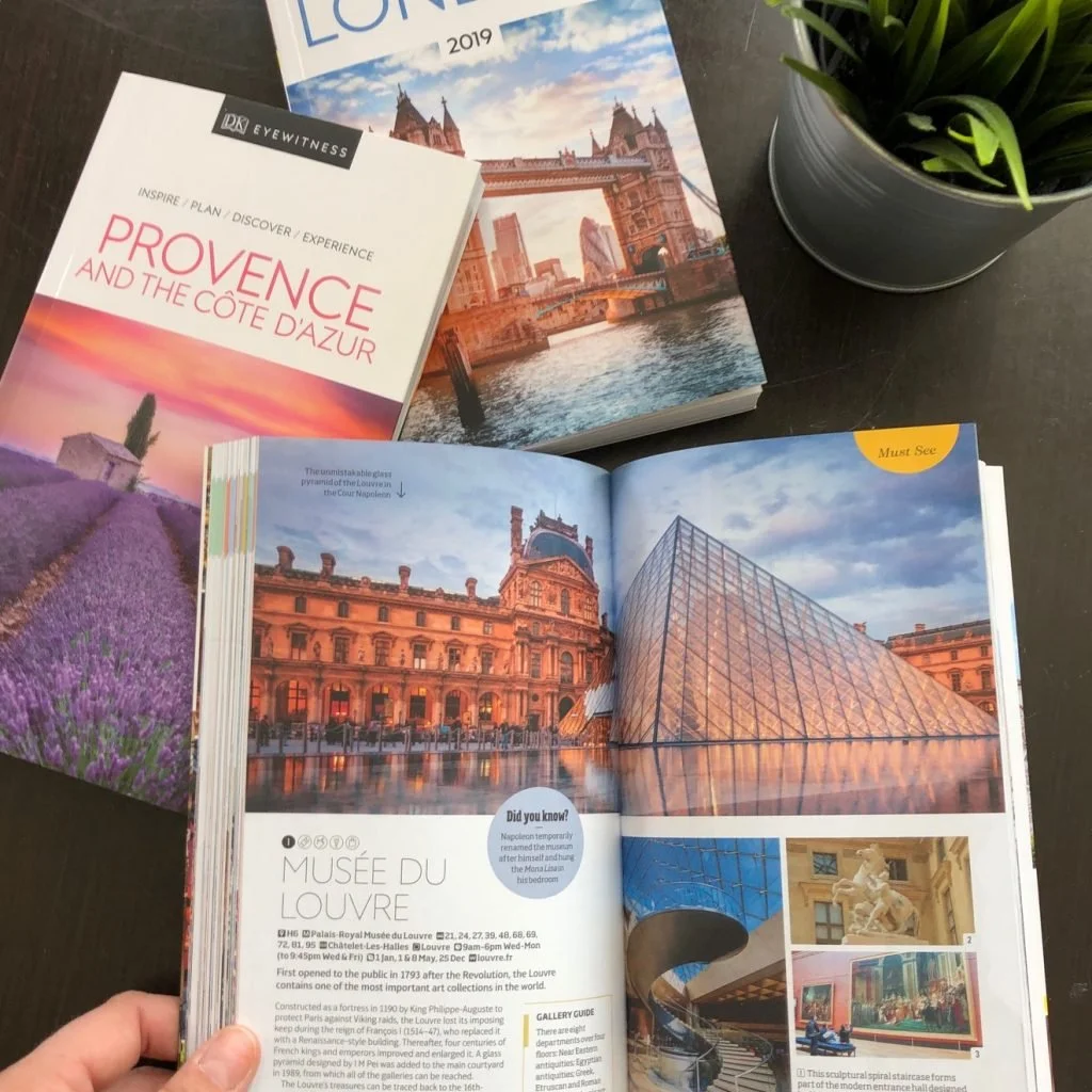
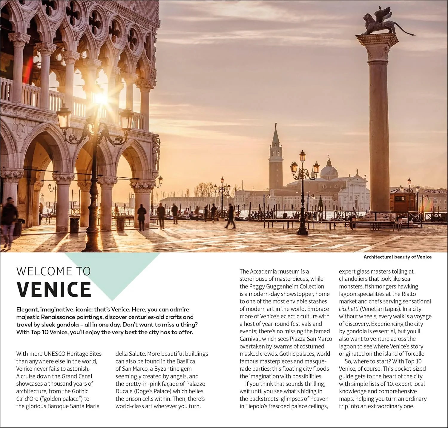
Three contributions that shaped the series.
From designing a full guidebook from scratch to evolving a style system used across two continents, each project required a different kind of thinking.
Designing a travel guide from scratch.
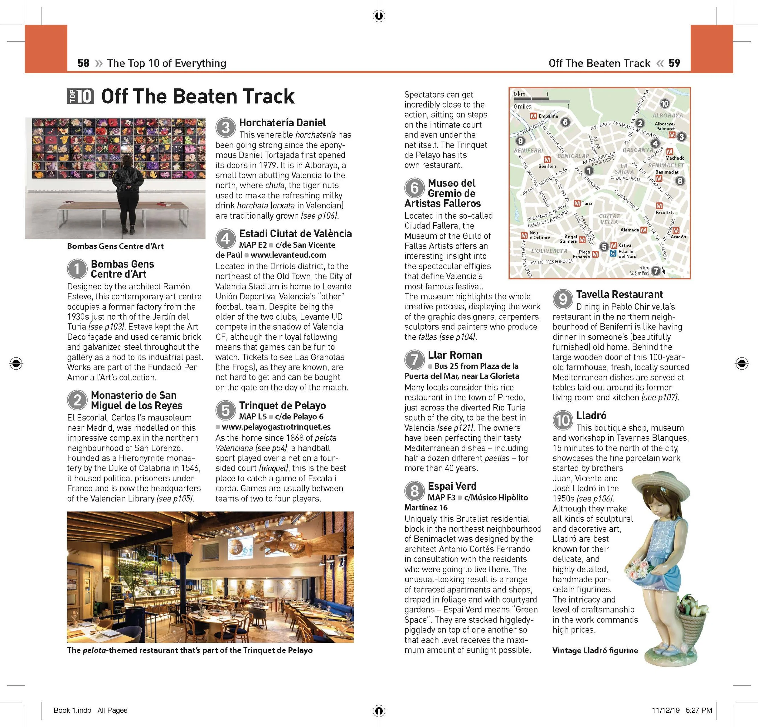
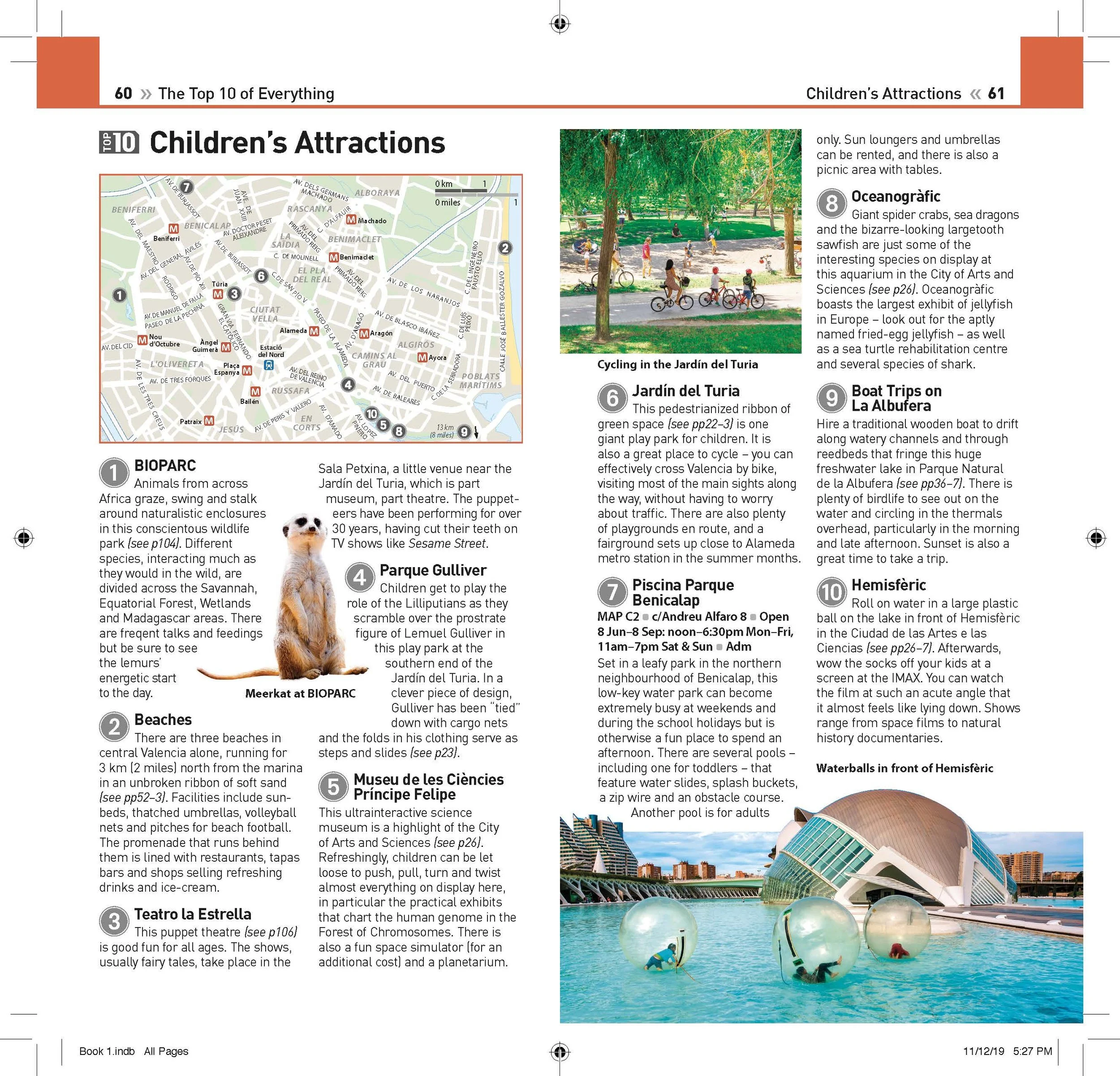
Designing Top 10 Valencia from scratch gave me the opportunity to shape the book from early content planning through final production. I translated editorial copy into structured layouts, collaborated closely with cartographers, illustrators, and picture researchers, and crafted spreads that balanced travel storytelling with information clarity.
This process required not only strong layout design but also careful image curation, spatial planning, and multiple rounds of refinement to ensure each spread felt distinct, accurate, and production-ready.
- Translating editorial briefs into structured two-page spreads
- Collaborating with cartographers, illustrators, and picture researchers
- Curating and placing photography within tight licensing budgets
- Multiple rounds of refinement across layout, typography, and maps
- Delivering print-ready files to production timelines
Translating the manuscript into page structure
I began with the editorial manuscript and flowed content into pre-defined InDesign templates for different page types and sections. This helped establish the overall structure of the book and identify where maps, illustrations, and photography would need to be integrated.
Translating the manuscript into page structure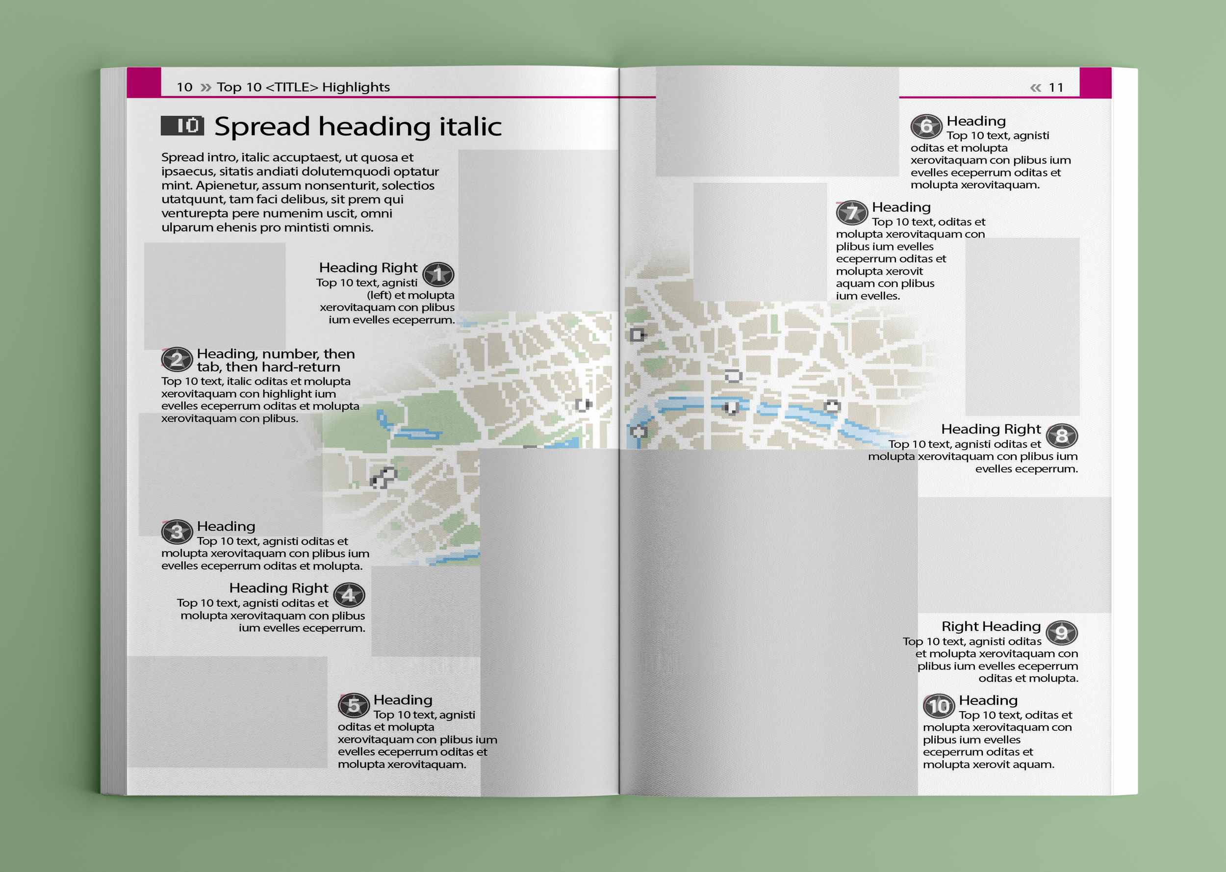
Planning space with cross-functional layout
I mapped out each spread to balance text, maps, and photography in a way that guided the reader naturally. This meant working closely with editors and cartographers early to anticipate where each element would land before assets arrived.
Planning the visual and editorial layout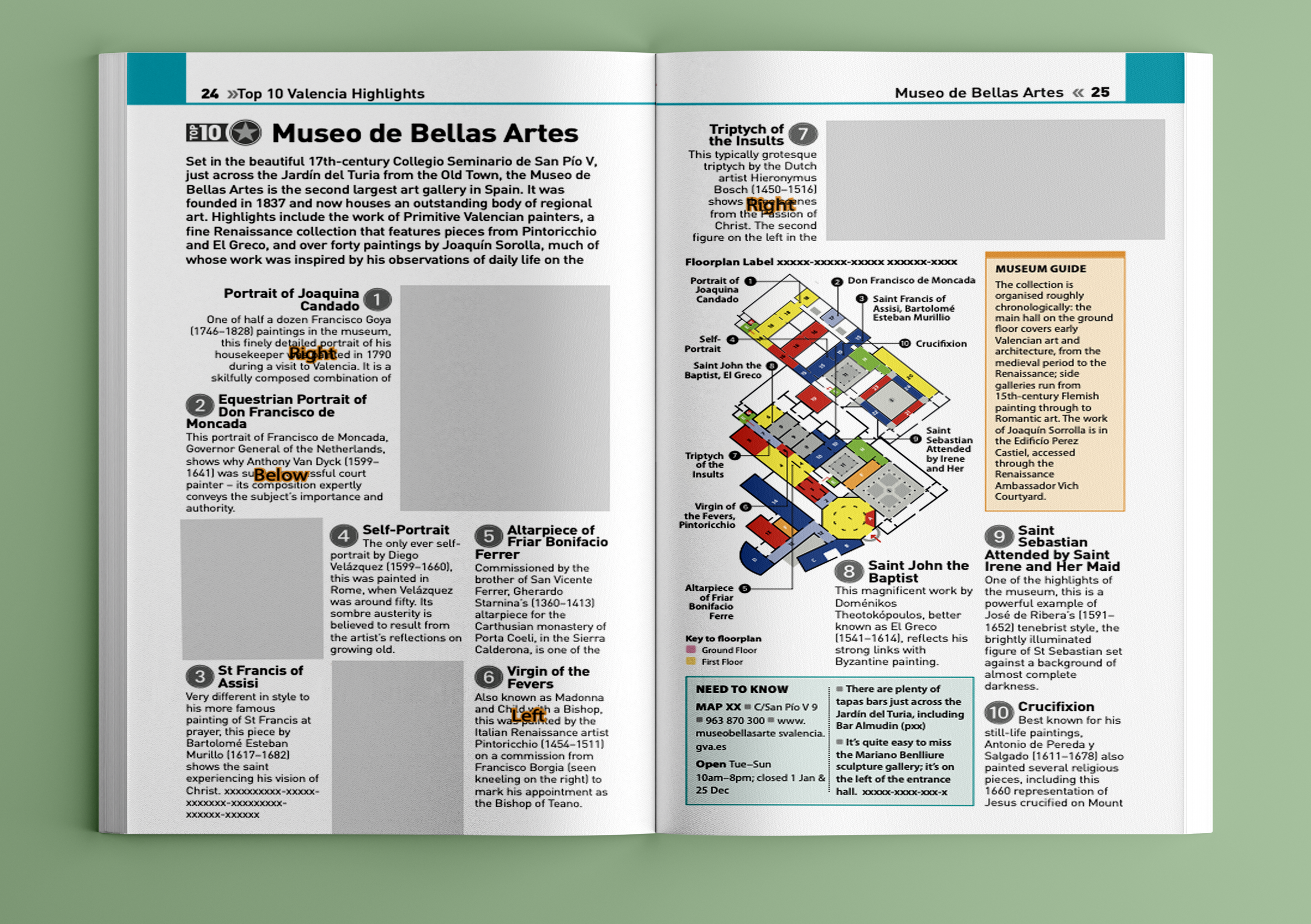
Researching the destination and curating imagery
I researched the content in detail and scouted locations using Google, Street View, and reference photography to create the right mix of outdoor views, interiors, details, and atmosphere. I worked with picture researchers to select and license photography that felt authentic to each destination.
Colourful / monochrome, busy / serene — balancing the visual mix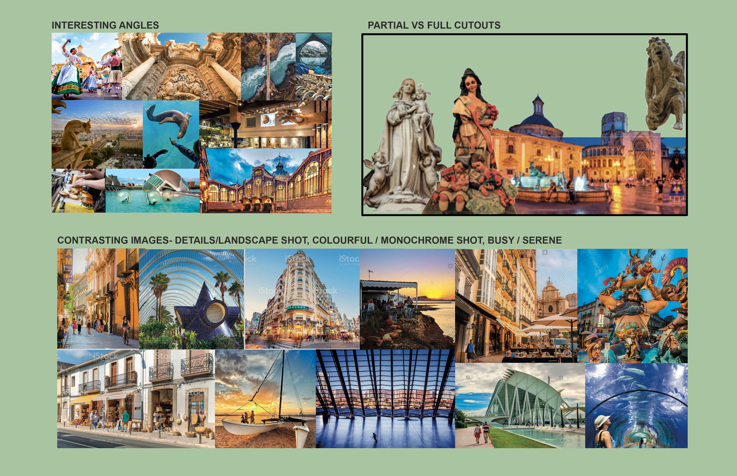
Building and reviewing rough layouts
Using placeholder assets and low-resolution images, I created rough spreads to explore pacing, hierarchy, and visual balance across the book. I reviewed the spreads as a full set to ensure pages felt varied and not repetitive, then shared them with senior designers and peers for feedback before entering editorial review.
Reviewing spreads as a set — back and forth with editors and cartographers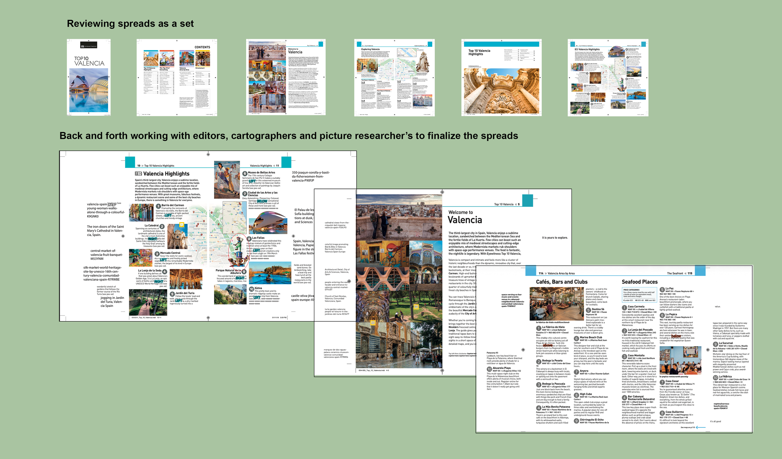
Refining for production
As the book evolved, layouts were adjusted through multiple rounds of collaboration with editors, cartographers, and final illustrators. Once content and imagery were approved, I placed high-resolution assets, ordered and attached final maps and illustrations, prepared production files, and readied the book for quality checks and translation handoff.
Ordering high-res assets — finalizing spreads with illustrations and maps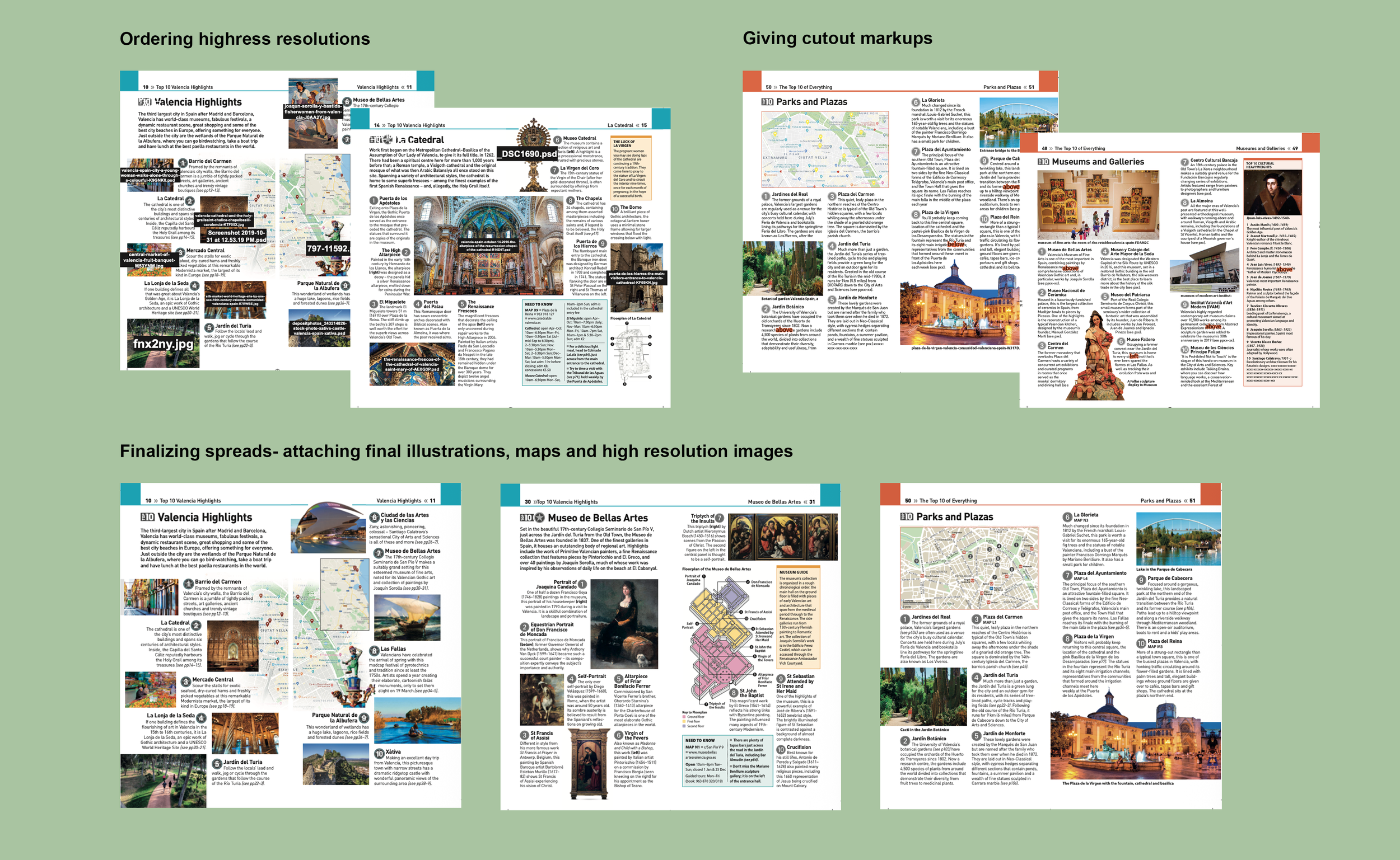
The finished spreads, from cover to final page.
Every spread below went through the five-step process above, from raw manuscript to print-ready production file.
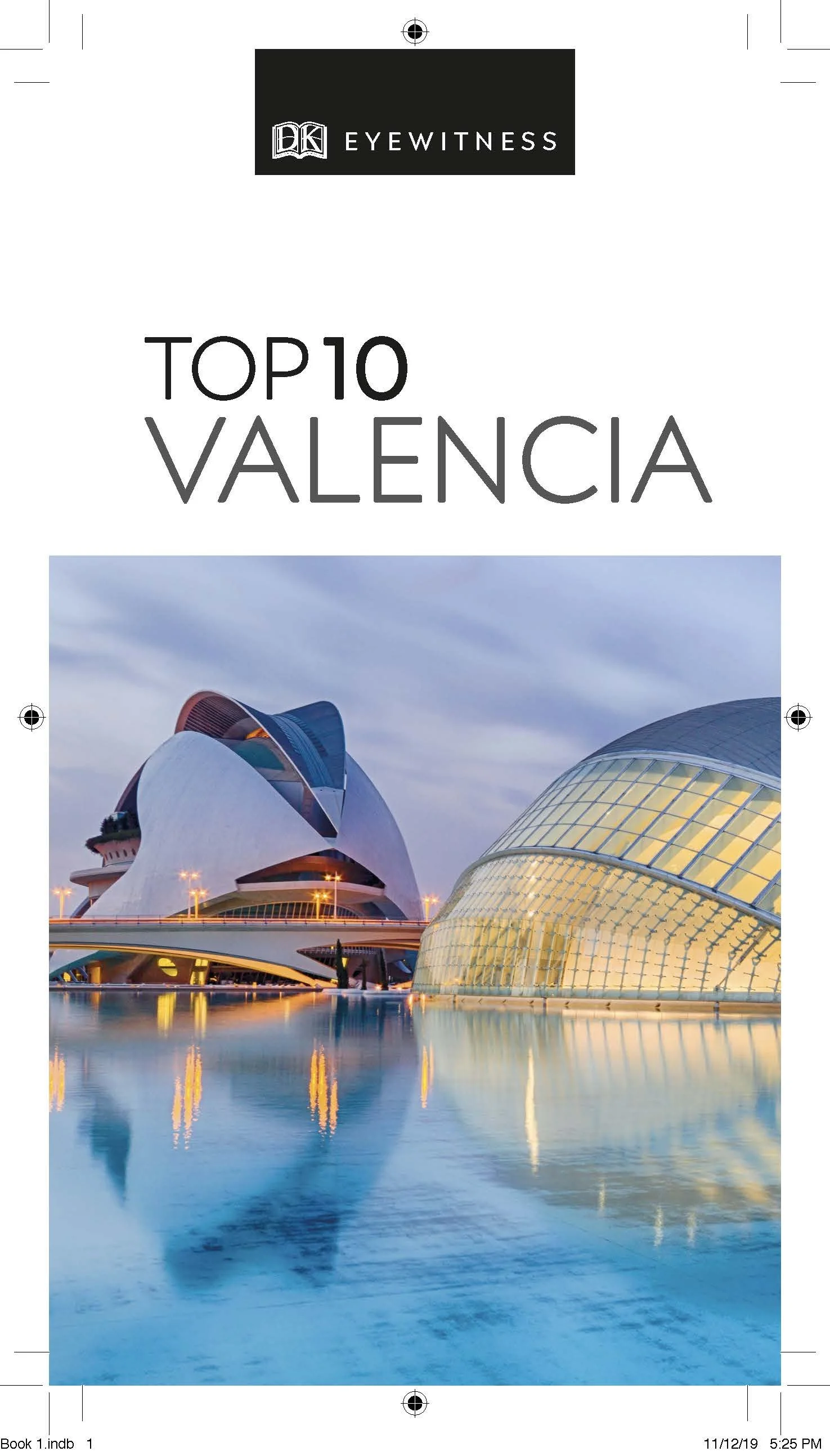
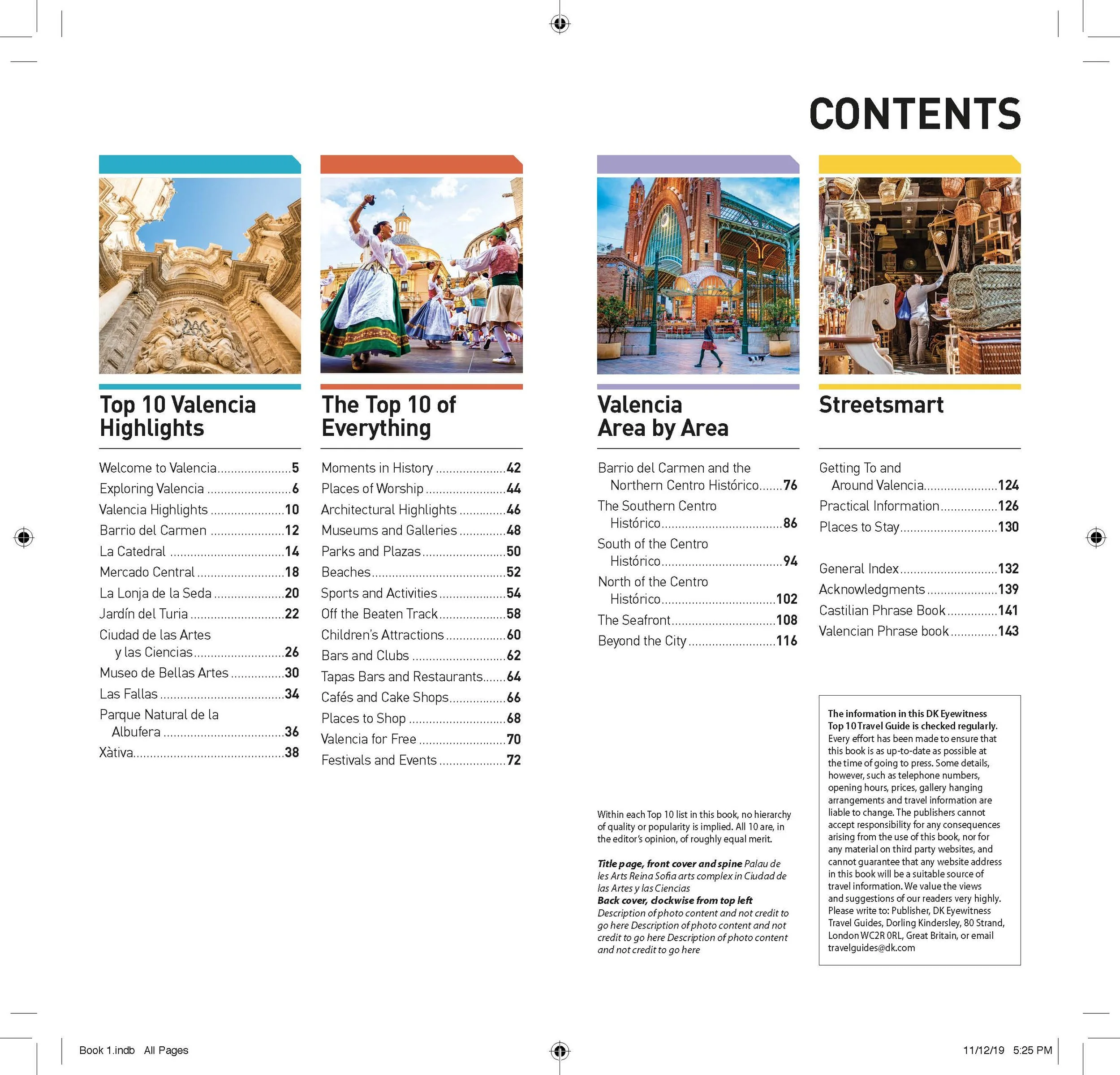
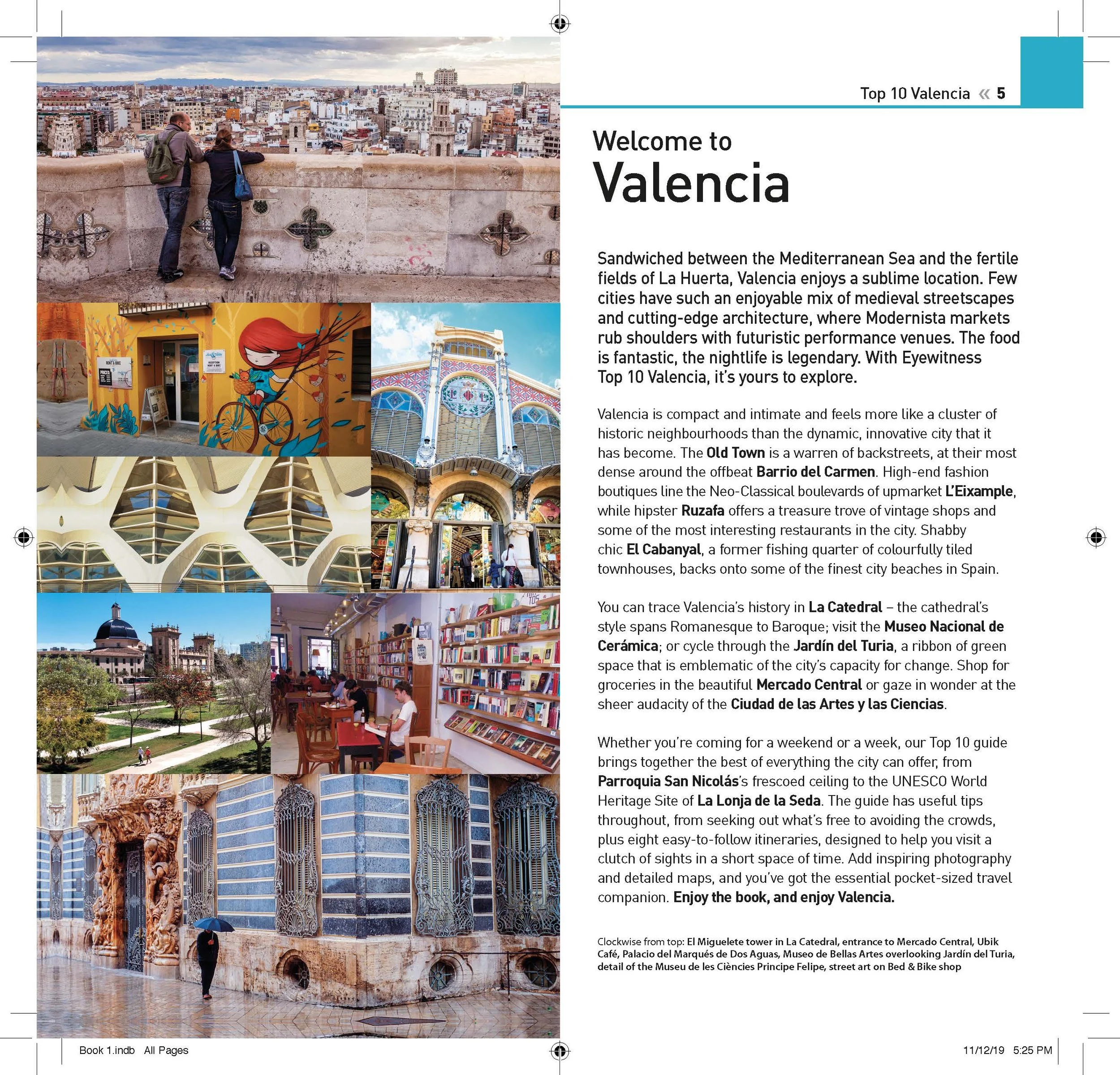
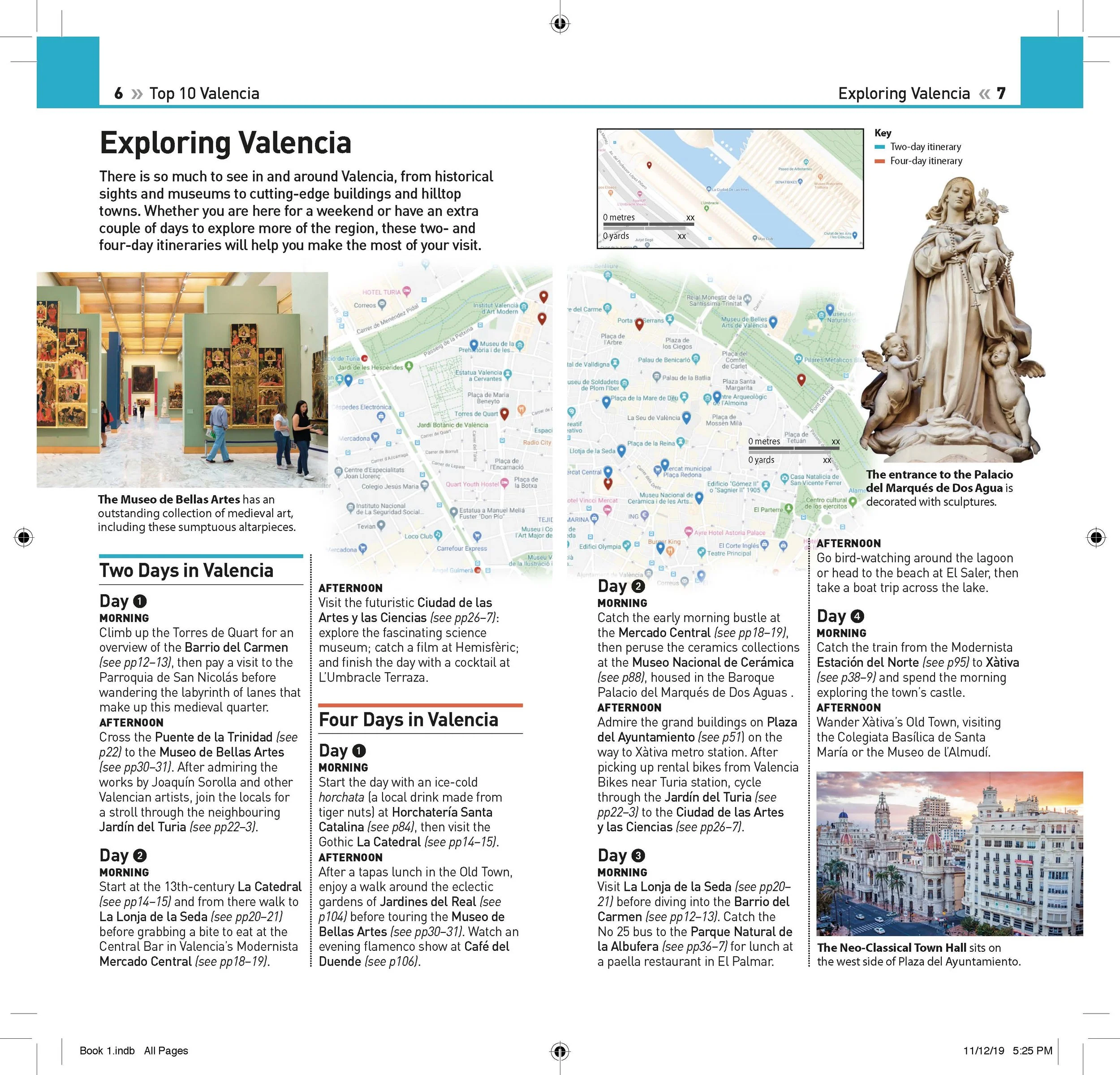
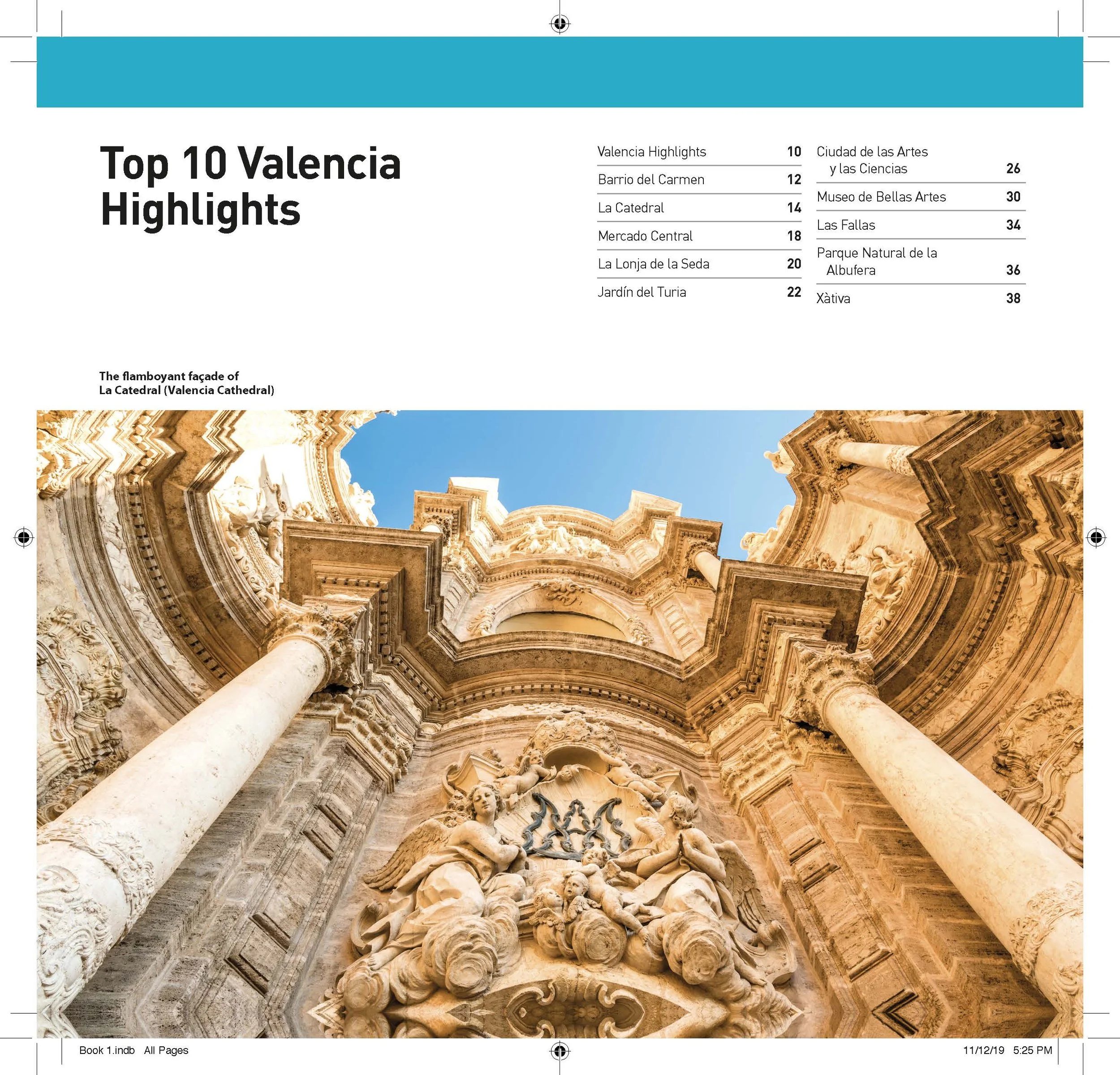
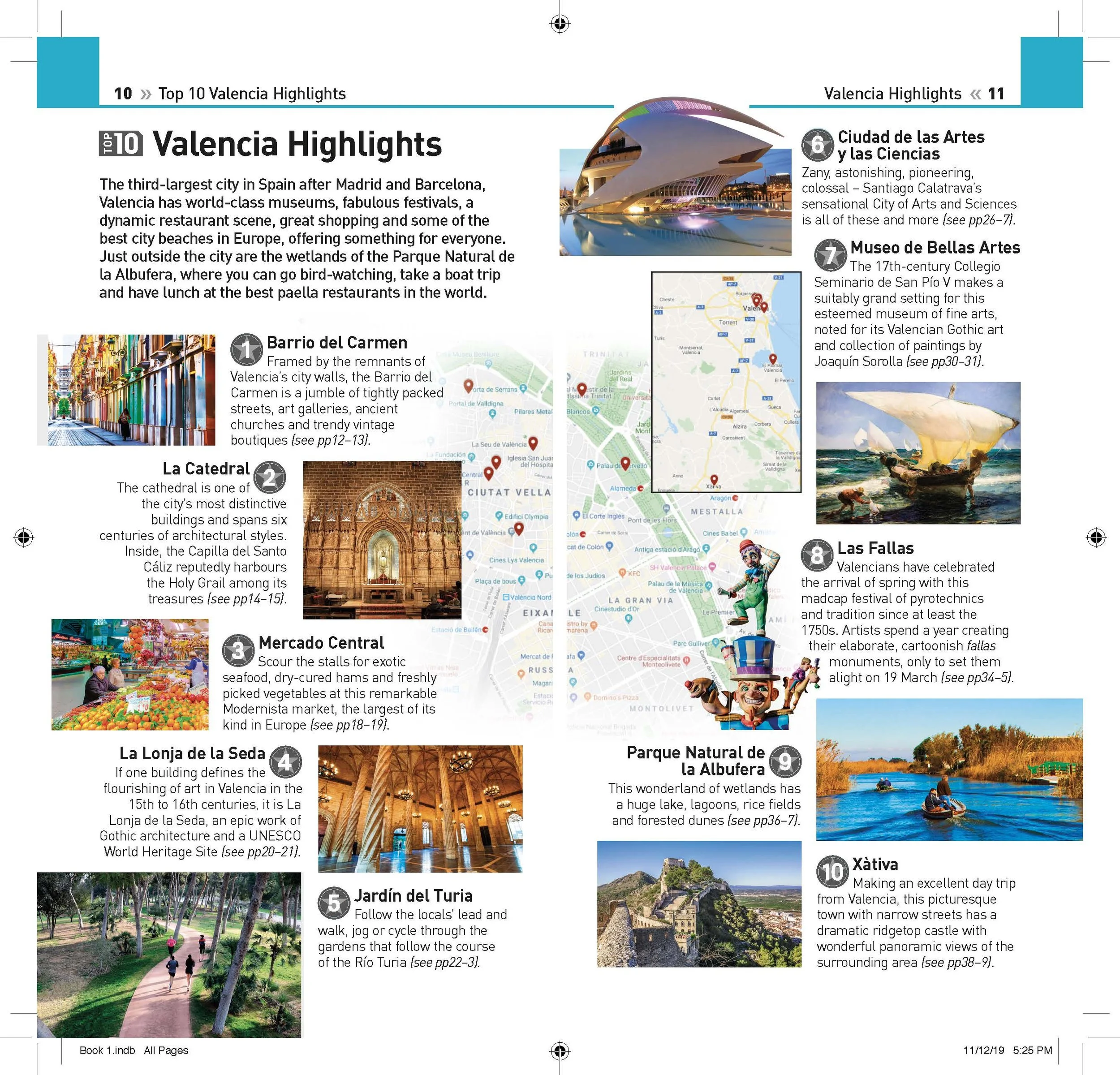
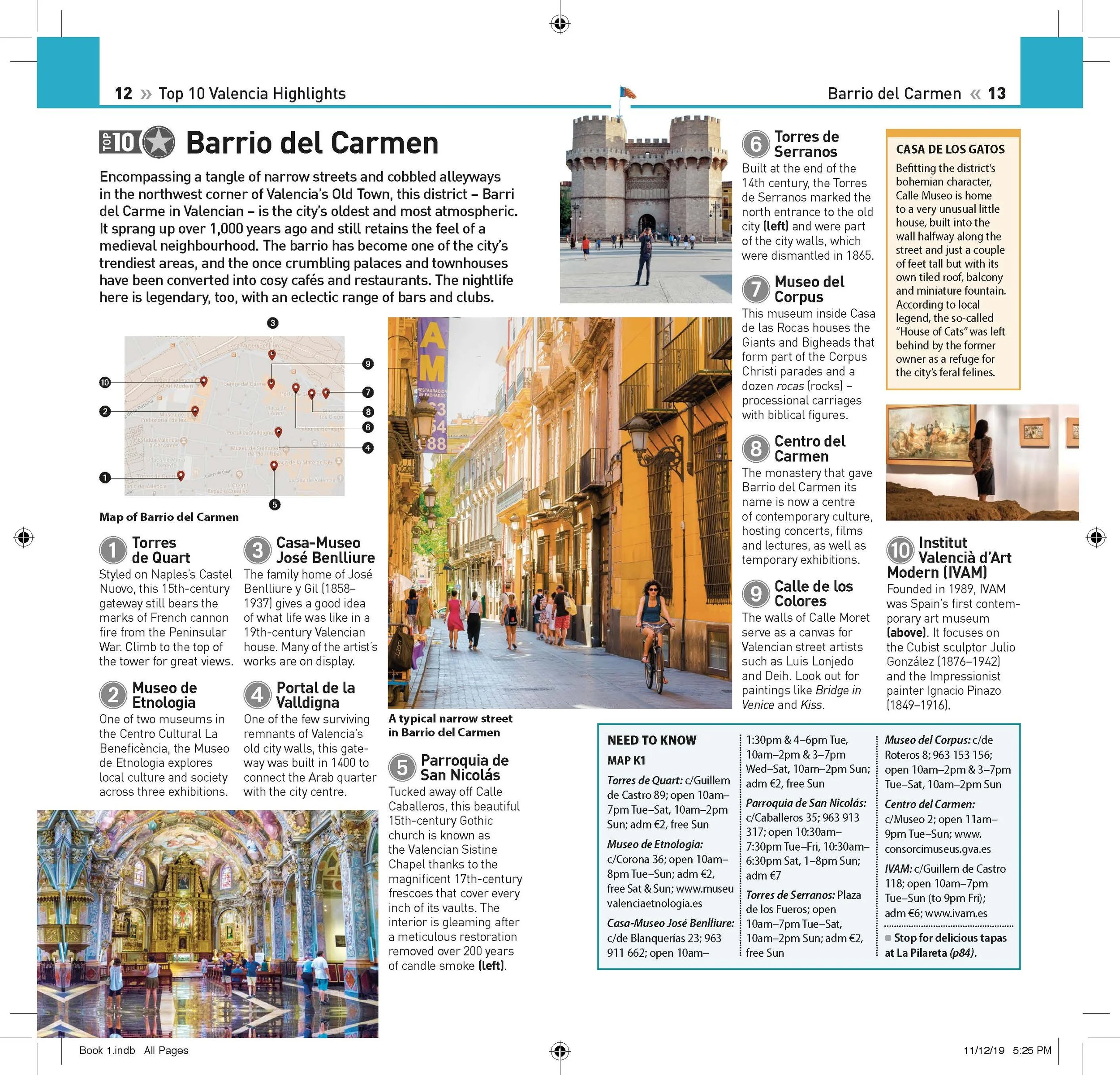
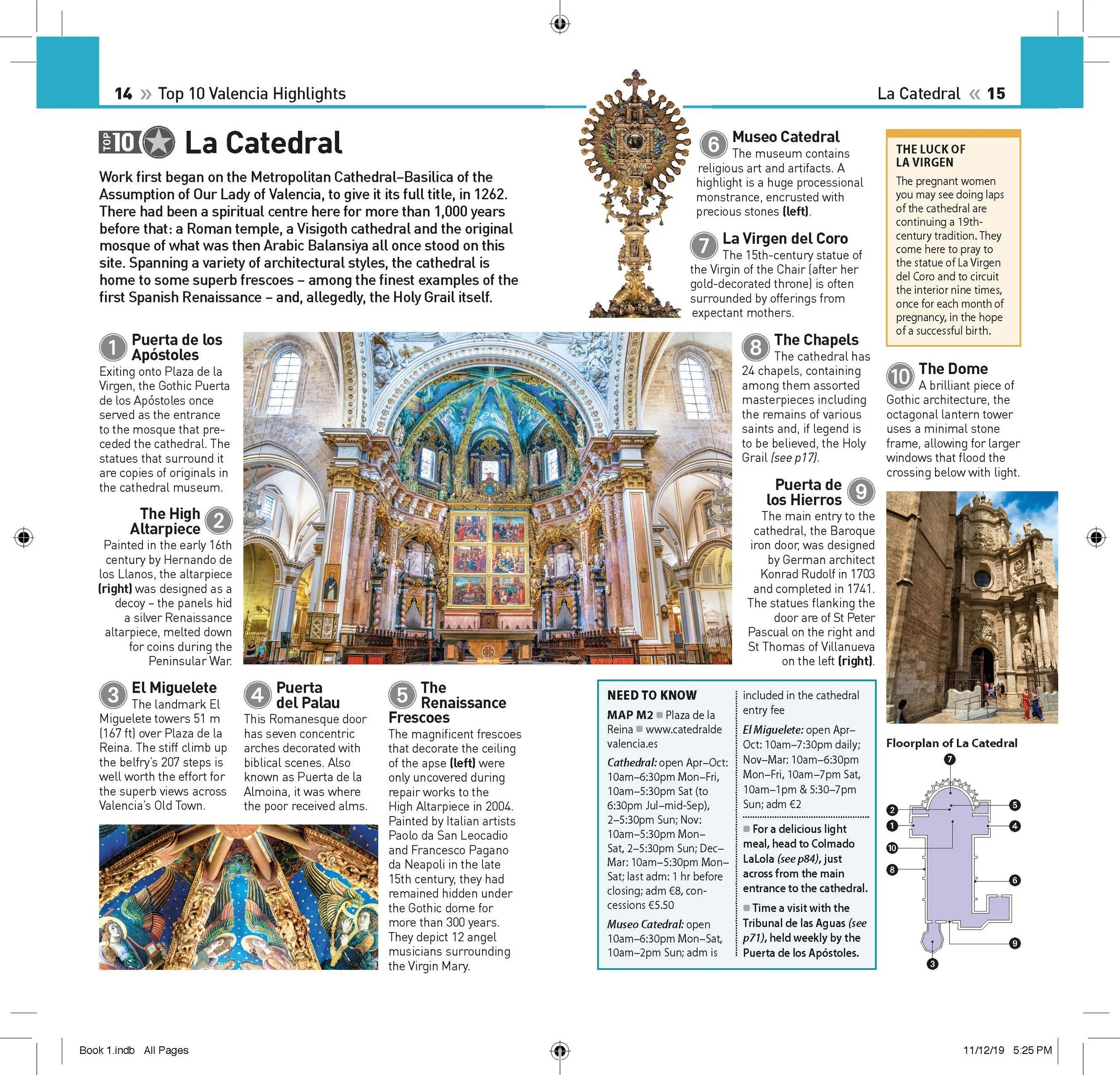
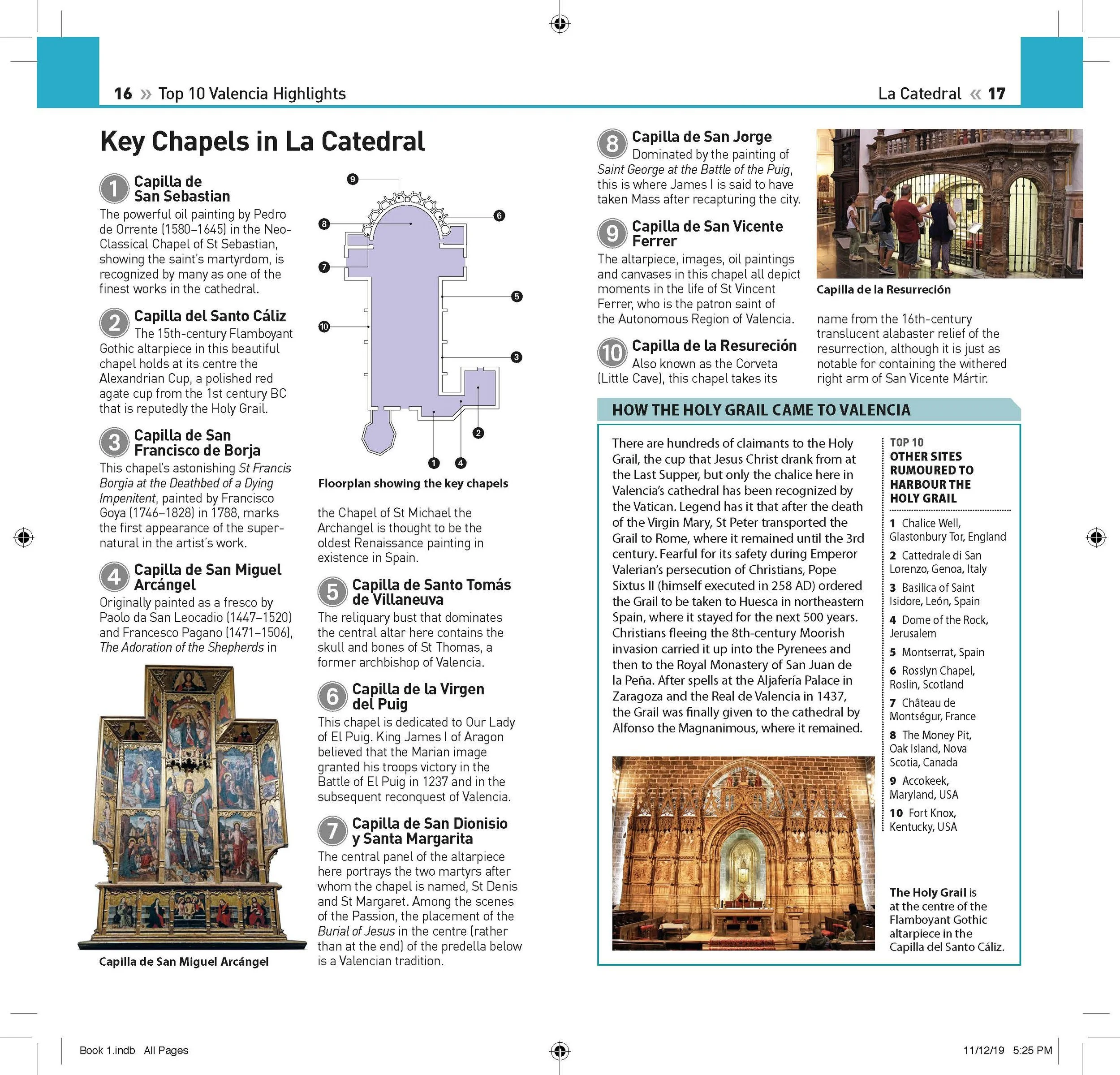
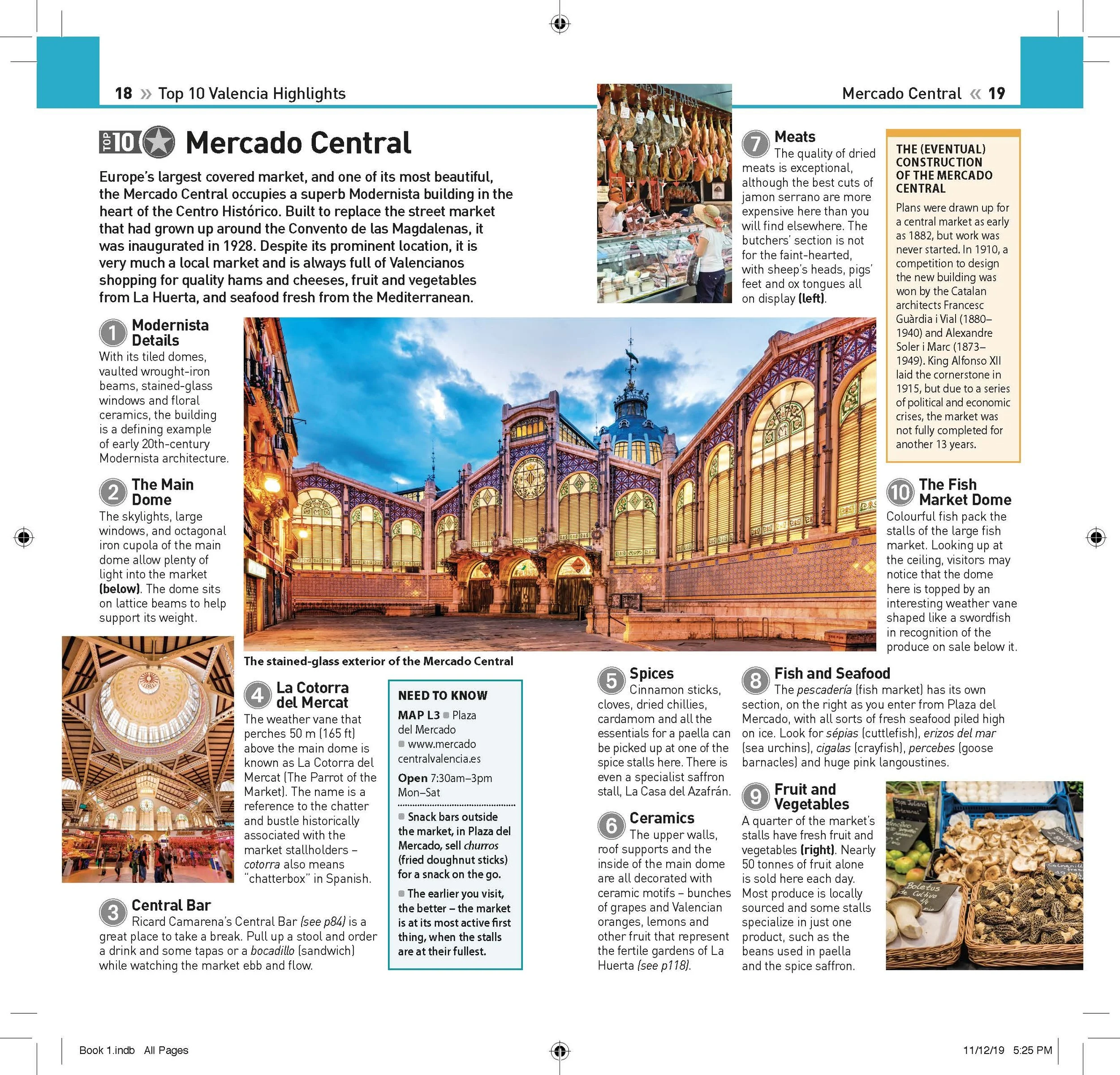
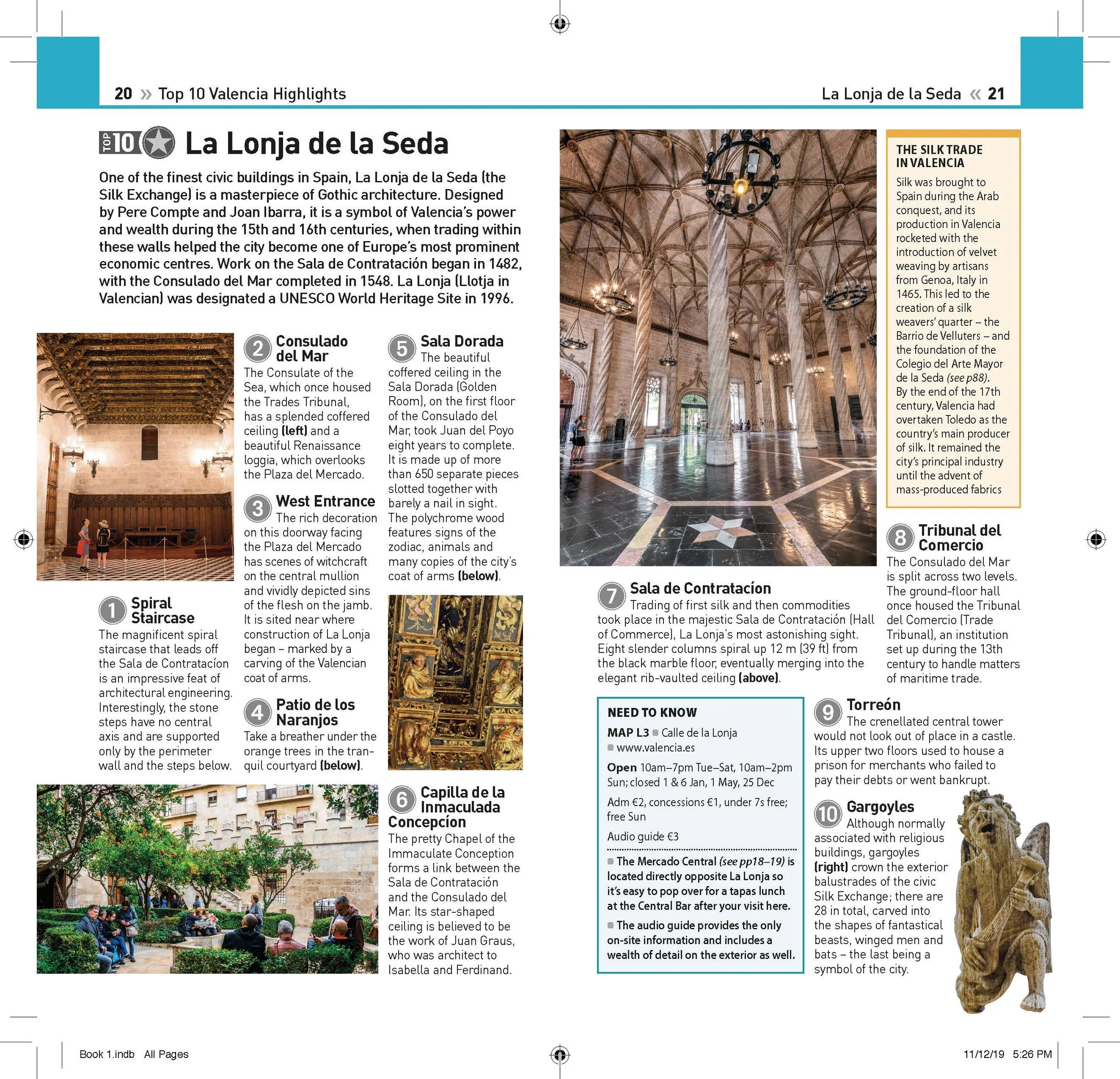
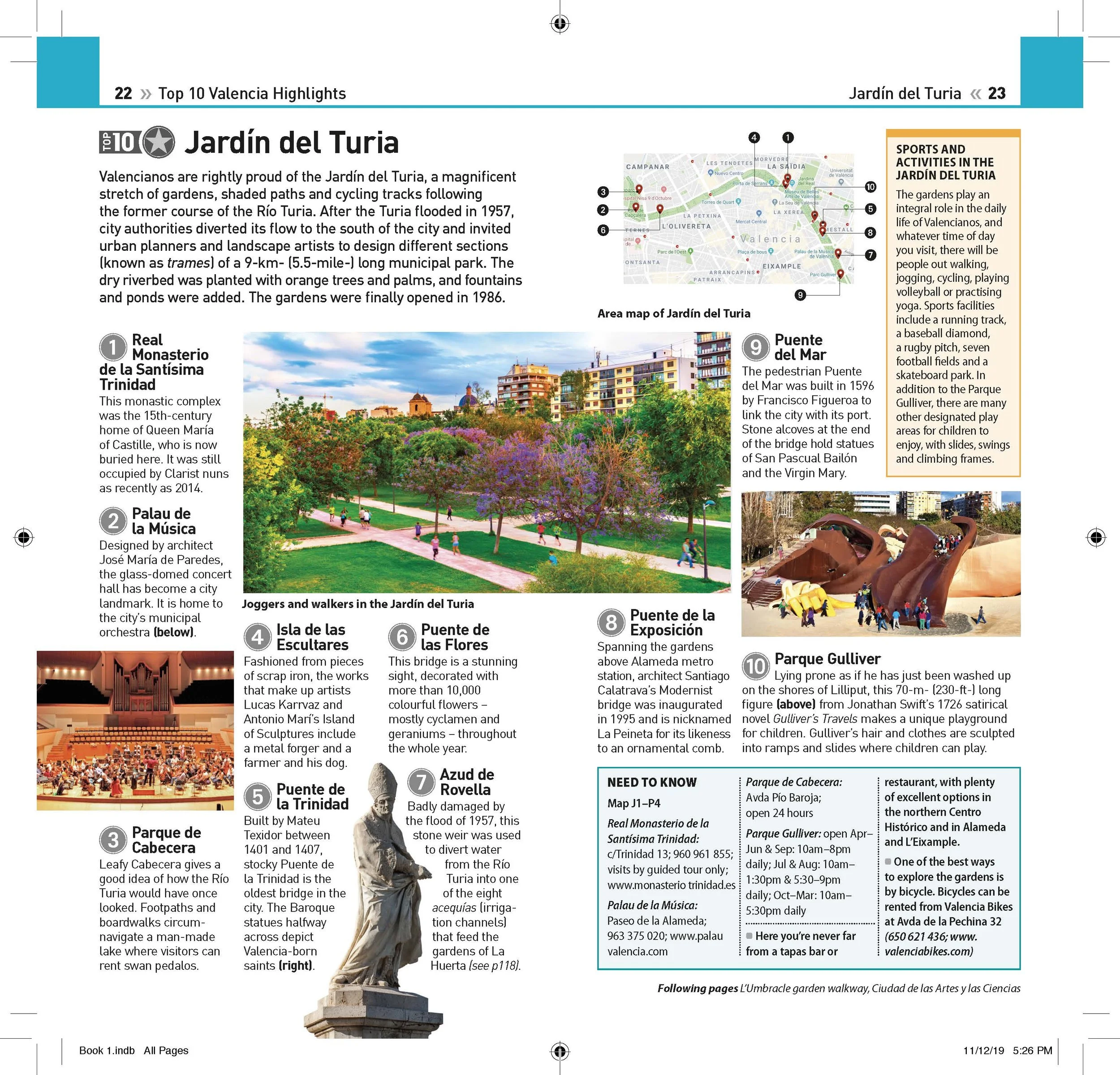
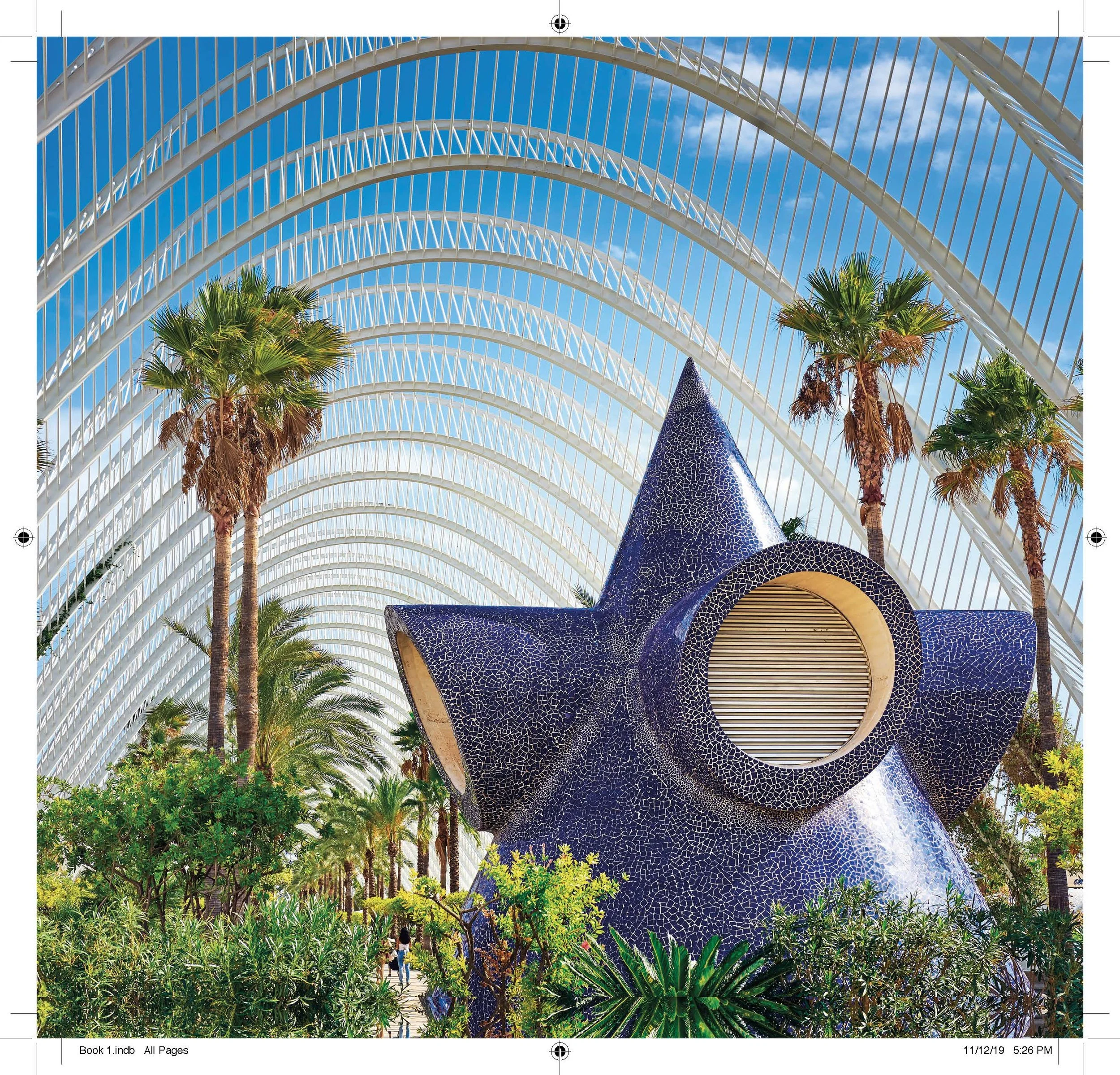
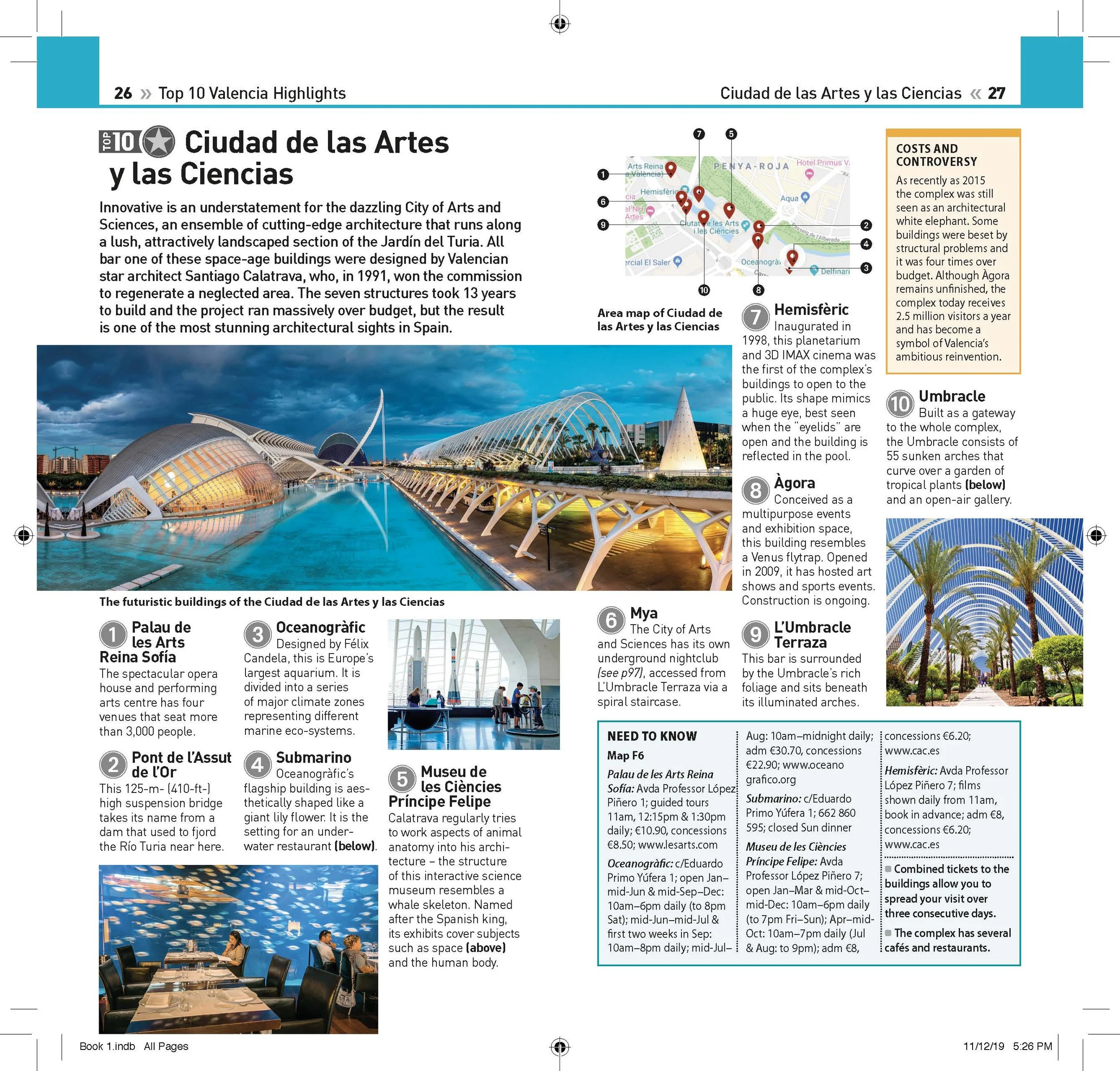
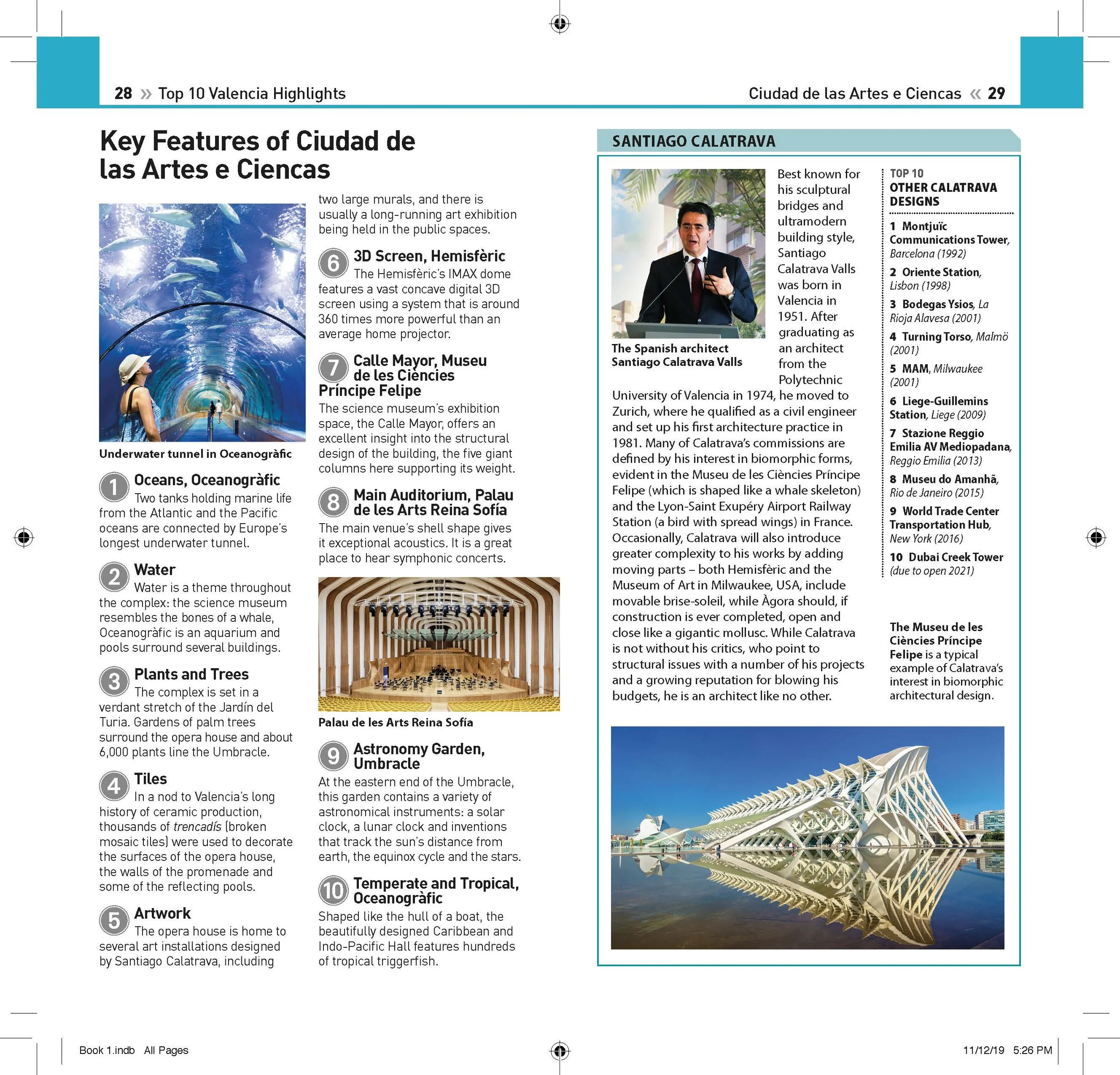
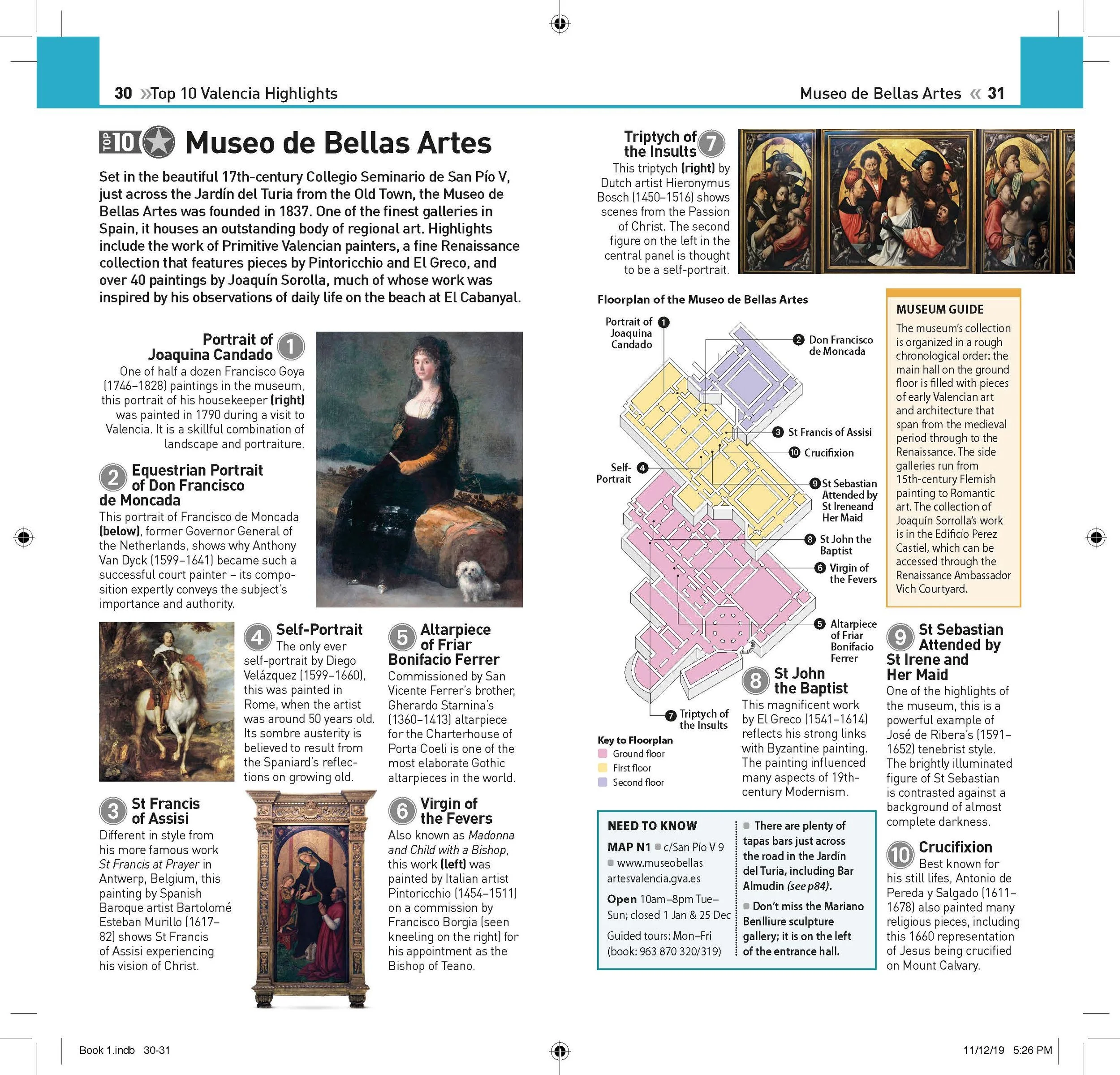
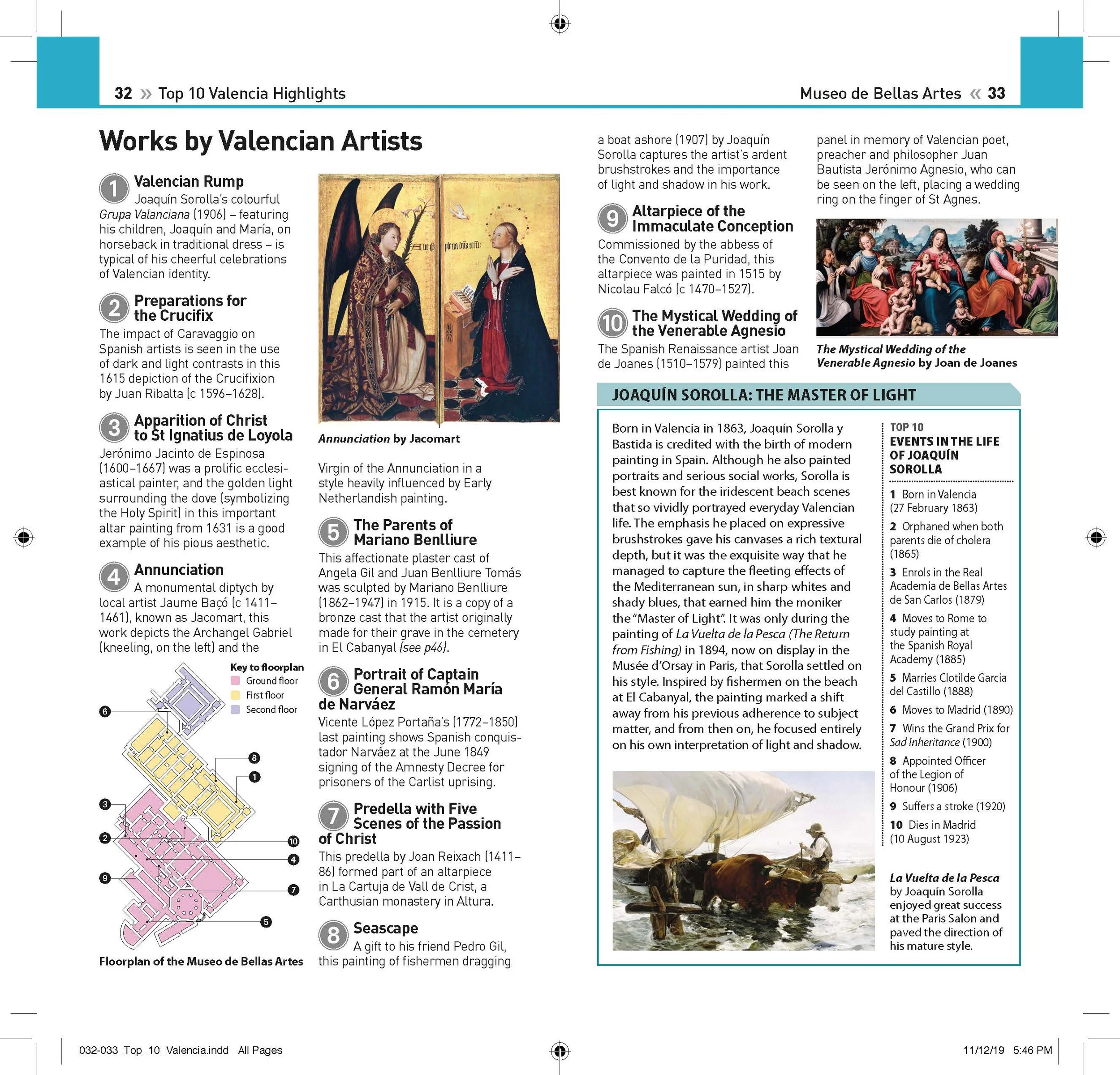
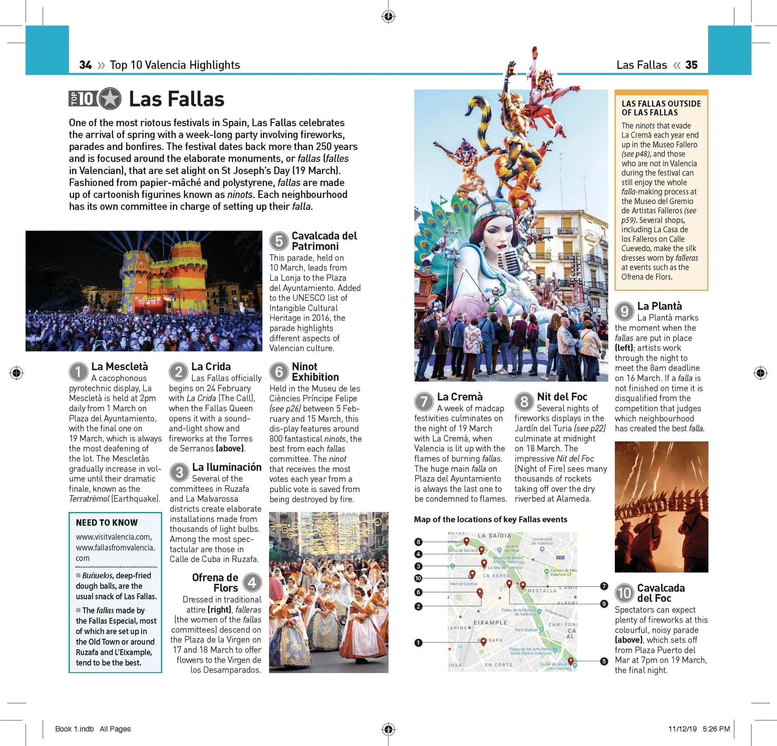
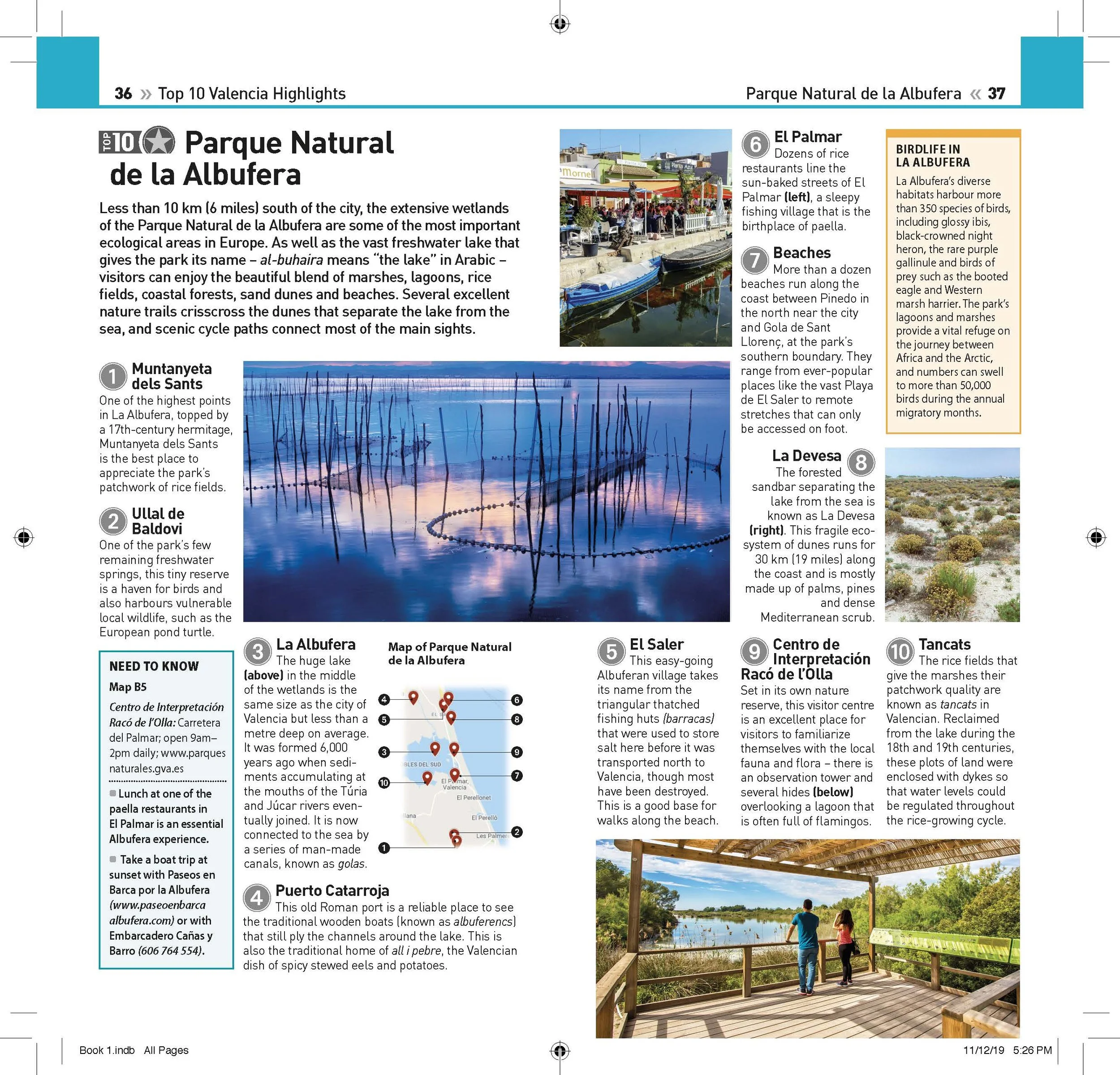
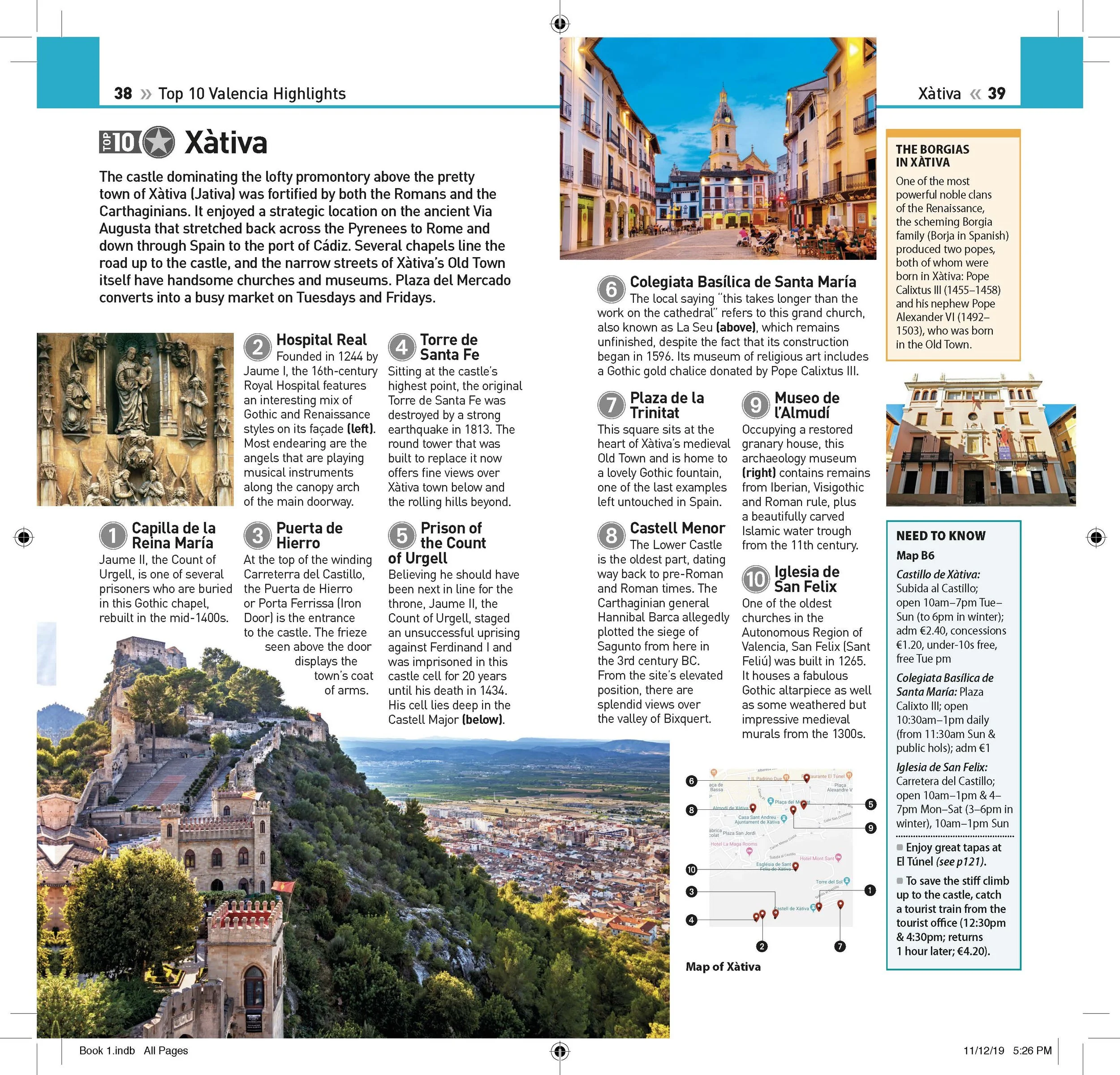
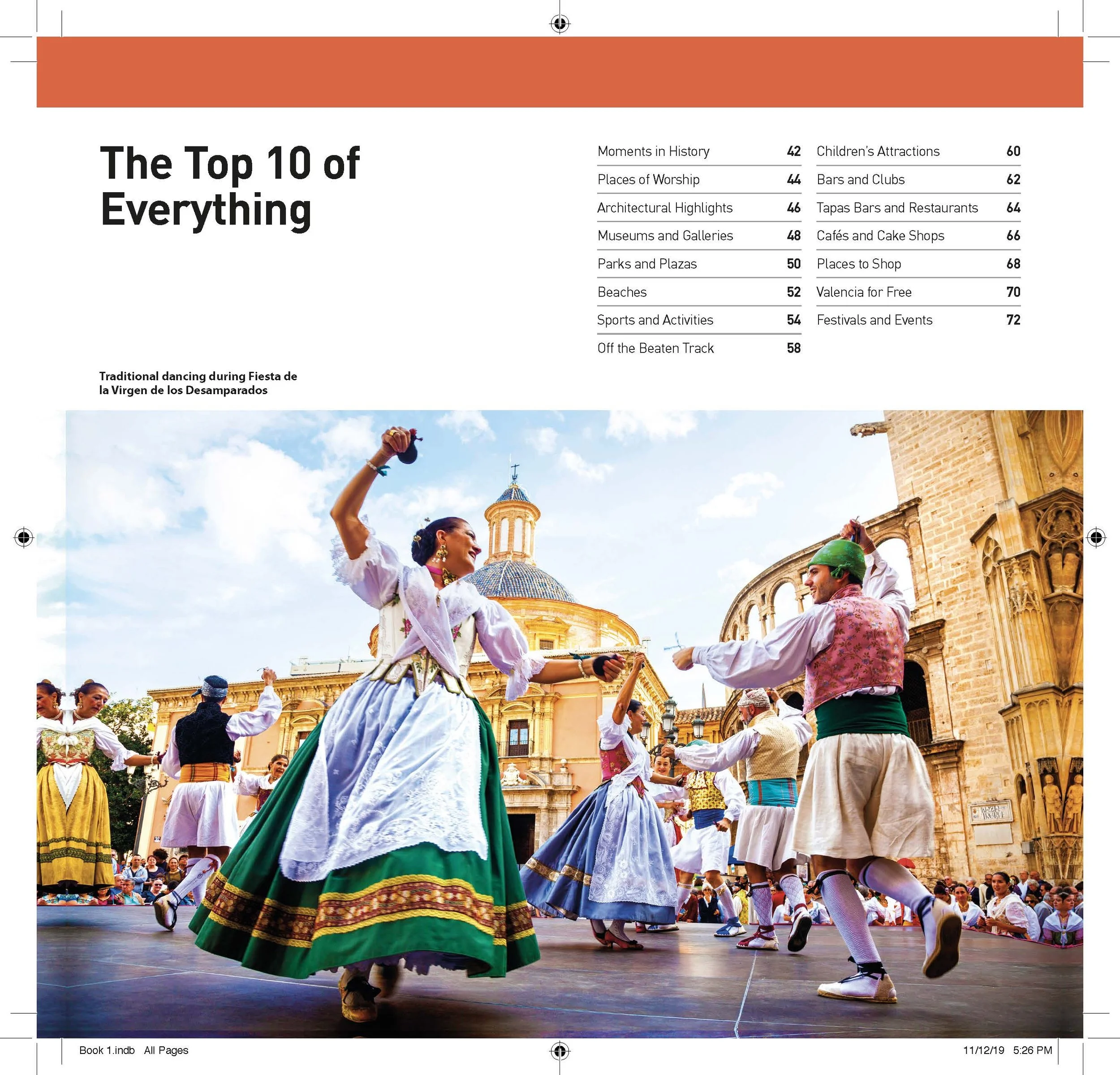
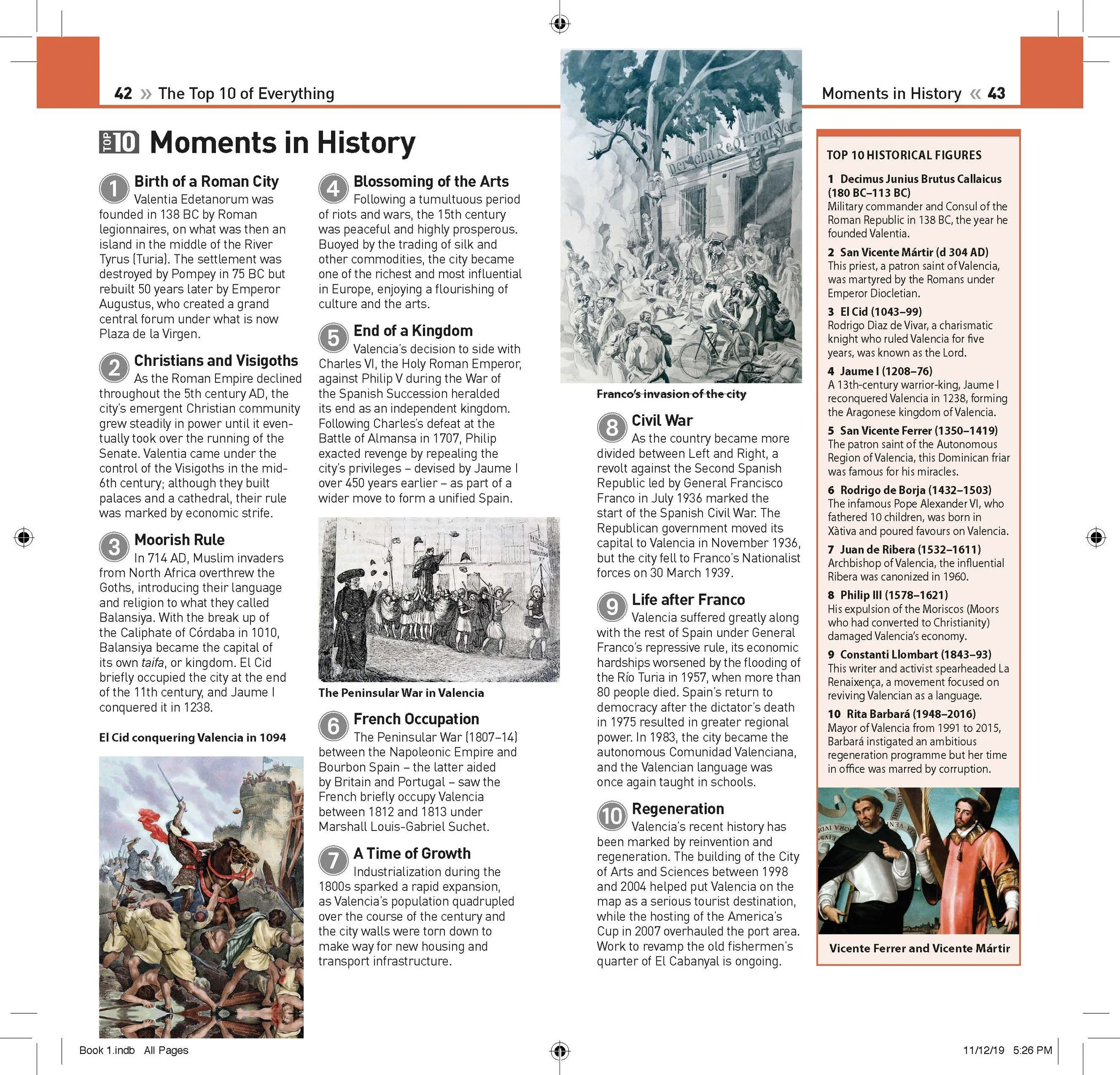
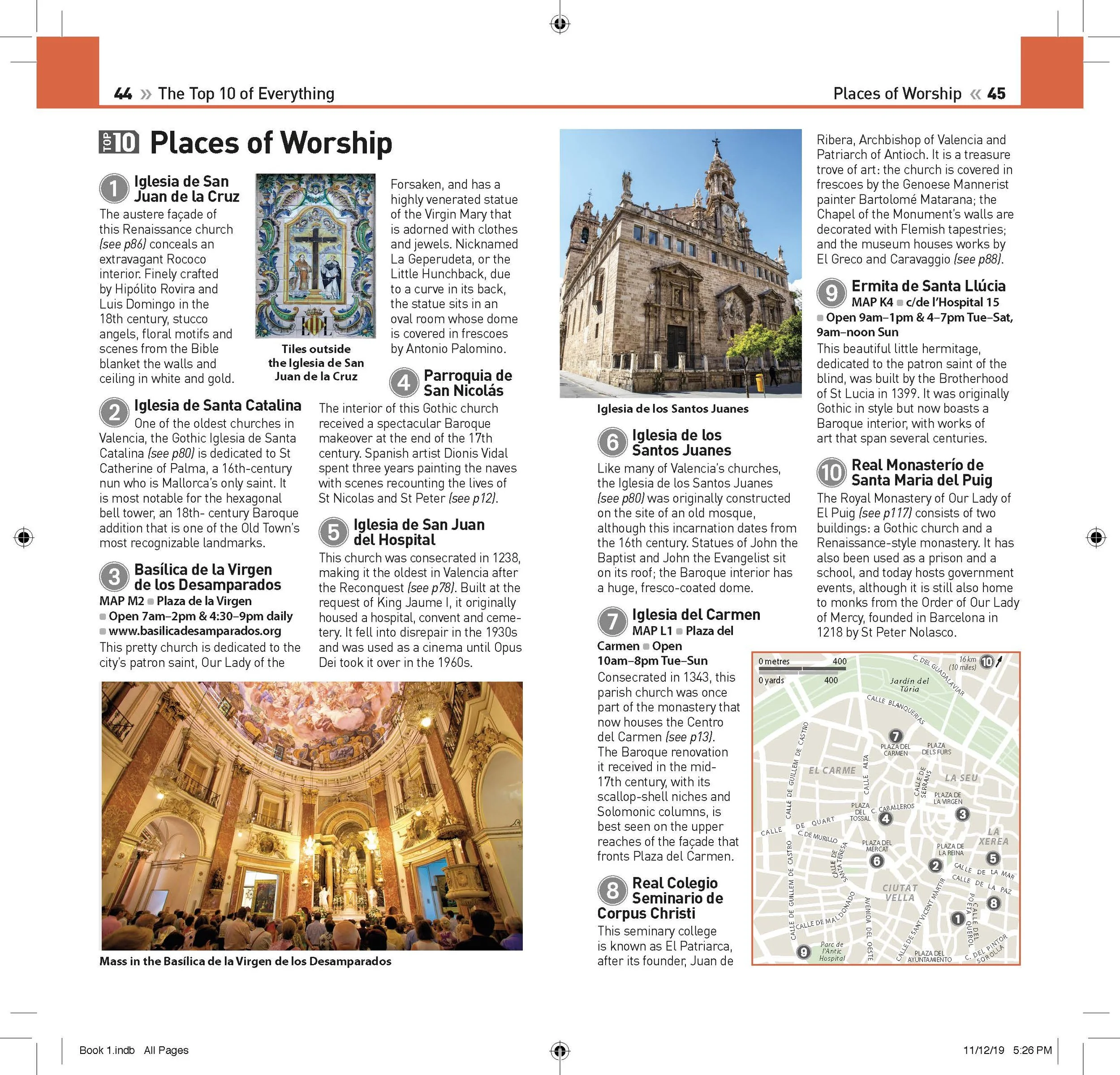
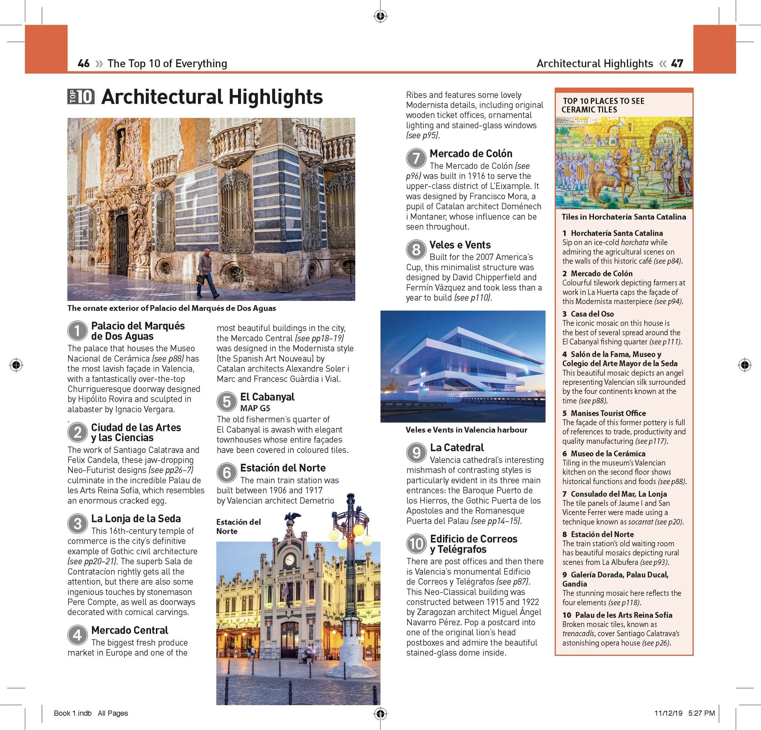
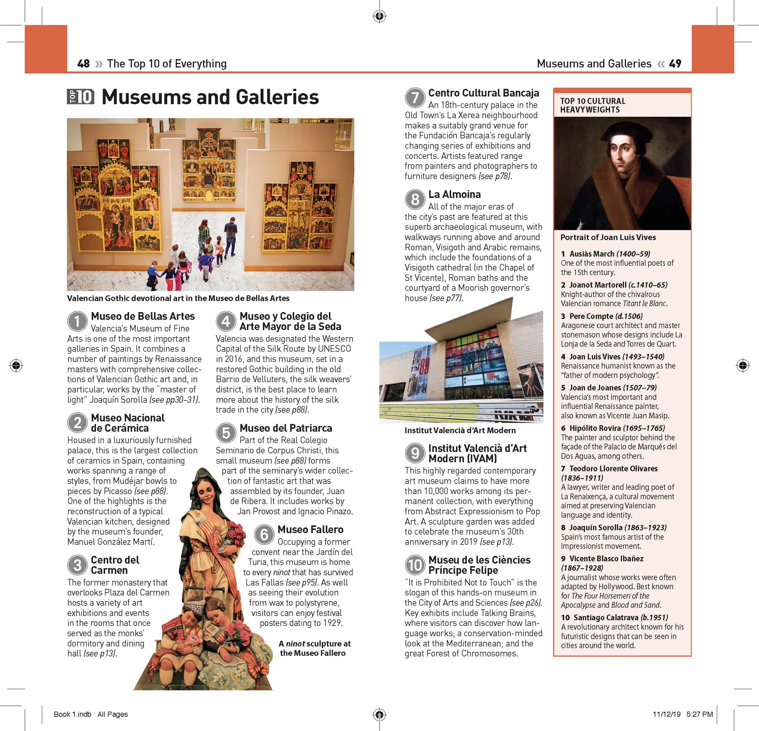
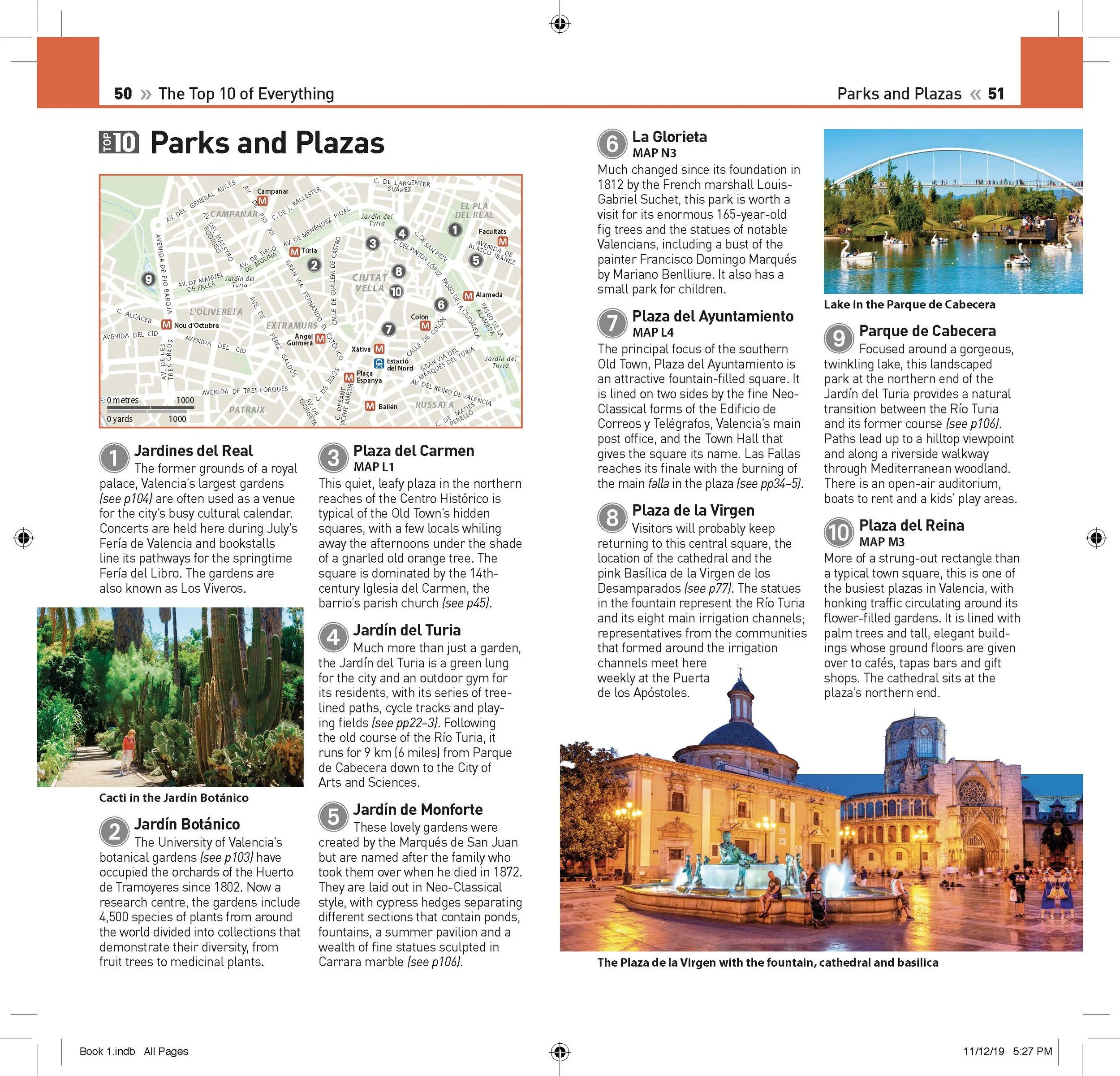
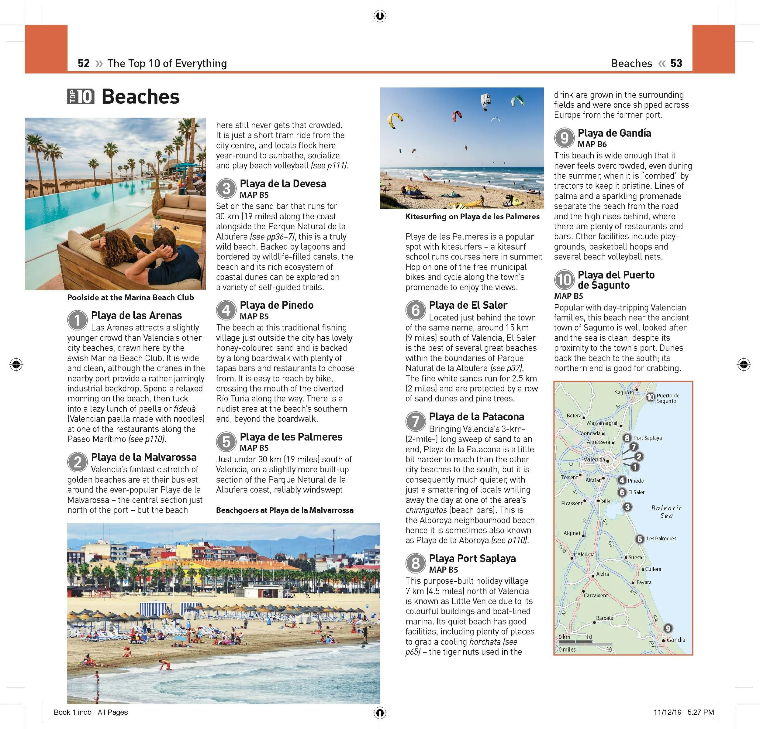
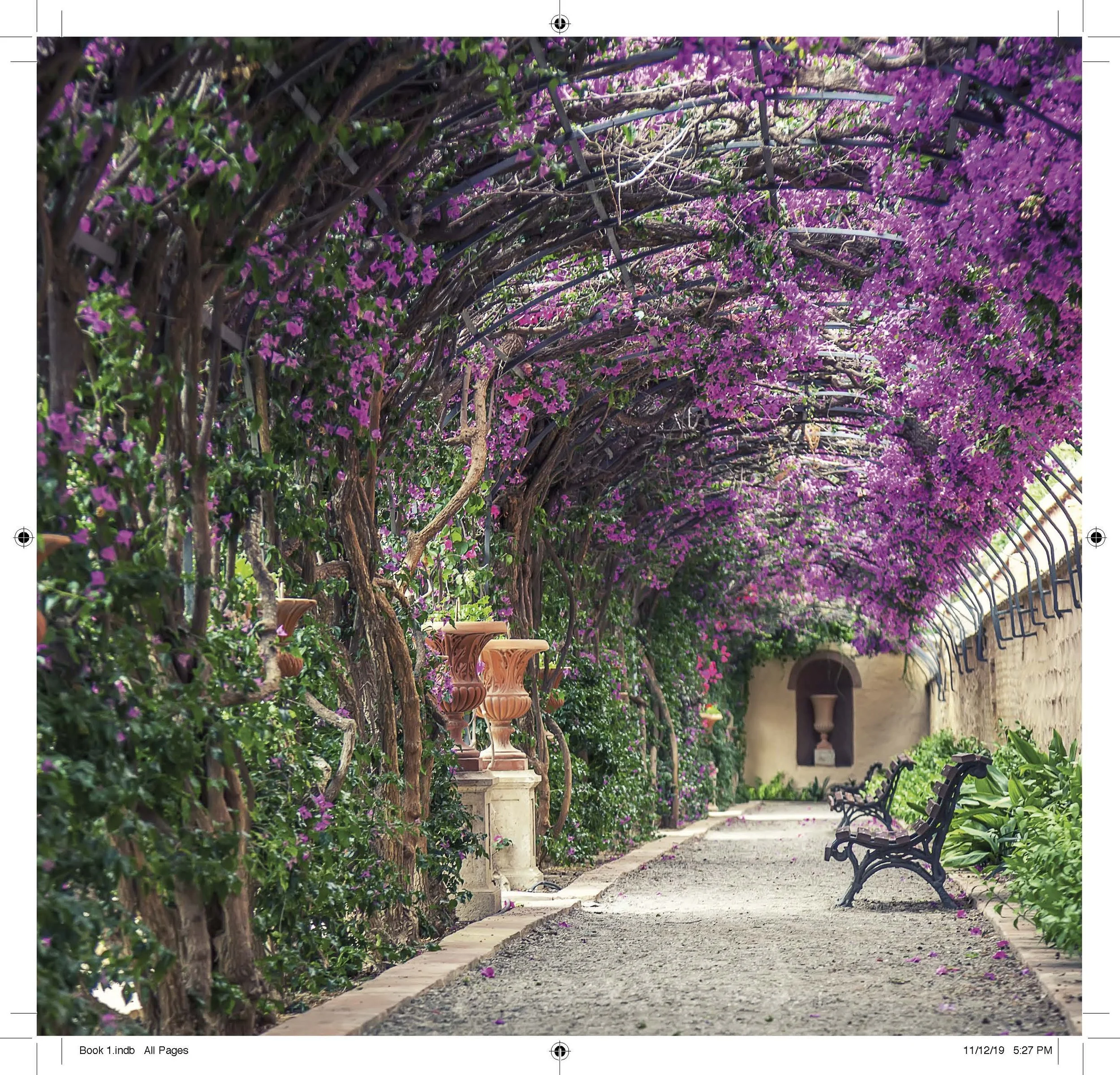
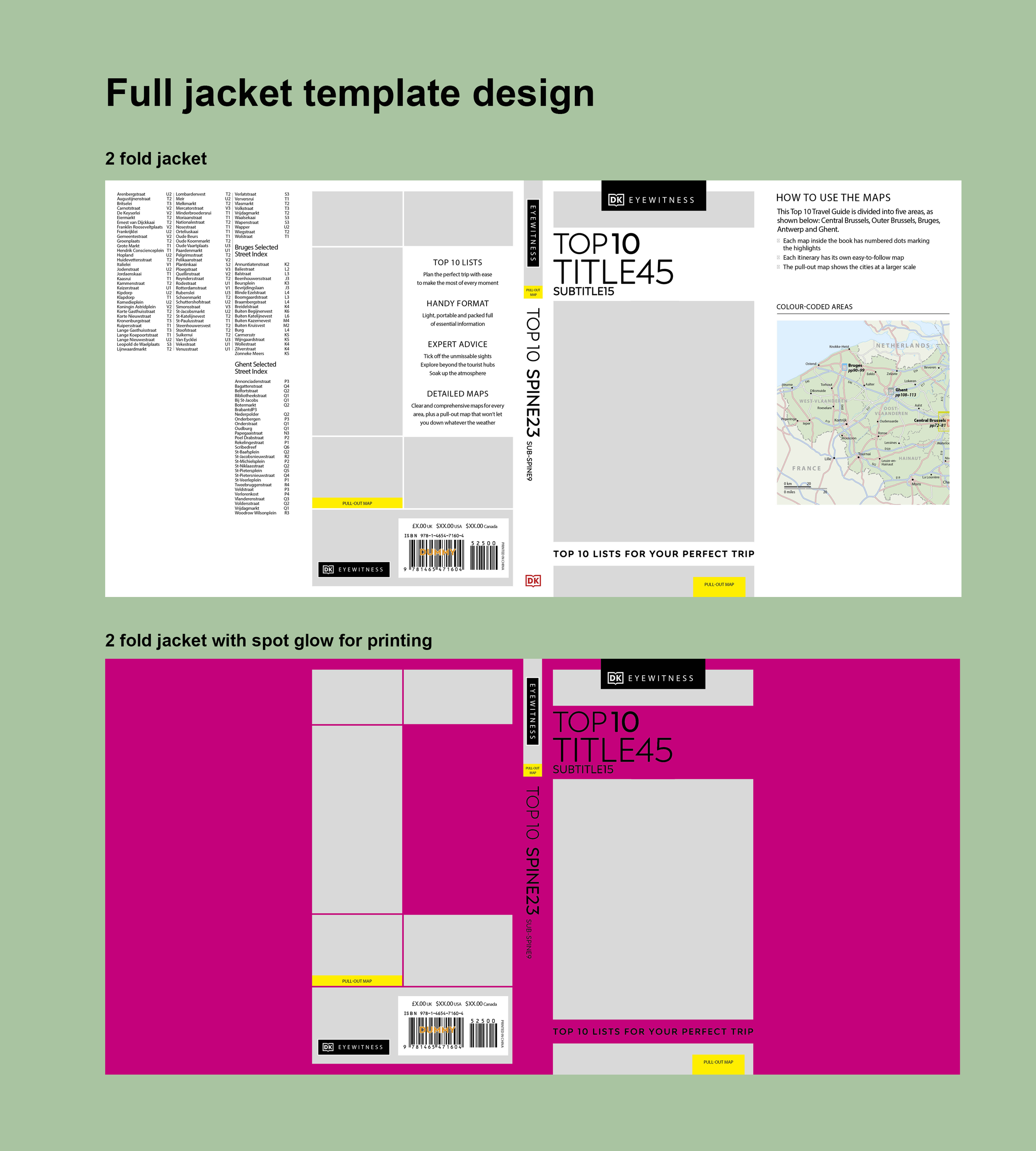
Redesigning jacket covers for visual hierarchy and shelf impact.
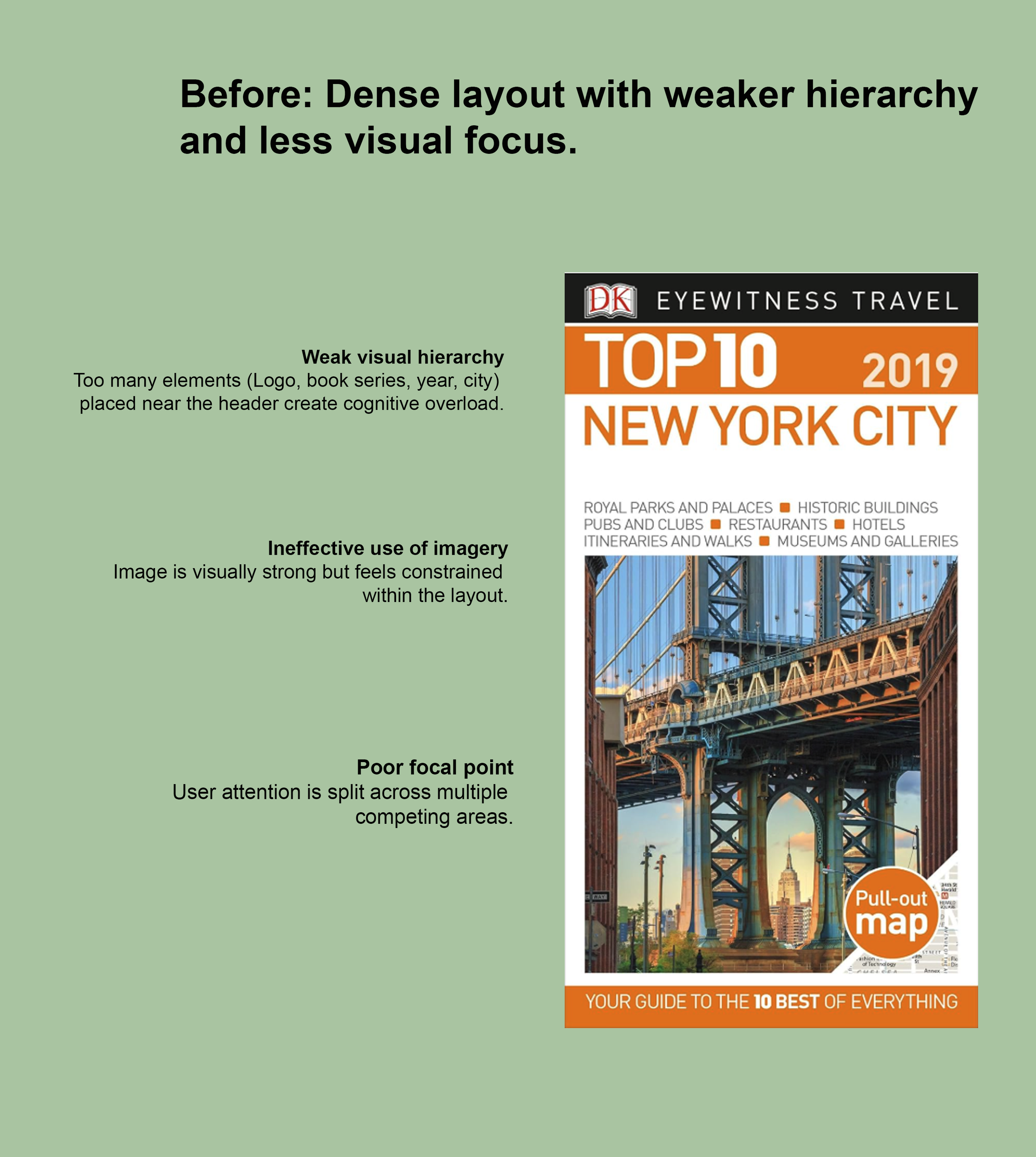
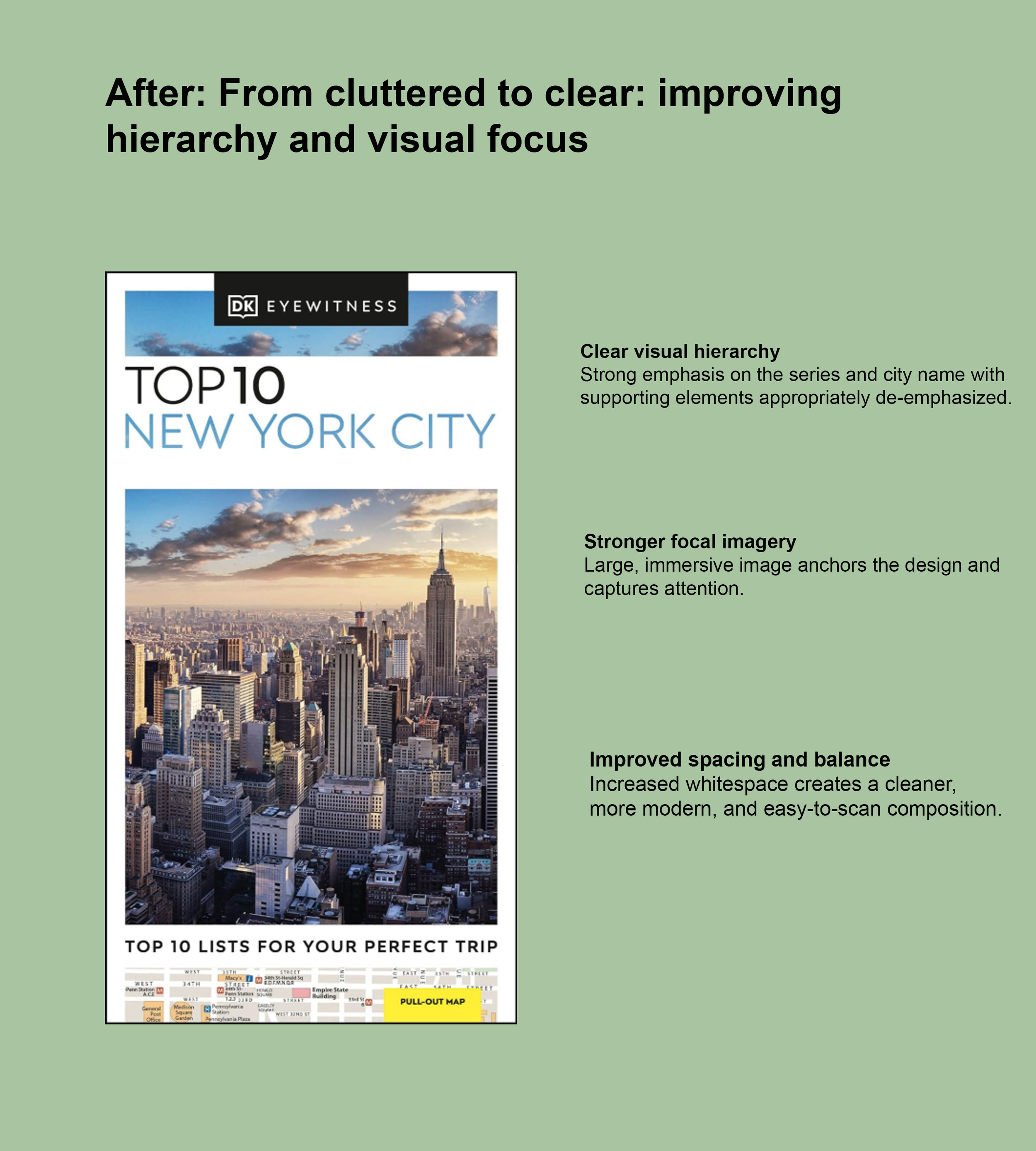
I redesigned jacket covers for the DK Eyewitness series to improve visual hierarchy, reduce clutter, and create stronger focal points that stand out both on shelves and digital storefronts.
The before version had competing elements, dense typography, and no clear entry point for the eye. The redesign simplified the cover to lead with a single hero image, tightened the type hierarchy, and gave the title far more breathing room.
- Reduced visual clutter by removing competing graphic elements
- Established a clear focal point with a single hero photograph
- Tightened typographic hierarchy for stronger title legibility
- Improved shelf and digital storefront presence
Evolving the DK Eyewitness Top 10 style guide.
The DK Eyewitness Top 10 series was produced by teams across London and Delhi, which led to inconsistencies in layout, typography, and visual structure across titles. I updated the existing style guide to create a clearer, more scalable system that could support multiple designers while maintaining a cohesive visual language across the series.
- No clear hierarchy between design guidelines, editorial info, and templates
- Difficult for new designers to quickly onboard and apply standards
- Too much information, overwhelming to navigate
- Limited guidance for different content types: maps, lists, highlights
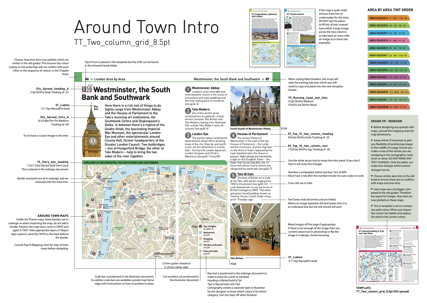
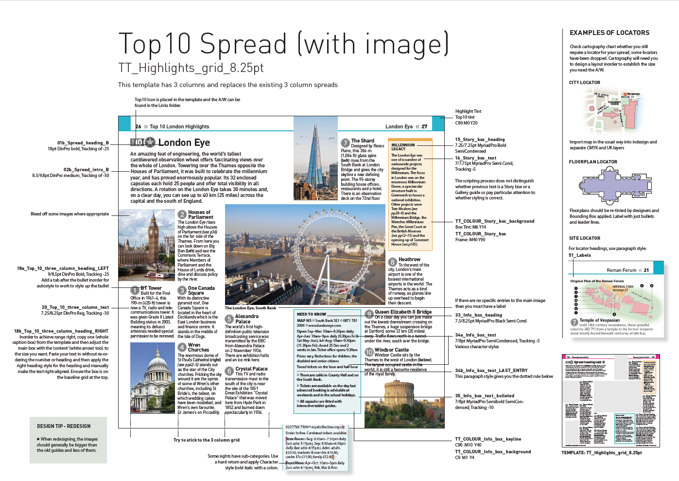
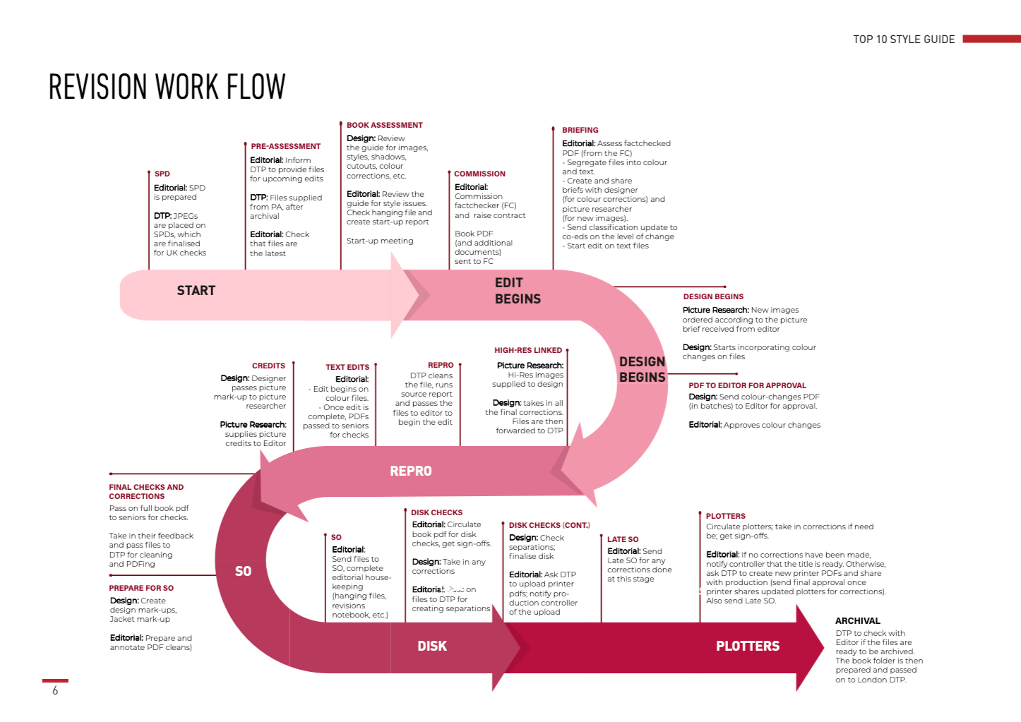
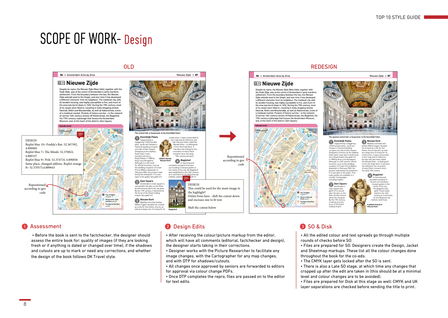
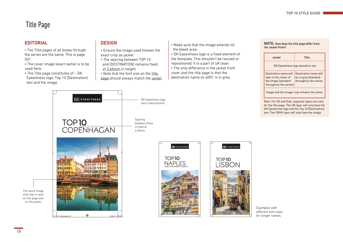
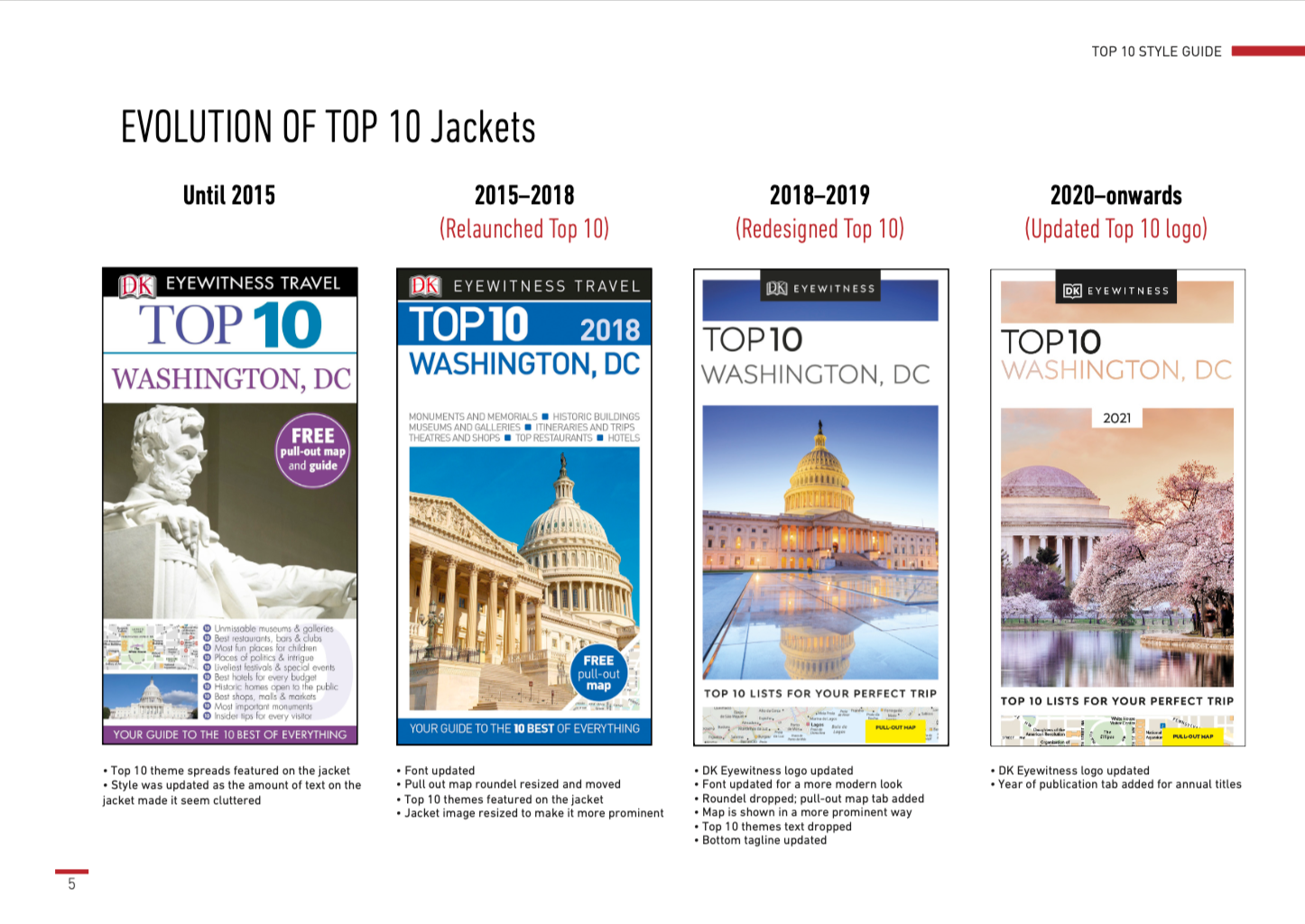
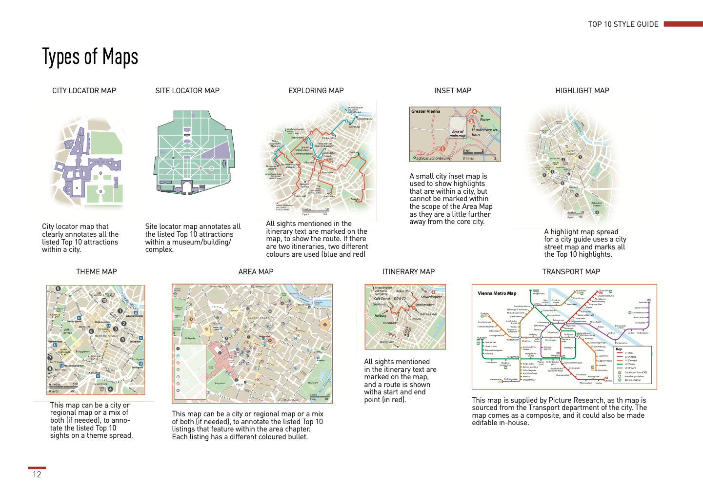
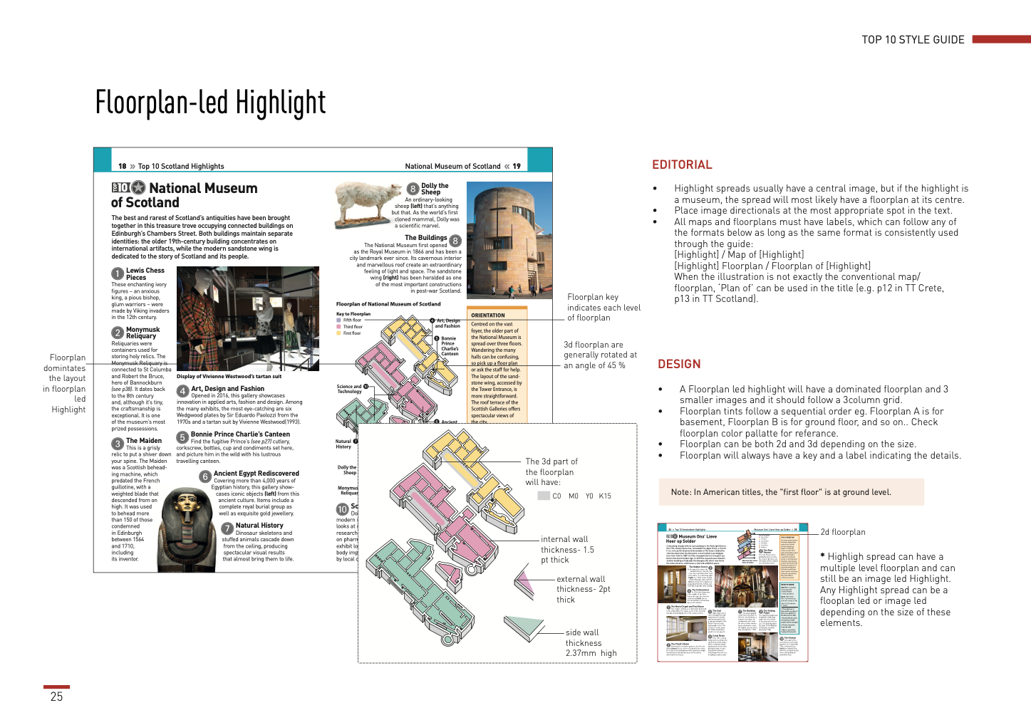
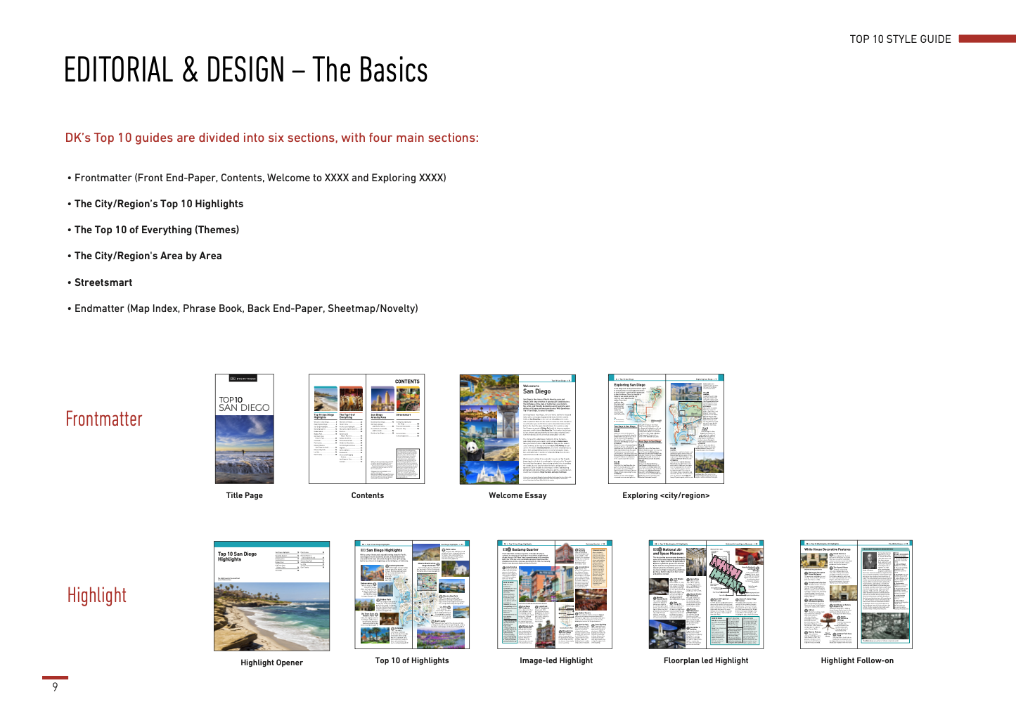
Pages from the old design style guide for DK Eyewitness Top 10 series.
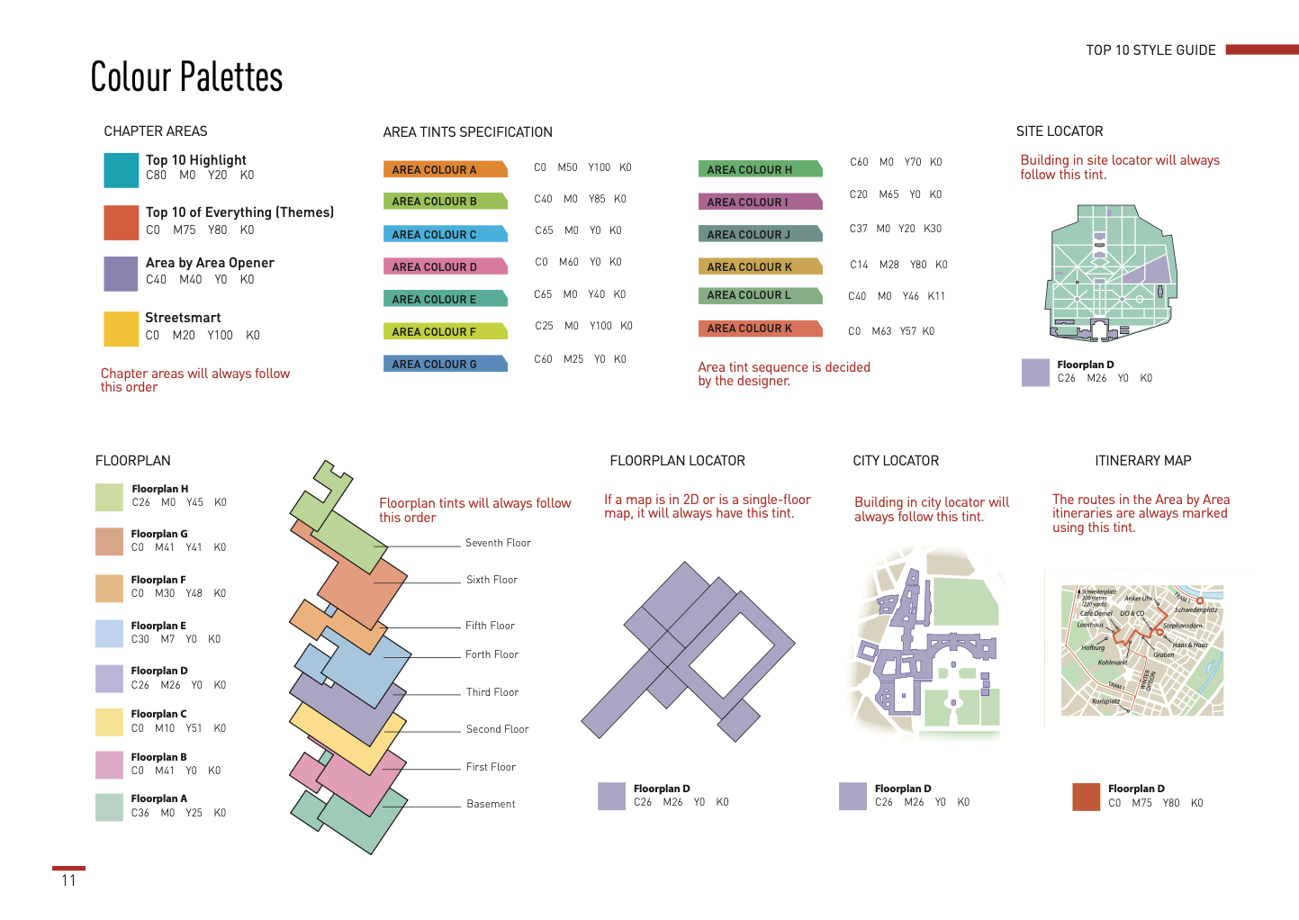
A clear, modular system designers could actually use.
Clearly outlined the structure of Top 10 guides organized into key sections. Introduced guidance on new book vs. revision workflows and included background on past updates and series structure to support onboarding.
Separated editorial and design guidelines into distinct sections to reduce cognitive load. Gave examples of different map types, floor plans, and colors. Simplified templated information to only what was essential for decision-making.
Introduced "Do's and Don'ts" sections to highlight common mistakes. Made it easier to validate decisions quickly by providing key information like text sizes across title sections and exact CMYK codes for flat maps.
All images have been intentionally scaled down to maintain copyright and brand confidentiality.
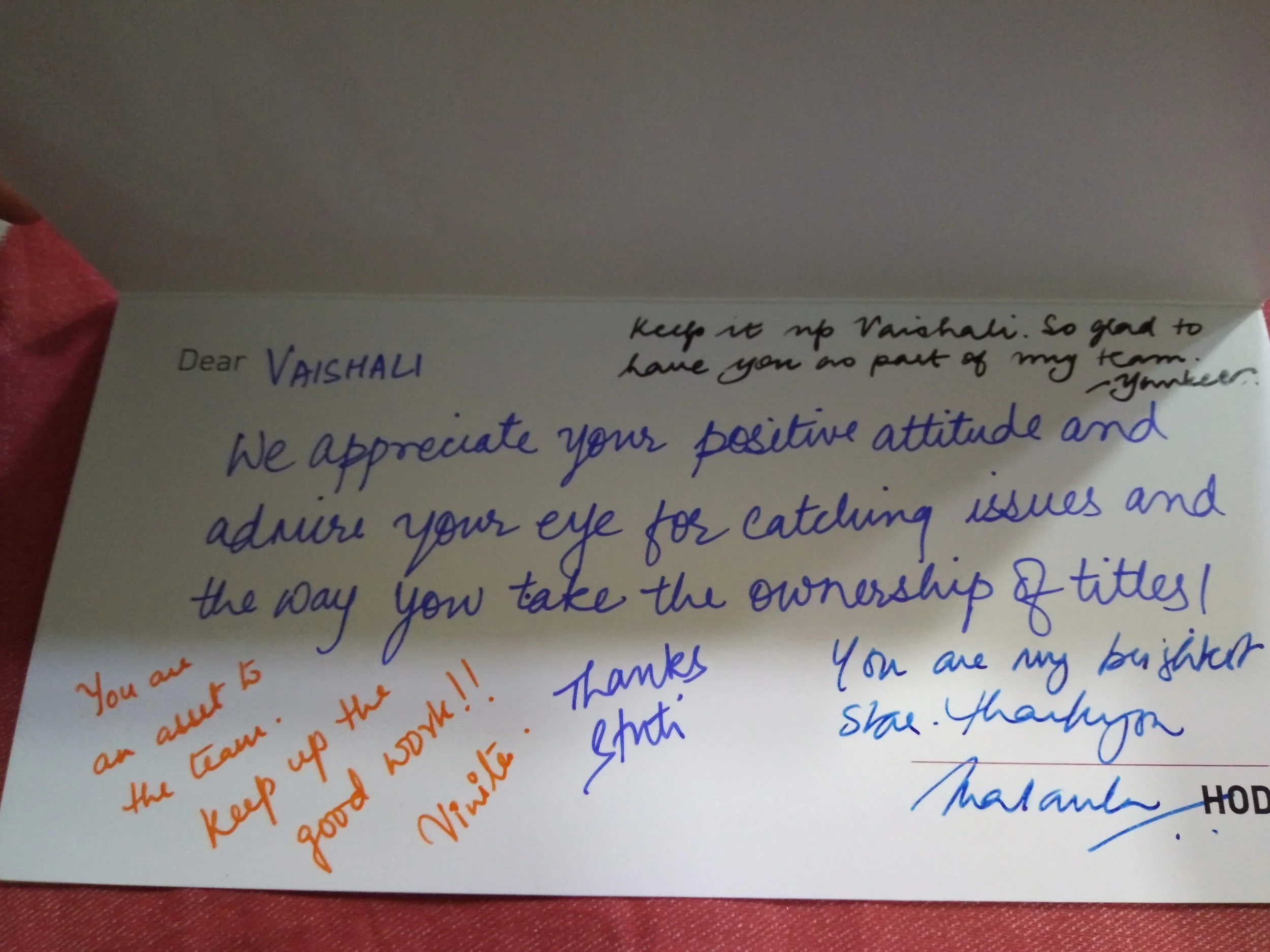
Recognized for craft, collaboration, and growth.
Collaborating with teams at Dorling Kindersley helped me strengthen both my visual craft and understanding of editorial design. Working closely with designers, editors, and authors allowed me to create layouts that balanced aesthetic quality with clarity and accuracy.
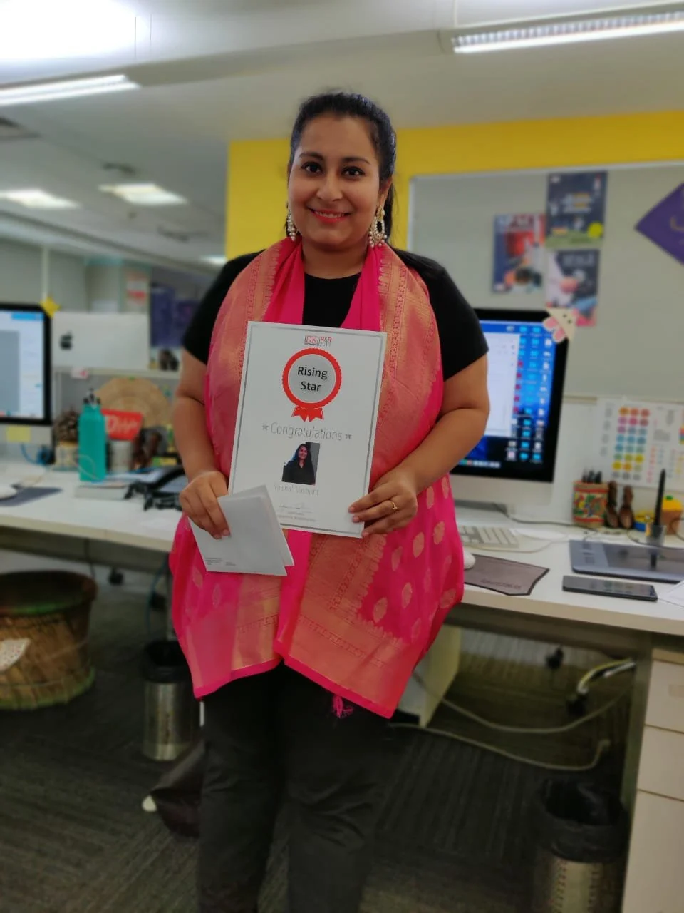
Two performance awards in two consecutive years.
The people, the work, the recognition.
What two years at DK taught me about designing at scale.
Leading the style guide work shifted my perspective from designing individual spreads to designing a system that others could use. I learned how small decisions around typography, layout, and color scale across dozens of titles and multiple teams.
This project reinforced the importance of consistency in building a strong design language. Defining color guidelines, layout patterns, and templates required significant upfront effort, but it created a foundation that made the series more cohesive and easier to scale over time.
Working closely with editors, designers, and other collaborators helped me understand how design decisions impact not just visuals, but content clarity and usability. This experience also helped me grow into a more confident designer and a go-to resource for series-related decisions.