SAMSUNG GALAXY
Analyzing the cover screen features for Z Flip 4 device and identifying areas of opportunities.
Status: Live

Improving usability and personalization of the cover screen on Samsung Galaxy Z Flip 4.
Identifying friction points in the cover screen experience and delivering redesign recommendations — all three of which shipped with the Z Flip 5.
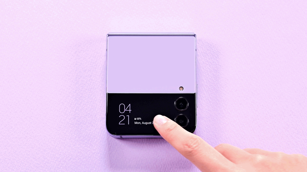
In August 2022, Samsung launched the Galaxy Z Flip 4 with customizable lock screens and enhanced widgets, catering to Gen Z's desire for self-expression. Seeking user feedback, Samsung aimed to enhance the cover screen's usability.
I conducted 8 in-person moderated usability sessions with Gen Z participants, pinpointing 3 key areas for redesign in the cover screen. The findings were presented to Samsung's VP of Design and senior managers at their Bellevue office — resulting in 100% adoption of all recommendations for the Galaxy Z Flip 5.
Three usability gaps that broke the cover screen experience.
Evaluating discoverability, friction, and personalization — across 8 in-person sessions with Gen Z users.
Too many swipes to reach widgets — defeating the cover screen's purpose.
Users had to scroll back and forth repeatedly to access different widgets. Opening the main screen was consistently faster. The high click rate directly undermined the cover screen's core promise of quick access.
Users often swiped back and forth multiple times just to locate widgets.
No on-screen feedback — users had no way to know if they were doing it right.
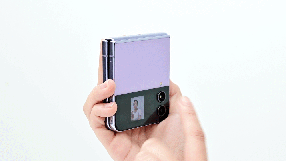
Accessing the camera required a double-tap on hard keys with zero on-screen indication this was even possible. Users resorted to guesswork, and several gave up. The absence of visual cues turned basic tasks into frustrating puzzles.
7 out of 8 users failed to discover the camera feature without prompts.
Widgets and wallpapers shared the same interaction — making both feel confusing.
Both customization modes were triggered by a long-press, but on different screens. Users couldn't predict which mode they'd enter. The lack of visual distinction between the two left people unsure if they were even in the right place.
Users frequently confused editing widgets with changing wallpapers.
How might we make cover screen features instantly discoverable and usable without relying on hidden gestures or prior knowledge?
Three targeted design changes. All three shipped with the Z Flip 5.
Each recommendation directly maps to a usability gap identified during testing.
Reduced friction in accessing widgets.
From hidden navigation → instant access
Users had to swipe multiple times to find widgets — breaking the expectation of quick access on the cover screen.
- Introduced pinch gesture to reveal all widgets in a single view.
- Enabled users to scan and jump directly to any widget.
- Eliminated the need for sequential swiping across screens.
 A pinch gesture transforms widget navigation from linear browsing to instant overview.
Made the camera instantly discoverable.
From invisible feature → visible entry point
Users couldn’t discover the camera because access depended on a hidden gesture with no visual cue. Only 1 out of 8 users could complete this task without assistance—highlighting a critical discoverability and visual clue failure.
- Added persistent camera icon on the cover screen.
- Removed reliance on double-tap gesture for discovery.
- Introduced clear visual affordance for entry.
 Camera icon introduced on the cover screen — giving users a clear, direct pathway to selfie mode.
Separated widget and wallpaper customization.
From shared interaction → clear customization modes
Users couldn’t distinguish between widget editing and wallpaper customization because both used similar gestures and entry points.
- Introduced separate entry points for widgets and wallpaper customization.
- Created distinct visual states for each mode.
- Clarified interaction patterns to match user expectations.
 Redesigned customization flow — single entry point with clearly differentiated widget and wallpaper editing modes.
How did we get here?
8 in-person sessions. 3 usability gaps. All three fixed in the Z Flip 5.
Evaluating discoverability, usability, and personalization preferences — and what we found along the way.
How I researched.
I conducted a usability study with 8 Gen Z participants aged 22–25, including individuals with experience using iPhones, Pixels, OnePlus, and Samsung devices. Sessions were 60-minute, in-person, and used a think-aloud protocol to capture thoughts and reactions during product interaction.
The study focused on evaluating the discoverability and usability of personalization features on the outer cover screen of the Samsung Galaxy Z Flip 4, and gathering user preferences and suggestions for enhancing those features.
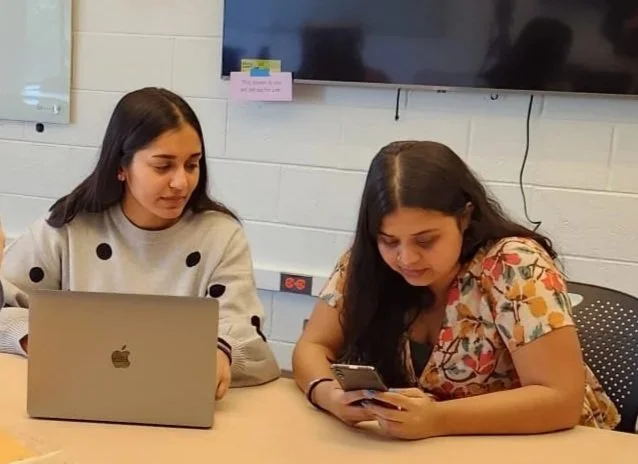 In-person usability testing session with a Gen Z participant.
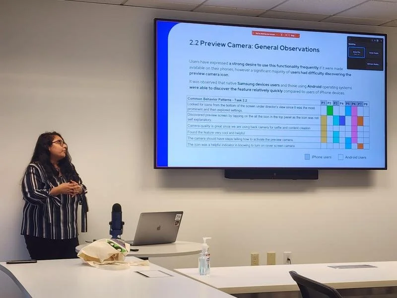
 Rainbow-chart of Behavior Patterns in the Usability Study.
What participants were asked to do.
Three patterns surfaced across all sessions.
Instead of repeating the solution section, this section explains the evidence behind the three design changes — what users actually did, and what the data showed.
Users expected quick access, but widget navigation felt hidden and repetitive.
"The cover screen promised speed, but widget access still depended on repeated navigation."
Users understood the value of widgets, but the path to reach them was slower than expected. Many relied on repeated swiping and trial-and-error, which made the cover screen feel less efficient than the main screen.
- 7/8 users found double-tap to wake the screen frustrating
- 4/8 users found swipe gestures unintuitive
- 3/8 wanted confirmation after adding widgets
Participant struggling to locate widgets during Task 1 — swiping back and forth repeatedly.
The camera feature was valuable, but almost invisible.
"A core feature existed, but users had no visible way to know it was there."
The biggest breakdown happened with the cover screen camera. Users expected an obvious camera entry point, but the feature relied on hidden gestures and unclear cues — and almost no one found it independently.
- 7/8 users struggled to discover the camera
- 4/8 looked for it inside widgets first
- Only 12.5% completed the task successfully
- Average misclicks: 11 — classified as critical severity
Participant attempting Task 2 — unable to locate the camera feature without guidance.
Customization modes blurred together.
"Users liked personalization, but the system didn't clearly separate what could be edited where."
Users wanted to personalize the cover screen, but widget editing and wallpaper customization felt too similar. The system did not clearly communicate where each action lived — leading to frustration even among users who liked the customization options.
- 4/8 users tried to change wallpaper directly from the cover screen
- Users were confused by actions split between cover screen and main phone
- 6/8 users liked the customization possibilities once they found them
Participant during Task 3 — accidentally entering widget edit mode while trying to change the wallpaper.
All 3 recommendations shipped with the Galaxy Z Flip 5.
Delivered to Samsung North America's Bellevue office — praised by the VP of Design and adopted in full.
All 3 design recommendations implemented in the Galaxy Z Flip 5, released December 2023.
Reduction in time on task for key cover screen interactions after the redesign.
Fewer clicks required to complete core cover screen tasks in the updated device.
Findings presented to Samsung's VP of Design and senior design managers at their Bellevue office.
The presentation received enthusiastic praise from the VP of Design and senior managers, who noted that the insights would directly guide future enhancements. All three recommendations were adopted in full and shipped with the Galaxy Z Flip 5 in December 2023.

What the Samsung design team said.
"The insights you've shared today are exactly the kind of user-centered thinking we need. “The depth of your research and clarity of recommendations will directly influence how we approached the next generation of cover screen experiences.”"
What I learned
Running 8 usability sessions and presenting to Samsung's design leadership taught me things that no classroom could have. Here are the three that stayed with me.
Recruit a diverse participant group
Recruiting participants with varied device backgrounds, not just Samsung users surfaced friction that habituated users had learned to ignore. Diversity in the sample made the findings sharper and more defensible.
Observe behavior, not just feedback
What users did consistently diverged from what they said. Subtle hesitations, mis-taps, and workarounds revealed the real usability gaps, especially for undiscoverable interactions like the hard key camera trigger.
Actively check your own bias
Working closely with peers to validate interpretations helped separate personal assumptions from real user behavior. The most impactful findings came from moments I nearly dismissed as outliers.
Three things I'd do differently from day one.
Every research project reveals its gaps in hindsight. These are the decisions I'd make earlier — not because anything went wrong, but because making them sooner would have sharpened the work at every stage after.
-
01Recruit participants earlier in the processScheduling 8 in-person sessions took longer than expected. Starting recruitment before the study protocol was finalized would have compressed the timeline and allowed more time for iteration.
-
02Include more participants unfamiliar with SamsungSeveral participants were longtime Samsung users whose habits masked genuine usability issues. A wider mix of device backgrounds would have surfaced friction points earlier and strengthened the findings.
-
03Map the full cover screen interaction model before testingBuilding a complete interaction map upfront would have helped write sharper task scenarios and identify edge cases before they surfaced mid-session — saving time and reducing noise in the data.