HIMALAYA WELLNESS
Reimagining the product page experience to build trust, increase discoverability and drive conversions
Status: Live
Reimagining Himalaya's product page to build trust, improve discoverability, and drive conversions.
Transforming an information-heavy, low-trust experience into a visual, conversion-focused product page for a global herbal wellness brand.
Himalaya Wellness, a global leader in herbal products, was experiencing high drop-off rates on its product pages. The existing experience was overloaded with text, lacked compelling visuals, and failed to provide key trust signals such as reviews or related products.
I led the end-to-end redesign of the product detail page — conducting UX audits, usability research, and competitive analysis to identify friction points, and delivering a visual, trust-driven experience that shifted the page from information overload to product storytelling.
Three gaps in the product page experience — all undermining trust and conversions.
Users couldn't quickly understand what the product does, why it works, or whether it's trustworthy.
Information overload with no visual hierarchy.
The page was packed with long paragraphs of text but lacked compelling visuals, clear hierarchy, or scannable sections. Users couldn't quickly find what they needed before deciding to purchase.
"The page is packed with information, but it doesn't clearly communicate the benefits or ingredients." — Product Manager
No trust signals — reviews, imagery, or ingredient transparency.
The page omitted customer reviews, authentic product imagery, and clear ingredient information — all critical for wellness products where users need confidence before purchasing.
"I want to see real product pictures and user reviews before making a purchase. What if it's not authentic?" — P1
Weak product discovery — no related products or recommendations.
Users landing on a product page had no way to explore complementary products or discover the broader range. The page treated each visit as a one-time transaction rather than a wellness journey.
"Our current product page is experiencing a high bounce rate. Customers are leaving without making a purchase." — Sales Manager
Design a product page that builds trust, communicates benefits clearly, and drives conversions?
The redesign needed to shift the experience from information overload to visual product storytelling — making it easier for users to understand what a product does, why it works, and feel confident enough to buy.
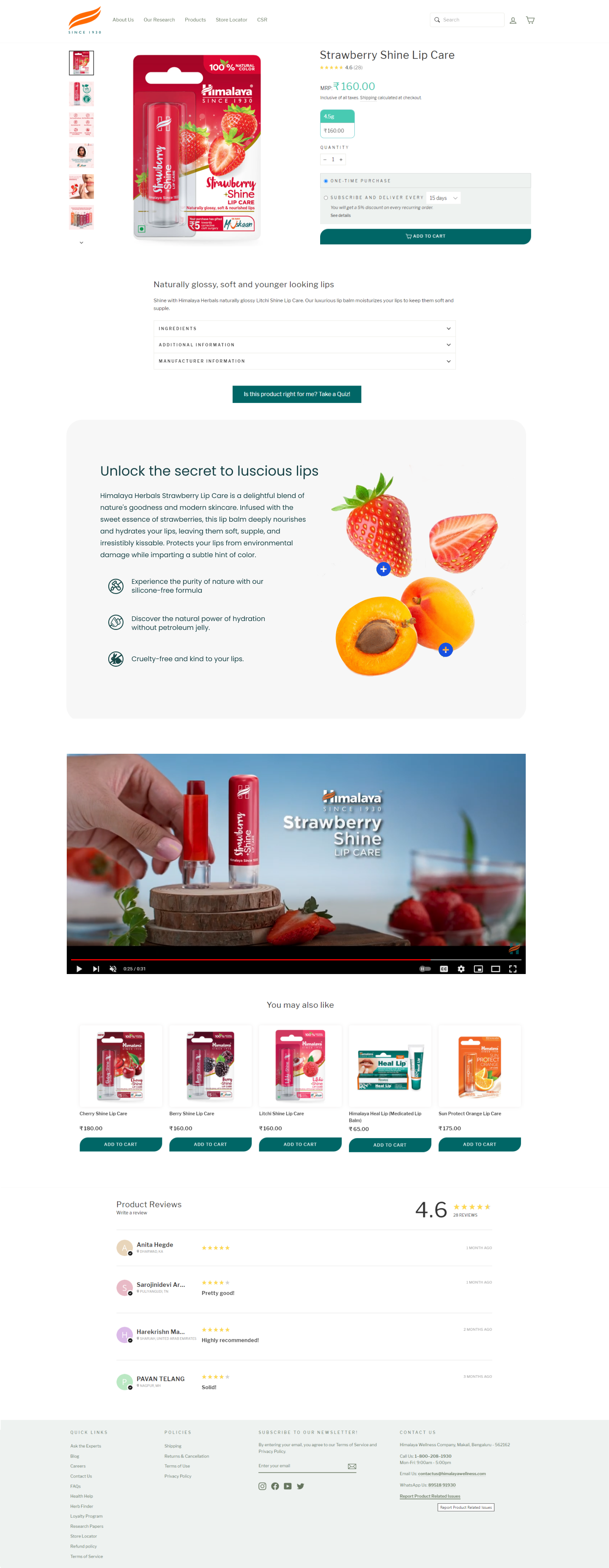
From information overload to visual product storytelling.
The redesigned product page highlights ingredients, builds trust through transparency, and supports both first-time and repeat purchases.
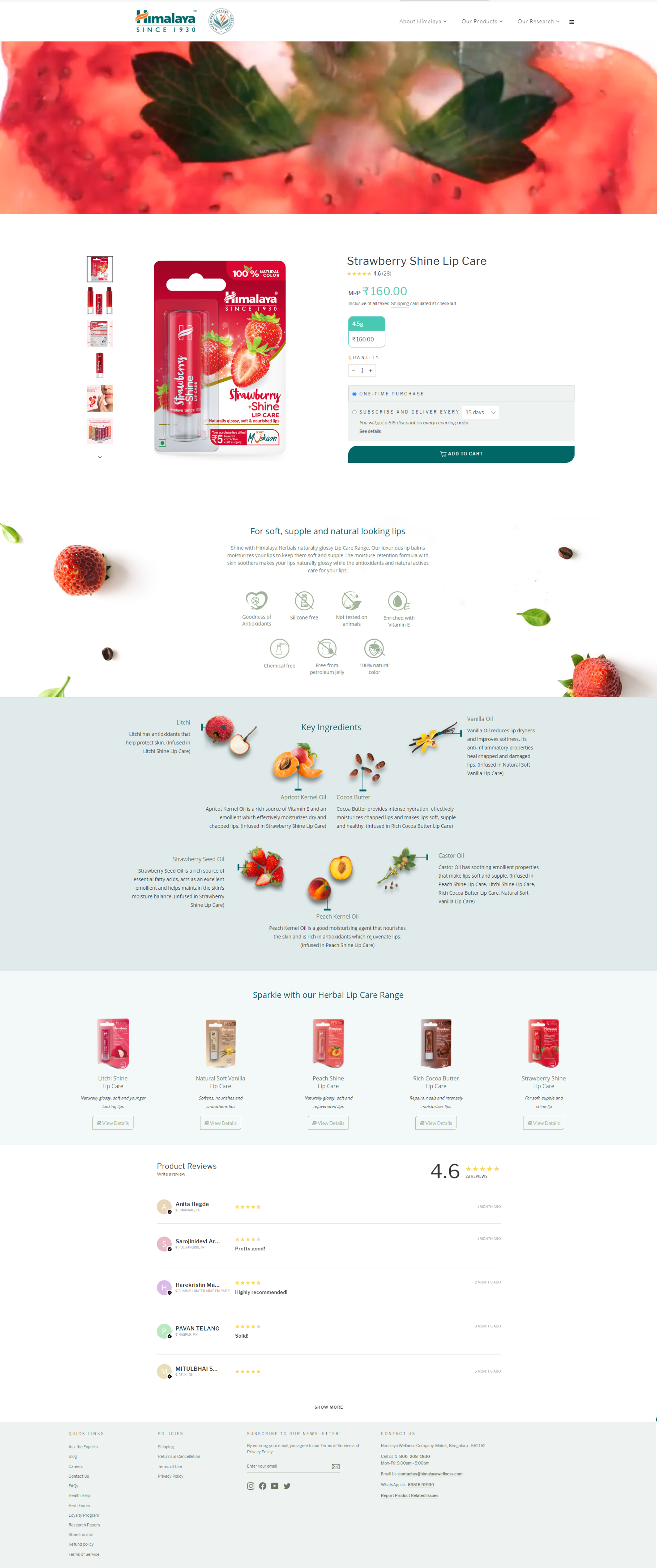
Text-heavy, no trust signals, low visual appeal.
Visual storytelling, trust signals, subscription purchasing, and product discovery.
Reason-to-believe posters
Icon-led visual modules highlighting key ingredients, benefits, and product properties — replacing walls of text with scannable, trust-building visuals.
Accordion-based information layout
Detailed product information organized into collapsible sections — reducing cognitive load while keeping everything accessible for users who want to dig deeper.
Subscription-based purchasing
A recurring purchase option allowing customers to receive products at regular intervals — supporting long-term wellness routines and increasing repeat purchases.
Related product recommendations
Suggested complementary products to support discovery and cross-selling — turning a single product visit into a broader wellness journey.
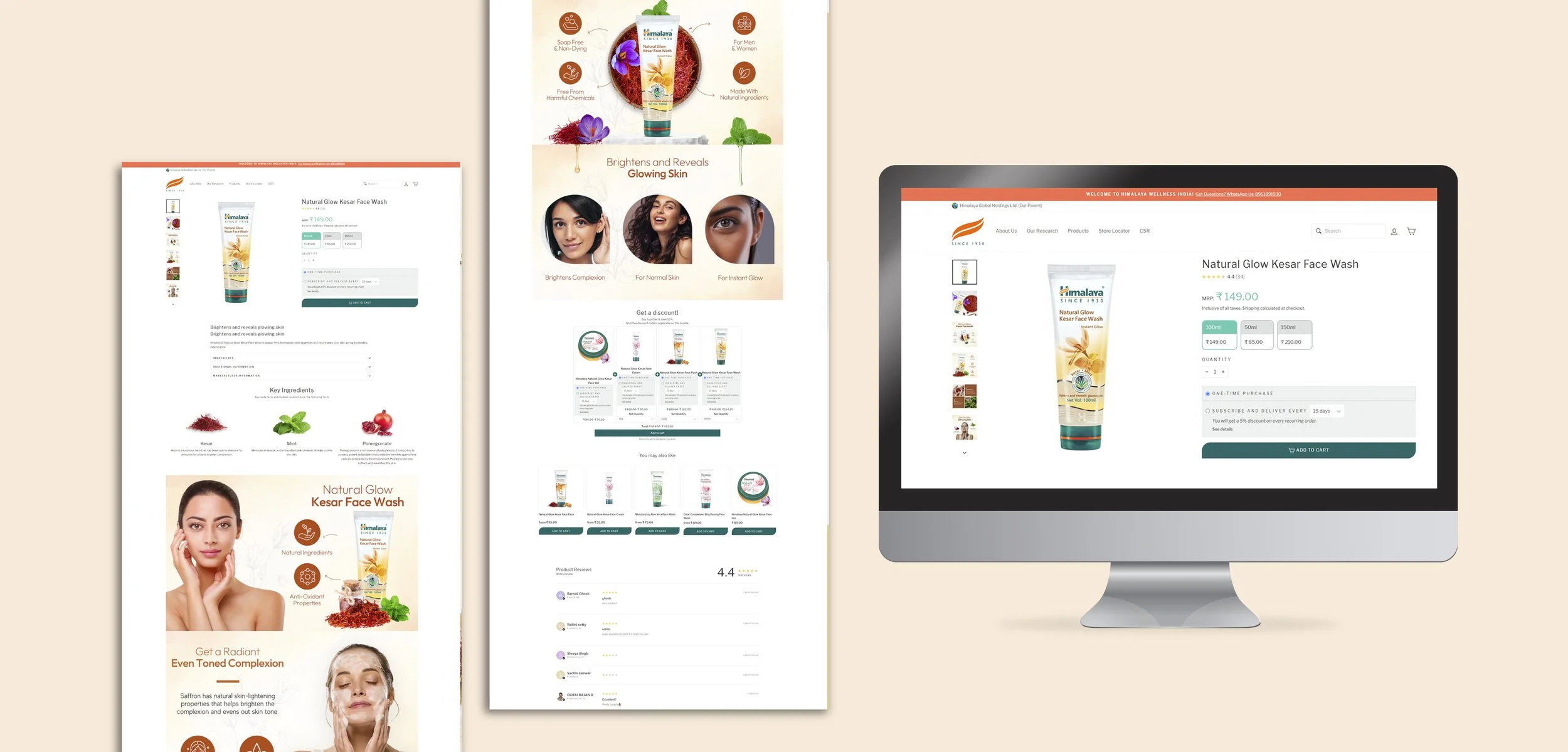
Overview of the redesigned Himalaya product page experience — reason-to-believe posters, subscription purchasing, and related product recommendations.
So how did we get here?
Understanding the problem before designing the solution.
Blending quantitative and qualitative research to identify patterns, uncover pain points, and prioritize areas for improvement.
How I approached the research.
I blended quantitative and qualitative approaches to identify patterns and uncover user pain points. The existing product page was burdened with excessive text, lacked comprehensive product visuals, and failed to offer an appealing visual experience — omitting crucial sections such as product reviews and suggested product pairings.
Audited the existing product pages against Nielsen's 10 usability heuristics to surface design problems and accessibility issues.
Conducted 8 usability testing sessions to observe how users interacted with the existing website and identify friction points.
Studied competitor websites including Forest Essentials, Biotique, and Mamaearth to benchmark against industry design standards.
What users struggled with.
-
01
Couldn't understand the product quicklyUsers struggled to understand what the product does, why it works, and whether it is trustworthy before committing to a purchase.
-
02
No trust signals to validate the purchaseReviews, real imagery, and ingredient transparency were absent — leaving users with no social proof or confidence before buying.
-
03
Slow loading times compounded the experienceThe website frequently experienced slow loading times, resulting in a subpar user experience and contributing to the high bounce rate.
-
04
Product discovery was weakUsers could not easily explore related or complementary products — each visit was treated as a standalone transaction.


"I want to see real product pictures and user reviews before making a purchase. What if it is not authentic?"
— Usability testing participantWhat the research told us.
Reviews, real imagery, and ingredient transparency were critical to building user confidence — especially for a wellness brand where authenticity matters.
Long paragraphs created cognitive overload. Users needed structured, visual hierarchy — not more text — to evaluate a product quickly.
Competitors were using ingredient imagery, lifestyle photography, and benefit-led design. Himalaya's pages felt static and generic in comparison.
Users wanted to explore — but the page offered no related products, no cross-selling, and no pathway to broader discovery within the Himalaya range.
From insights to a visual, trust-driven, conversion-friendly product experience.
Four design principles shaped every decision — from color palette to component structure to interaction patterns.
Four principles that shaped the redesign.
Highlight ingredients, benefits, and customer feedback — giving users the confidence to purchase without doubt.
Structure information using clear visual hierarchy and collapsible sections — replacing walls of text with scannable layouts.
Encourage exploration through related product recommendations — turning one-time visits into broader wellness journeys.
Introduce subscription-based purchasing for frequently used products — supporting long-term wellness routines and increasing retention.
A new color palette and iconography system.
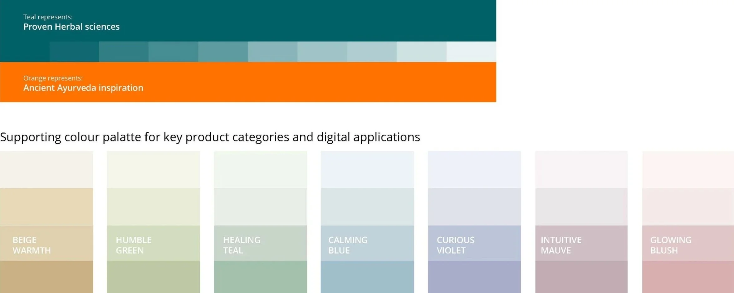 New color palette — earthy tones rooted in natural ingredients.
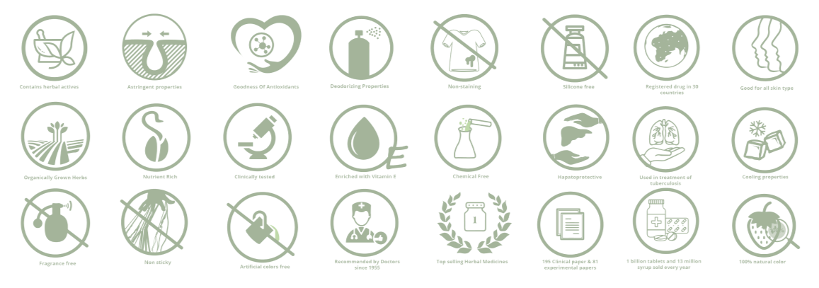 Product-specific iconography — benefit-led visual language for each product range.
The redesigned product page experience.
The redesign focused on creating a visual, trust-driven, and conversion-friendly product experience. The new design highlights ingredient benefits, authentic product imagery, customer reviews, and subscription-based purchasing, while using accordions to reduce clutter and improve scannability.
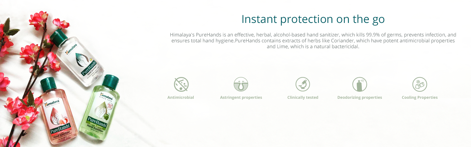
Icon-led visual modules highlighting key ingredients, benefits, and product properties.
Detailed information organized into collapsible sections — reducing cognitive load.
Recurring purchase option supporting long-term wellness routines and repeat purchases.
Suggested complementary products supporting discovery and cross-selling.

Overview of the redesigned product page experience.
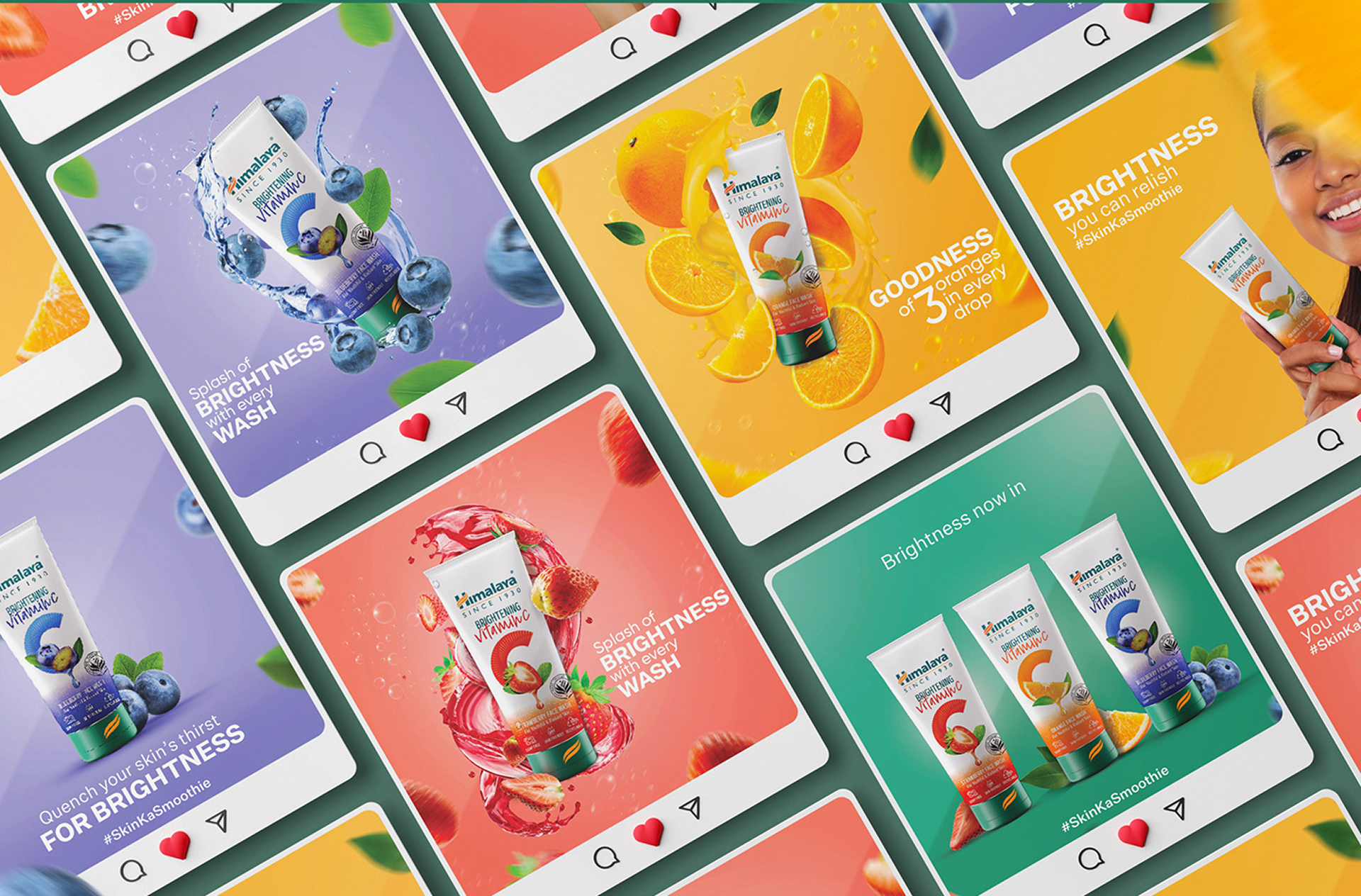
Product specific reason to believe banner, which was later converted to reason to believe posters.
I introduced reason-to-believe product banners that use iconography and concise messaging to highlight key ingredients, benefits, and product properties. These banners help users quickly understand what makes each product unique. To create a more engaging entry point, I experimented with several hero banner styles, including:
- → Benefit-driven headlines framed as user questions
- → Lifestyle imagery showing real product usage
- → Animated GIFs to add visual interest and highlight product application
Below are some of the banner and GIF explorations across different product ranges.


Product specific reason-to-believe banners — which were later converted to side posters.
The clients enthusiastically embraced the concept — but feedback from multiple teams highlighted issues that required a rethink.
"We are having difficulty coding all the banners while maintaining it visually pleasing for different screen sizes and screen types."
"Excessive GIFs increase load times and can slow the website significantly."
"The excessive use of banners is distracting from the main product. The product should be the focal point, with other elements playing a supportive role."
 Full-width reason-to-believe banners — high scroll rate, product de-emphasised.
 Side posters alongside the product — product stays the focal point.
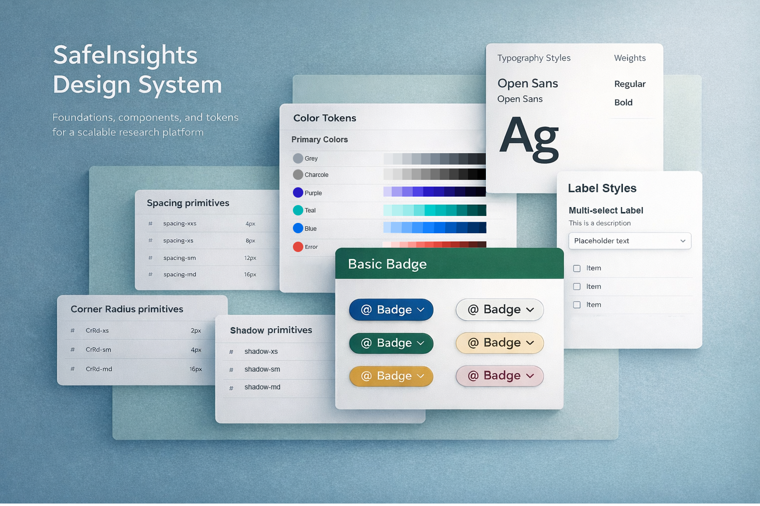
A scalable foundation built for Himalaya's growing digital ecosystem.
From primitives to components — a structured system designed for clarity, trust, and consistency across the platform.
Building the system from the ground up.
I approached the design system as both a product and a foundation for scale. I began by auditing existing screens and components to identify inconsistencies in layout, typography, color usage, and interaction patterns.
From there, I defined a set of core design principles focused on clarity, trust, and scalability — translating these into a structured set of primitives and building reusable components on top using a modular approach. Each component was designed to be flexible and adaptable across use cases, reducing redundancy and ensuring consistency across the platform.
-
01
Audit firstReviewed existing screens to surface inconsistencies in spacing, color, and component patterns before building anything new.
-
02
Primitives before componentsDefined color tokens, typography scale, and spacing rules first — ensuring every component built on top was consistent by default.
-
03
Modular and reusableEach component was designed to be flexible and adaptable — reducing redundancy and making it easy to extend the system as the product grew.
Color, typography, and spacing.
The foundation layer defined the visual language of the system — a warm, earthy color palette rooted in natural ingredients, a clear typographic hierarchy, and a consistent spacing scale that ensured rhythm across every screen.
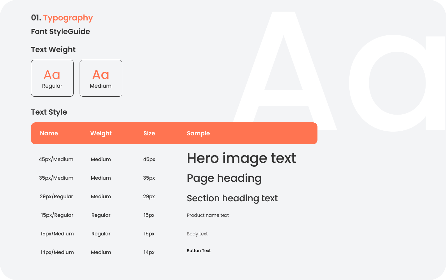 Typography scale — hierarchy for headings, body text, and labels.
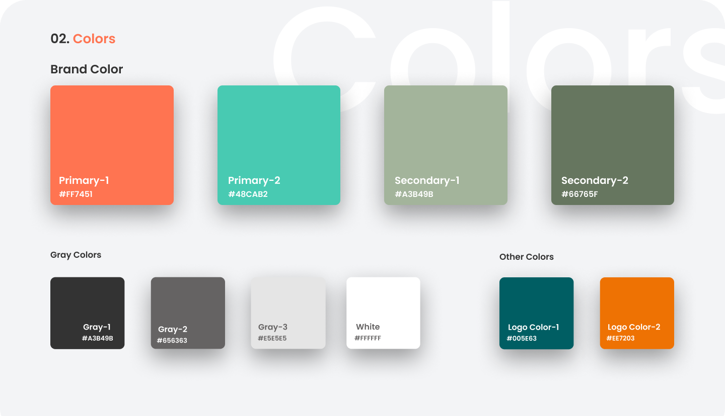 Color foundations — primary, secondary, and neutral palette.
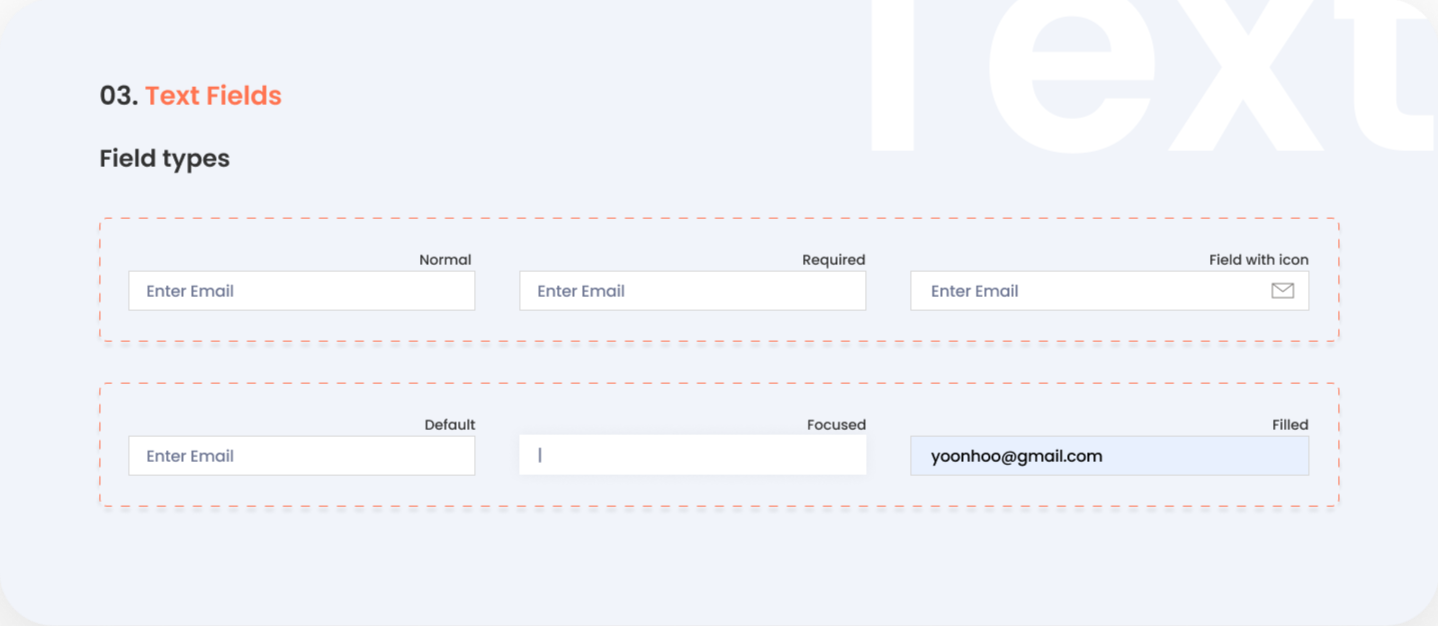 Text fields
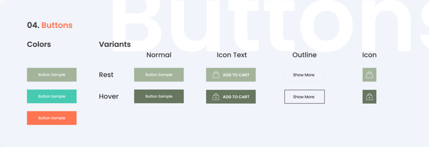 Buttons and state
Reusable building blocks for the product page.
Built on top of the foundation layer, the component library covered everything from buttons and form elements to product cards, accordions, review modules, and subscription selectors. Each component was documented with variants, states, and usage guidelines to support design-dev handoff.
 Product card component
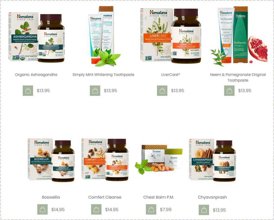 Product card with — with add-to-cart action.
The redesigned product page significantly improved both user engagement and business performance.
Helping Himalaya better communicate the value of its herbal products online — and giving users the confidence to buy.
Improvement in user comfort scores — users reported feeling more confident navigating the website and evaluating products.
Reduction in bounce rate — a more visual, structured layout reduced information overload and encouraged users to explore the page.
Increase in online product sales — improved product storytelling and clearer trust signals helped users make confident purchase decisions.
Translating Himalaya's ingredient narratives into icon-led modules and visual sections made product benefits easier for users to scan and understand — reducing drop-off before purchase.
Reviews, authentic imagery, and ingredient transparency gave users the confidence to buy. For a wellness brand, these signals weren't optional — they were essential.
Subscription-based purchasing and related product recommendations turned the product page into a long-term wellness tool — not just a one-time transaction point.
What I learned
Three things that stayed with me from redesigning a product page for a global wellness brand.
Visuals do more than aesthetics — they reduce friction
Icon-led modules and visual storytelling made product benefits scannable in seconds. The design work wasn't decorative — it was doing cognitive work that text alone couldn't.
For wellness, trust must be designed — not assumed
Reviews, real imagery, and ingredient transparency weren't nice-to-haves — they were the threshold users needed to cross before they'd consider buying. The design had to earn confidence before asking for a decision.
Stakeholder feedback is useful — but it's not user research
The biggest design pivots on this project came from internal feedback, not user data. It worked out — but having usability evidence earlier would have made those decisions faster and more defensible.
Three things I'd do differently.
Not failures — just decisions I'd make earlier to sharpen the work at every stage after.
-
01Loop in development earlierBanner complexity surfaced late. Involving developers during early exploration would have saved a full iteration cycle.
-
02Test before presenting to stakeholdersA quick usability check before the client presentation would have given me objective evidence rather than relying on stakeholder instinct.
-
03Set performance constraints upfrontGIF-heavy designs looked great in Figma but caused real site performance issues. Defining animation budgets at the start would have prevented a costly rethink.