BELLEVUE PARKS AND COMMUNITY SERVICES
Improving the Parks & Community Services website so that users have an easier time finding information.
Status: In-process
Redesigning Information Architecture for Bellevue Parks & Community Services.
Transforming a department-siloed, 400-page website into a user-centered navigation system for 100K+ annual visitors.
Bellevue Parks & Community Services manages 100+ parks, 80+ miles of trails, and hundreds of recreation programs — all buried in a website organized by internal department structure, not user needs.
I led the end-to-end redesign of the site's information architecture and navigation system, conducting research with 200+ participants, designing and validating a mega-menu structure, and reducing average clicks to find information from 7 to 3.

A website built for the department, not the resident.
The site was difficult to scan, hard to explore confidently, and lacked visual cues to help users know where they were or what to do next.
Navigation was siloed by internal department structure — completely disconnected from how residents think about parks and services. Users looking for a tennis court had to know it lived under "Sports and Athletics" inside "Parks and Community Services" inside "City Government." There was no shortcut, no search that helped, and no visual hierarchy to orient them.
This wasn't a surface-level visual problem. It was a fundamental mismatch between how the organization structured information and how residents needed to access it.


Overwhelming, Text-Heavy Navigation
Too many categories with department-based labels and no visual grouping — impossible to scan and choose the right path quickly.

No Visual Hierarchy
Flat layouts across navigation and interior pages — no structure or visual anchors to guide users, especially first-time visitors.

No Visual Feedback on Interaction
Menu items required clicking to explore with no hover states — users couldn't tell if items were links or just headings.

Disconnected Breadcrumbs
Breadcrumb placement rarely aligned with where users expected to be — creating disorientation and eroding navigation confidence.
A multi-method approach to map failure points and understand mental models.
To understand what users searched for, where they failed, how they mentally group parks content, and whether a new structure would work — I ran five complementary research methods across 200+ participants.
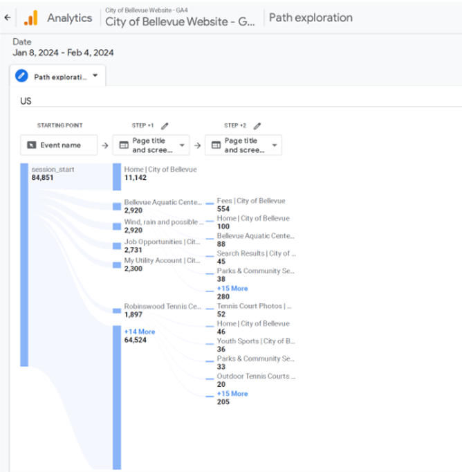
Google Analytics Review
400+ pages, 12 months of data. Identified 30 pages with zero visits and 40+ with under 120 annual visits — prime candidates for consolidation.
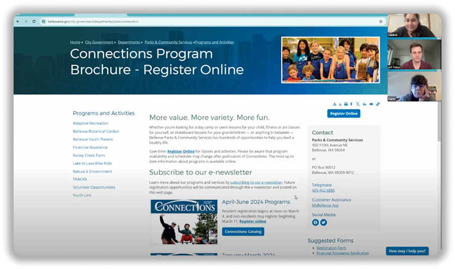
Usability Testing
10 remote sessions, 60+ survey participants, 45 min each. Tracked navigation paths and directly observed where users got stuck.
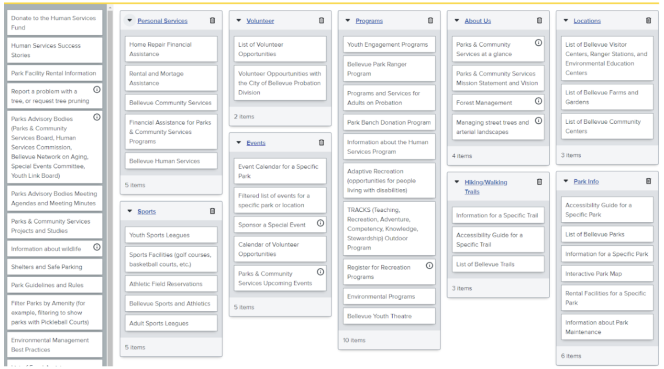
Card Sorting
62 cards, 53 participants over 2 weeks. Open sort revealed how users naturally group parks content — forming the new IA's backbone.
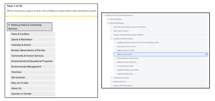
Tree Testing
123 participants validated the new IA. 70% overall success rate across 10 navigation tasks including courts, rentals, and financial assistance.
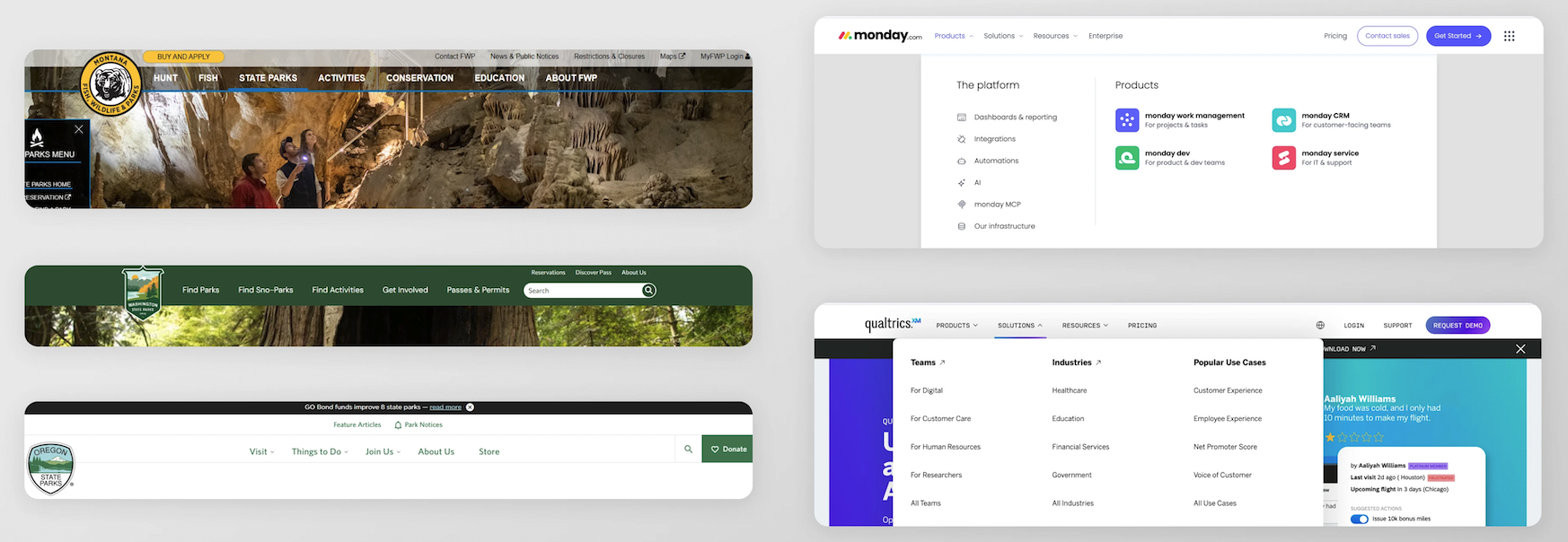
Competitive Analysis
Audited 5 major parks websites and 10 top navigation patterns. Three principles emerged: encourage exploration, minimize clicks, structure builds confidence.
Mapping, breaking, and rebuilding how 400+ pages were organized.
The old website mirrored the city's org chart — not how residents think. Here's how I diagnosed the structural failures, iterated through three versions, and arrived at a user-centric architecture.
Before any redesign work, I mapped the entire existing site — all 400+ pages — into a FigJam diagram to understand exactly how content was organized and where the structural failures lived. The scale of the problem became immediately visible — a sprawling, department-siloed structure with content duplicated across sections, critical pages buried deep, and no organizing principle that matched how residents actually think about parks and services.
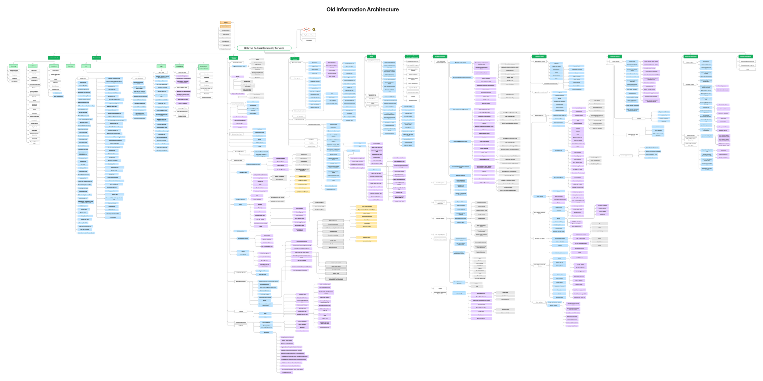
Old IA — 400+ pages organized by department, not by user need · View in FigJam →
Organized by org chart, not user tasks
The entire site mirrored the City's internal department structure. Users had to navigate Menu → City Government → Departments → Parks & Community Services before reaching any useful content. Nothing was organized around what residents come to do — find a park, book a facility, register for a program, get assistance.
Card sorting revealed 409 unique mental models — radically different from the existing structure.
Critical content buried and duplicated
Financial Assistance — one of the most searched terms — was buried 3–4 levels deep. Volunteer opportunities appeared under Nature & Environment, Community Centers, and Sports separately. Rentals existed under Sports, Community Centers, AND as its own top-level item. Users couldn't predict where to look.
Top usability failure: users gave up before finding financial assistance.
Overlapping sections with no clear distinction
Nature & Environment and Parks & Trails both covered the same locations — Kelsey Creek Farm, Mercer Slough, Lewis Creek — but split content between them with no clear rule. Sports and Programs were separate categories even though users think of them as one thing.
67% first-click failure on nature-related tasks in tree testing.
Internal content mixed with public content
Planning and Development — containing construction projects, feasibility studies, and steering committee minutes — sat at the same top level as Parks and Trails. ~30 pages received zero public visits in a year. The site served the department's needs, not the resident's.
40+ additional pages received fewer than 120 visits annually.
Three versions before the final structure
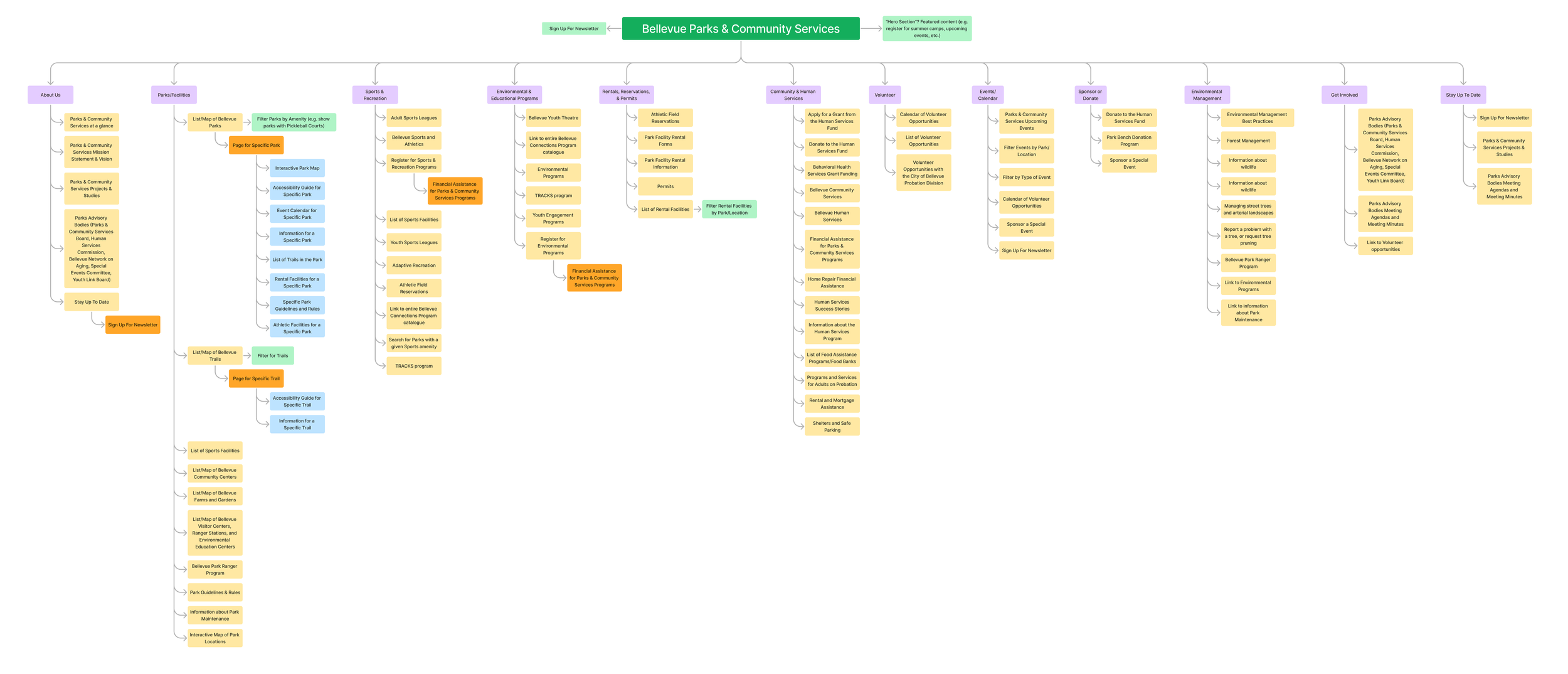
Breaking the department silos
Replaced department-based categories with user-intent categories: Parks/Facilities, Sports & Recreation, Environmental & Educational Programs, Rentals & Permits, Community & Human Services, Volunteer, Events, Sponsor, Environmental Management, Get Involved, Stay Up To Date.
Issue: 12–13 top-level items — too many for users to scan. "Volunteer" and "Get Involved" overlapped. "Environmental Management" and "Sponsor or Donate" felt out of place as top-level nav items.
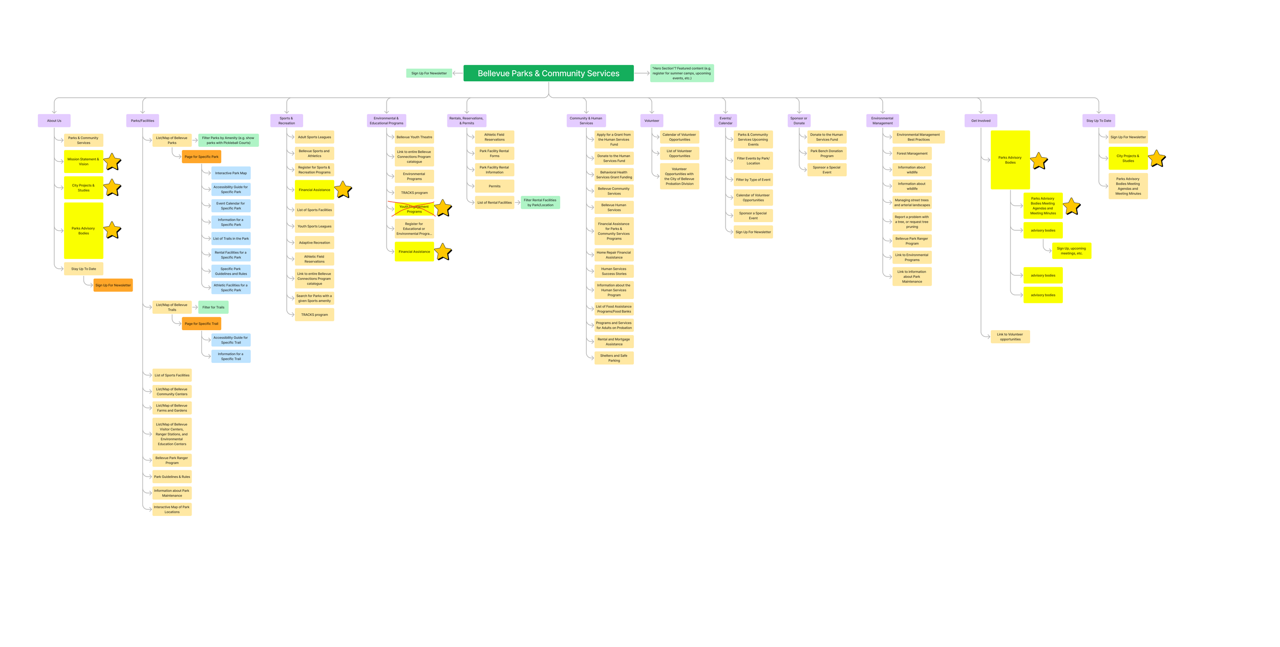
Tree testing refinements
Applied tree testing insights — starred items show content that moved based on low first-click and task success scores. Financial Assistance elevated. Youth Engagement Programs flagged for removal. Some sections consolidated based on where users actually clicked first.
Issue: Still 12 top-level items. Low-scoring tasks (volunteer: 67% first click, financial assistance: 75%) showed labels weren't intuitive enough. Structural overlaps remained.
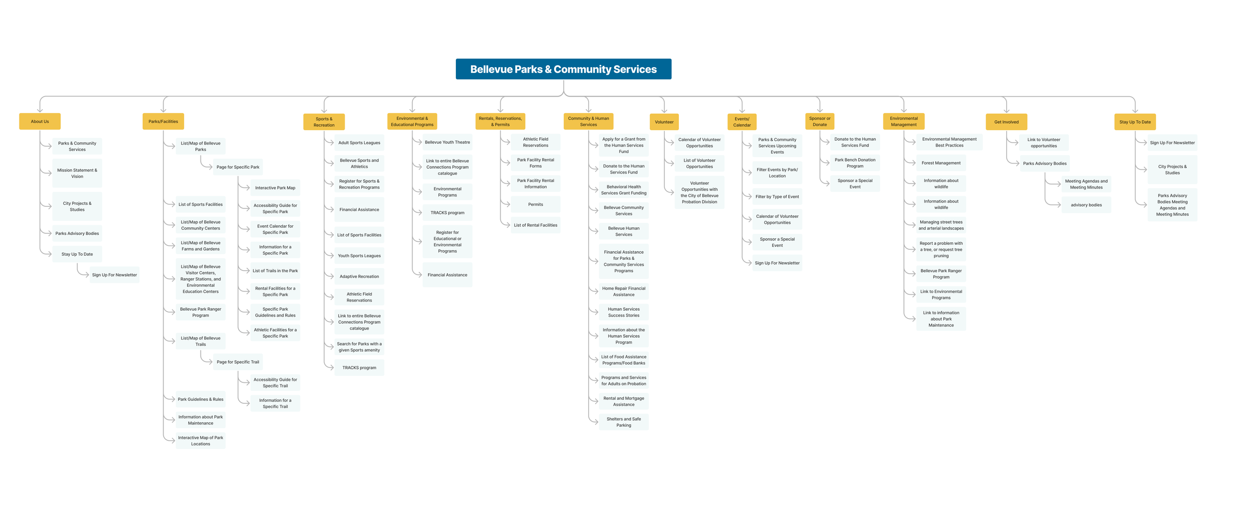
Cleaner labels, refined hierarchy
Stars removed, labels refined for clarity. "City Projects & Studies" replaced "Planning & Development." Parks Advisory Bodies streamlined with nested agendas. Financial Assistance made more prominent. Youth Engagement Programs removed.
Issue: Better labels, but still 11+ top-level items. "Environmental Management," "Sponsor or Donate," and "Stay Up To Date" remain as standalone categories — too granular for top-level nav.
Version 4 — Recommended structure
Consolidating three versions of iteration into a single user-centric structure. The core shift: instead of organizing by content type (Sports vs Programs vs Activities), V4 organizes by user intent — what do you want to do? 6 top-level items down from 12+, with zero overlap between categories.

Version 4 — 6 user-intent categories · zero duplicate sections · financial assistance elevated
Three principles that shaped the new structure
From the card sorting analysis — similarity matrix, dendrograms, PCA, and 3D clustering — three clear organizing principles emerged that replaced the old department logic entirely.
Consolidated Park Pages
All details about a specific park — trails, fields, rentals, reservations — accessible from one dedicated page. No more hunting across department sections.
Multiple Access Points
Users can complete tasks like reserving a field from the park page, Sports section, or Rentals — reflecting how different users approach the same task.
Do vs. Know
Clear hierarchy separating action-oriented content (find, book, register) from informational content (about, mission, advisory board).
Three deliberate decisions that shaped the final navigation.
Each decision was evaluated against alternatives, weighted by research insights, and validated with users. Here's the reasoning behind each choice.
Mega Menu over simple dropdown.
The site serves a diverse set of user goals — program registration, park exploration, facility rentals, community support. A standard dropdown hides subcategories and forces too many clicks. A mega menu exposes the full breadth of content at once, letting users orient and jump directly to what they need.
The Hover-Reveal Nested Mega Menu was selected — strong visual hierarchy, less overwhelming than a flat link dump, and it allows users to focus on one category at a time.

Three navigation concepts evaluated with their tradeoffs
Progressive disclosure over flat columns.
With 6 top-level categories and dozens of sub-pages, a flat two-column list would still overwhelm. The progressive disclosure pattern — categories on the left, contextual sub-links revealed on hover — reduces cognitive load while maintaining access to depth.
Validated through tree testing, where first-click accuracy on well-labeled categories reached 93%+.

Hover-reveal nested menu selected — scalability & reduced cognitive load
Icon + Heading + Description for maximum clarity.
The site's audience is broad — first-time visitors, seniors, non-English speakers, residents with disabilities. Heading-only links lack context. Icon-only fails users unfamiliar with the department's offerings.
The combination of icon + heading + one-line description gives every user the confidence to select the right category without trial and error — the only option that worked for the full spectrum of visitors.

Icon + Heading + Description — selected for clarity and scannability across all users

Final mega menu — progressive disclosure · icon + heading + description · clear hover feedback
UI improvements to support findability across the site.
Alongside the IA and navigation work, I developed UI recommendations targeting the most critical pain points from usability testing. These complete the redesign vision.
Interactive Park Finder with Map.
Users couldn't compare parks without clicking into each one individually. The redesign introduces a filterable card + map view — filter by amenities, activities, park rules, and rental type — so users can scan and decide without deep navigation.
The park finder supports two views: a card grid for browsing with photos and amenity icons, and a map view for geographic exploration. Both pull from the same filter state so switching views never loses context.
Figma: "Park Finder" · Slide deck p.35
Parks finder — filterable card + map view
Comprehensive Program Filters.
200+ programs were listed as plain text with no filtering and no comparison. The redesign introduces a multi-dimensional filter panel — activity type, age group, skill level, price, duration, and location — replacing the old department-organized text list entirely.
Users can now narrow, compare, and register without reading every program description. The filter state persists across page views so users can refine results naturally.
Figma: "Programs Filters" · Slide deck p.33
Programs — multi-dimensional filter panel

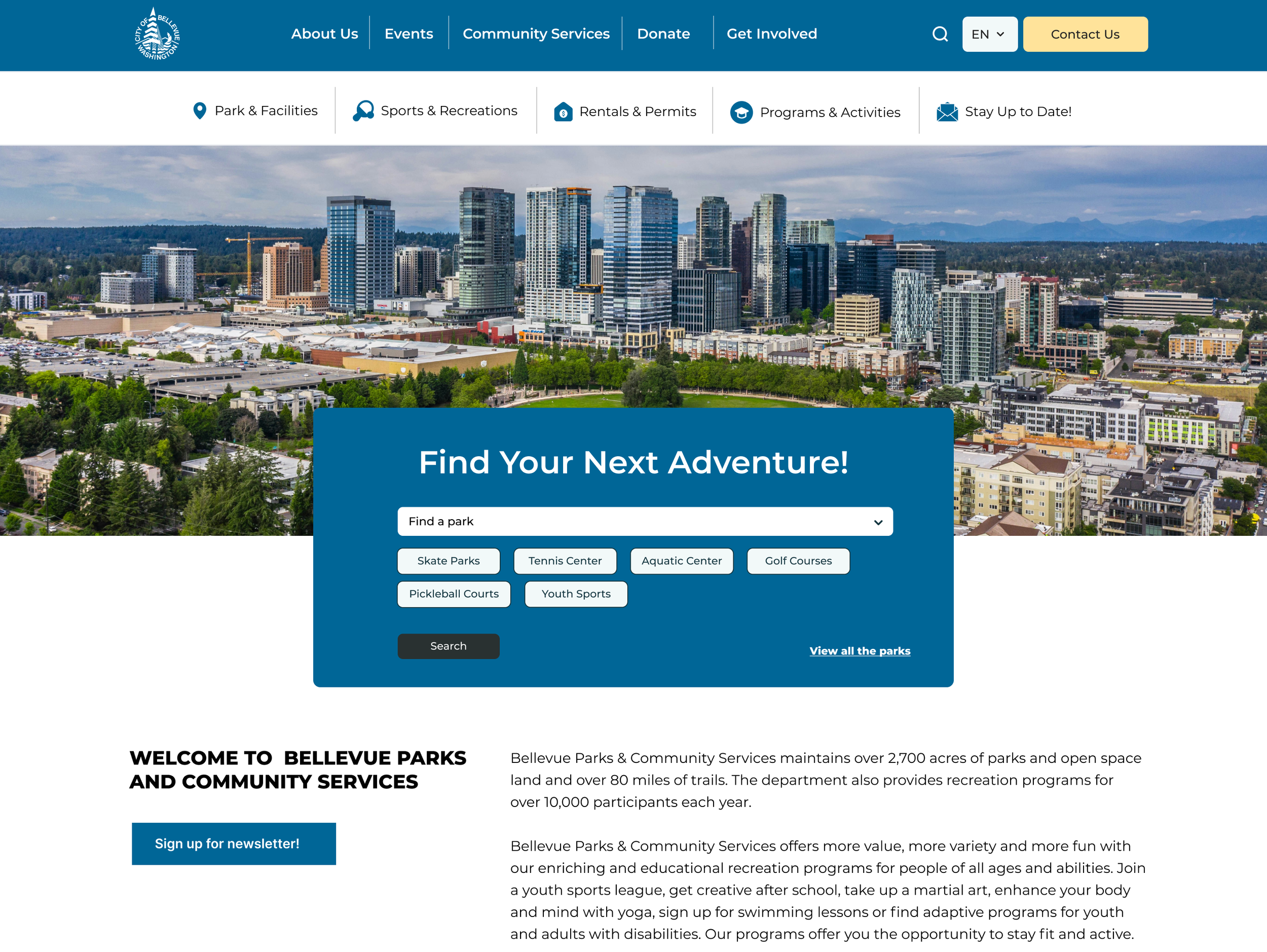
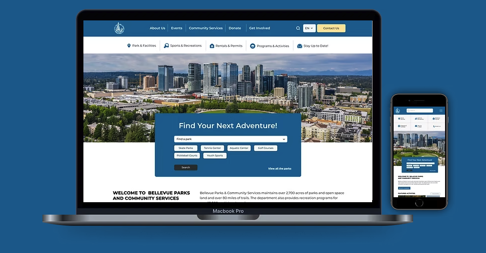
Homepage with adventure finder · Parks & trails with map · Programs with filters
City residents feel more confident navigating the website.
Validated across 115 post-redesign participants — the new navigation measurably improved confidence, exploration intent, and task efficiency.
"Vaishali brought a strong research-driven approach to redesigning our information architecture. Her work made navigation more intuitive and helped users find information significantly faster."
— Parks & Community Services, City of Bellevue
The core deliverable — progressive-disclosure mega menu validated by 115 users, 100% reporting increased navigation confidence
Research methods compound each other
Analytics showed what users searched for. Usability testing showed where they failed. Card sorting revealed how they think. Tree testing validated whether the new structure worked. Using all four in sequence created a feedback loop no single method could produce.
Good IA unlocks better features
The new information architecture didn't just reorganize content — it created a foundation for the park finder, program filters, and accessibility-first park pages. Structure enabled capability. Without solving IA first, those features would have been more content buried in the same broken system.