A world without creativity is like a Harry Potter’s novel without magic. Having been involved in the field of design for over seven years, I frequently embark on a quest to discover new and innovative solutions to the unique challenges that come my way.
By day, I am a UX designer, while my evenings are devoted to my passion for painting. I am currently pursuing a Master's degree in Human Centered Design and Engineering at the esteemed University of Washington in Seattle. In addition to this, I hold a Bachelor's degree in Communication Design and a Master's degree in Visual Design.
Prior to joining the University of Washington, I served as an Interaction Designer with the UX Consulting Team at ValueLabs, and also worked as a Visual Designer with Dorling Kindersley books.
When I'm not engrossed in my work, I take pleasure in traveling, meeting new people, taking photographs, and indulging in my love for food. As a painter, you will often find me engrossed in my canvas, lost in the act of creation.


Problem
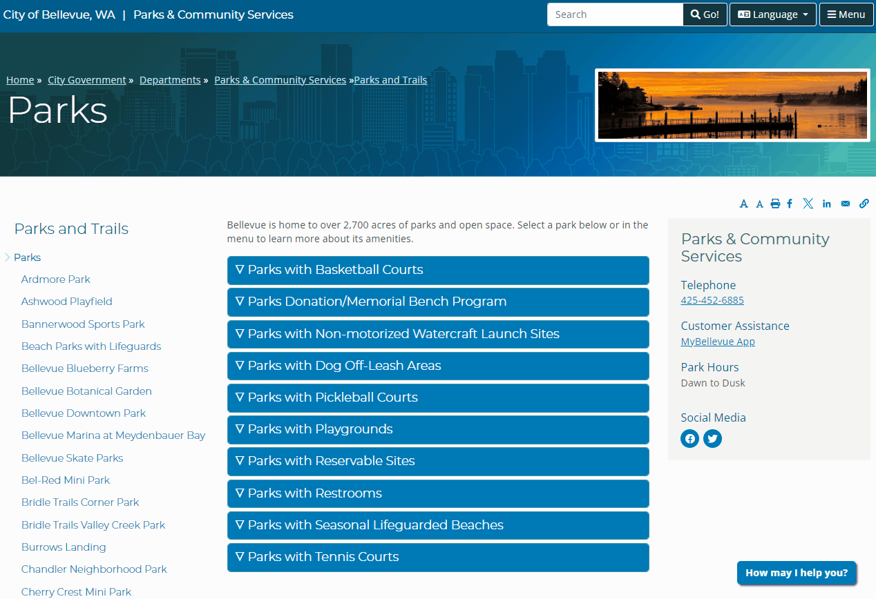
Bellevue Parks & Community Services boasts a wealth of resources – 90 parks, nearly 100 trails, and over 2,800 acres of green space – but their website, with over 400 pages, is cluttered and outdated.
The team regularly hears from customers that finding information is challenging with an average bounce rate of 60%. The department wanted to explore how data can be structured and displayed so that it is more user-friendly, intuitive, and visually appealing while meeting our accessibility standards
PAIN POINT 1
Outdated
Last updated in 2017, the website appeared outdated, inconsistent with modern design trends, and visually unattractive to users.
PAIN POINT 2
Confusing Navigation
Unintuitive grouping of information with a confusing mix of navigation options: top menus, sidebars, breadcrumbs, and a hamburger menu all crammed together.
PAIN POINT 3
Cluttered and text heavy
Walls of text and a cluttered layout made it incredibly difficult for visitors to find the information they needed.


Before
After
Project Goals
Role & Team
Improve the Parks & Community Services website so that users have an easier time finding information.
-
Develop an information architecture which aligns with users’ expectations.
-
Provide design recommendations for other aspects of the website (navigation, layout, etc.) which contribute to users’ difficulty navigating the content.
As the lead product designer I spearheaded all the collaborative efforts with the project manager to redesign the information architecture, navigation system, and web pages.
Me : Product Designer and Researcher
UX researcher : Jeff Pabst
Project Manager : Mariam Sarwary
Accessibility Consultant : Kunal Mehta
Project Toolkit
User Experience Research
-
Card sort study: Sorting exercise with 53 participants to inform a user-centered information architecture (IA).
-
Tree test: Results from 47 participants informed updates to the IA.
-
Usability study: 10 participants, including two with cognitive and/or visual disabilities.
-
Pre-launch usability study: 5 participants, including one with visual disabilities.
IA and website redesign
-
Information architecture
-
Navigation Redesign
-
User flows
-
Wireframe prototype
-
Design system and visual style guide
Design Challenge
How might we design an interactive website that engages visitors and significantly reduces the bounce rate, by showcasing Bellevue's impressive park system in a user-friendly way?
Target Users
The Bellevue Parks & Community Services website serves diverse users, including local residents, visitors, community organizations, event planners, businesses, and more.

New Users
People who are new to the city and are seeking information related to parks and services.

Local Resident
Local Residents of Bellevue who are the regular visitors of the website.

Parents
Parents interested in registering their children for summer camps or other programs.

Sports Enthusist
People looking to participate in a specific sport, or researching various athletic facilities.
Problems in Detail
01
Broken Information Architecture
The website's department-centric information architecture, currently structured up to eight layers deep, is a core usability problem. This deep and fragmented structure directly causes significant customer challenges in finding information, further exacerbated by jarring transitions to external sites, conflicting navigational elements (top, side, and in-page links), and unpredictable, warning-free jumps within the side navigation.
To solve this, we identified key challenges in the existing information architecture through a combination of 10 usability studies, and user testing methods like card sorting and tree testing. Please find the old information architecture here
.png)
OLD IA
New Users
People who are new to the city and are seeking information related to parks and services.
New Users
People who are new to the city and are seeking information related to parks and services.
New Users
People who are new to the city and are seeking information related to parks and services.
New Users
People who are new to the city and are seeking information related to parks and services.